8.2 ft, single fin, red

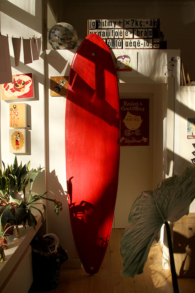
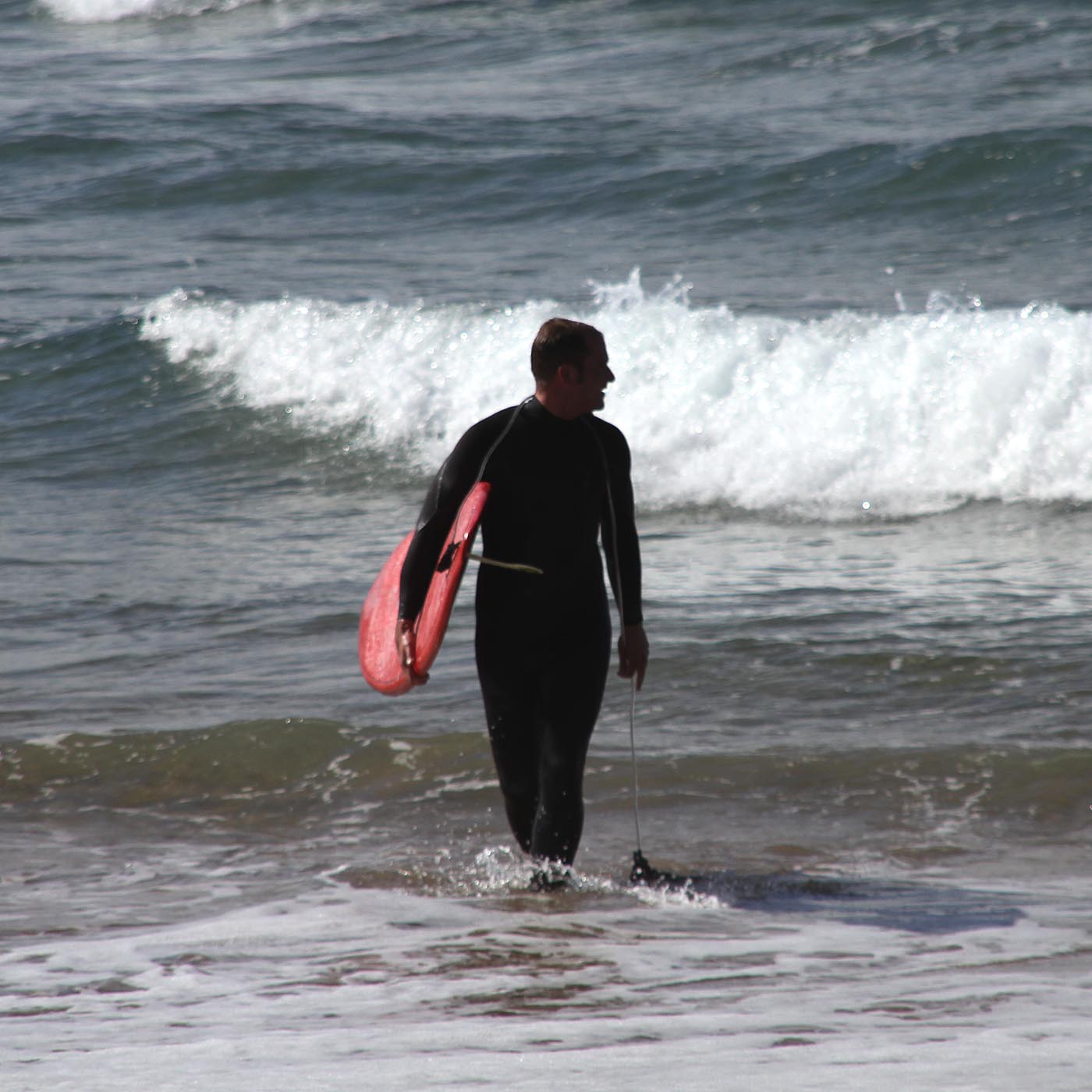
I needed a new Board.

My “Wack Board”, shaped by Hubert of crank surfboards still does his job, but due to its rocker it needs waves with a bit of punch or size. And when it’s a bit windier, due to it’s size it’s really hard to carry over sharp rocks or wiggly and slippery pebbles. So I wanted my new board to be a bit smaller, lighter, a bit less rocker but also with enough volume to compensate for the arms and the tummy. And I wanted it to be red.

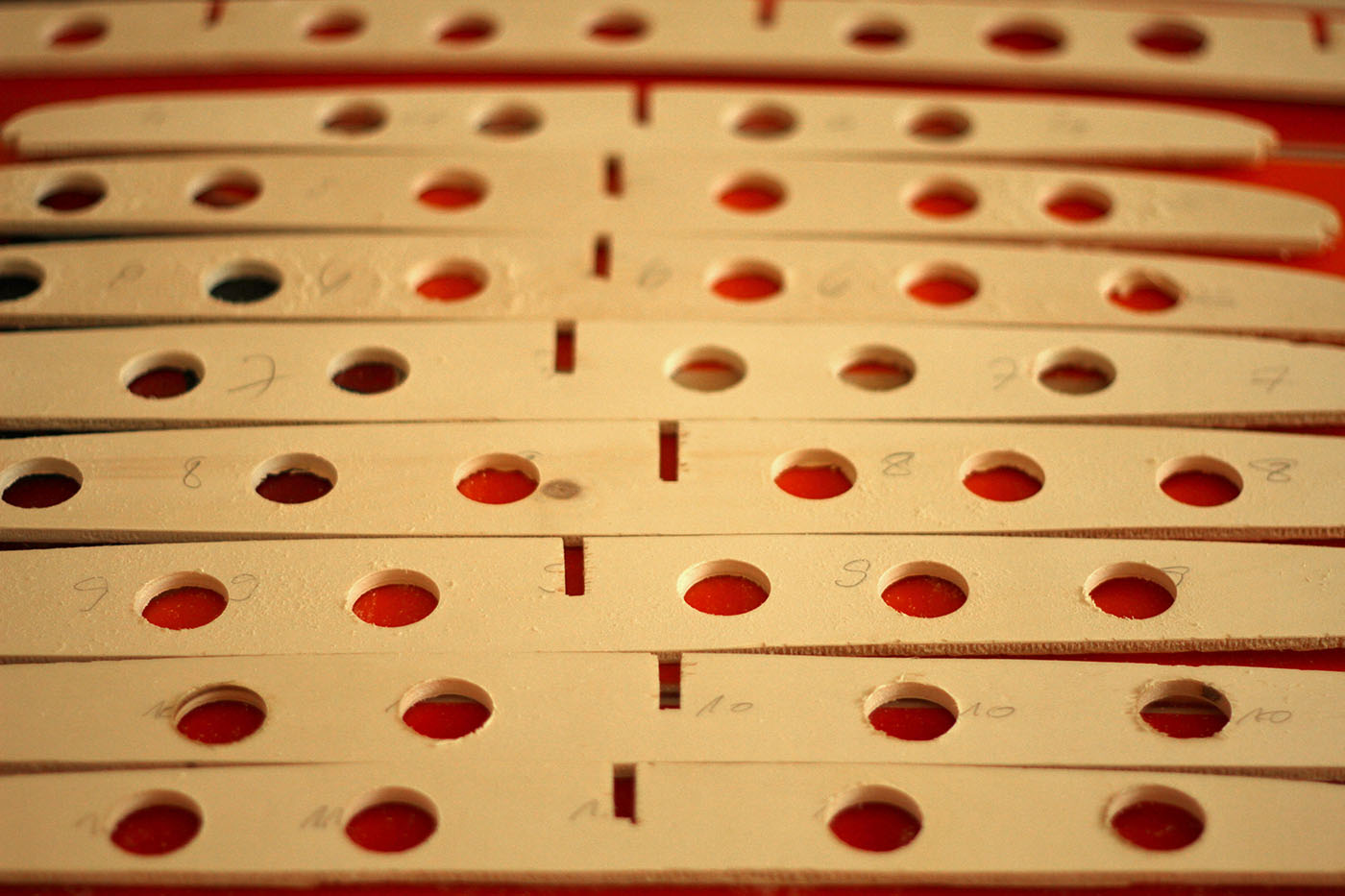
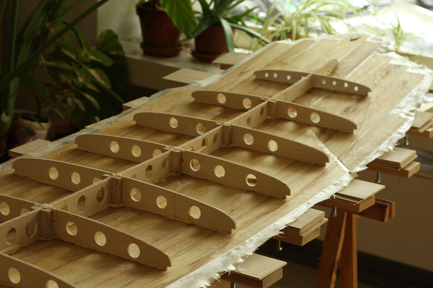
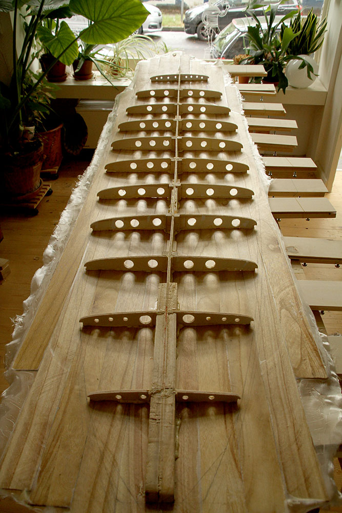
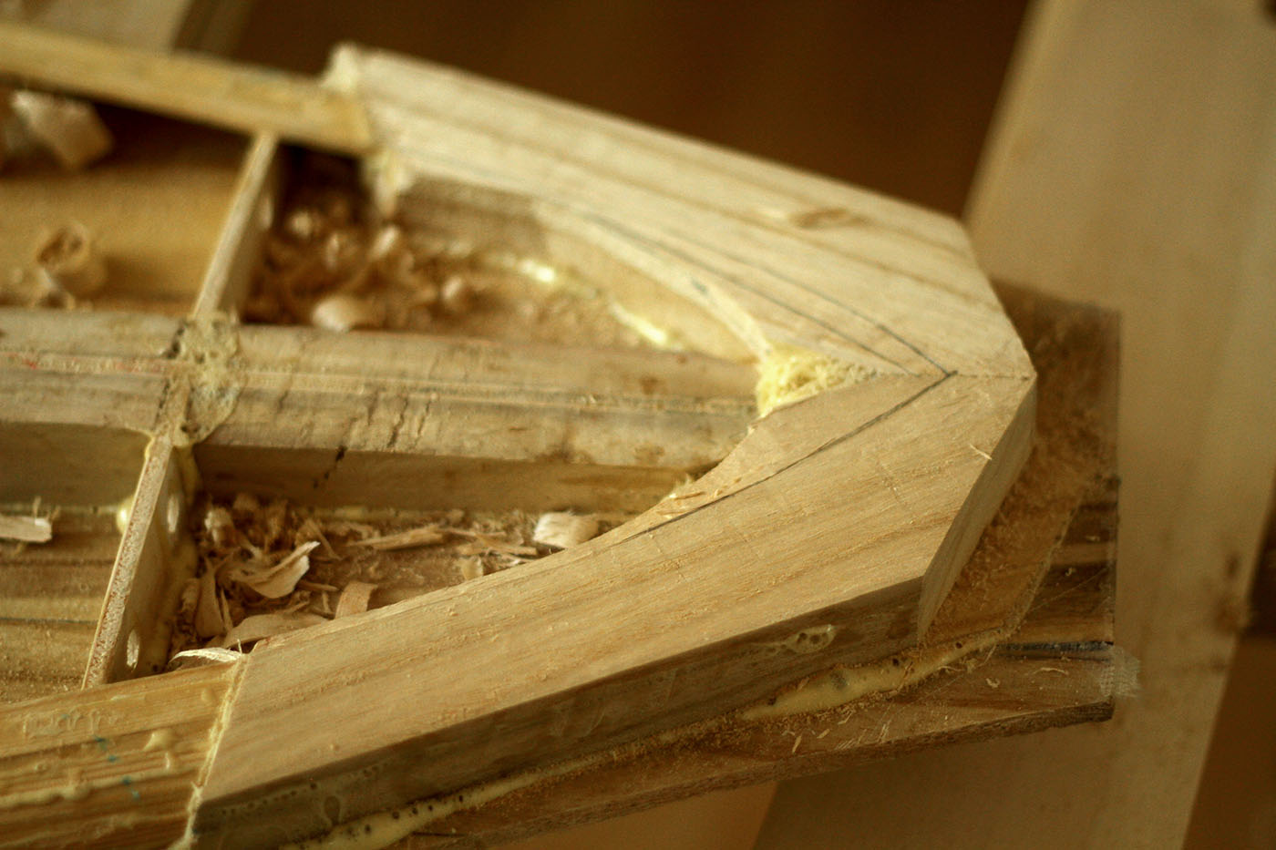
I found a suitable plan online, altered the rocker and the shape a bit, printed out the ribs and spine on A4 sheets and glued them back together. Of course I could have ordered a large print, but this method worked fine before and I didn’t want to wait any longer before I could start. I still had enough paulownia planks and thin cedar strips for the rails, just needed some plywood for the ribs and stringer.

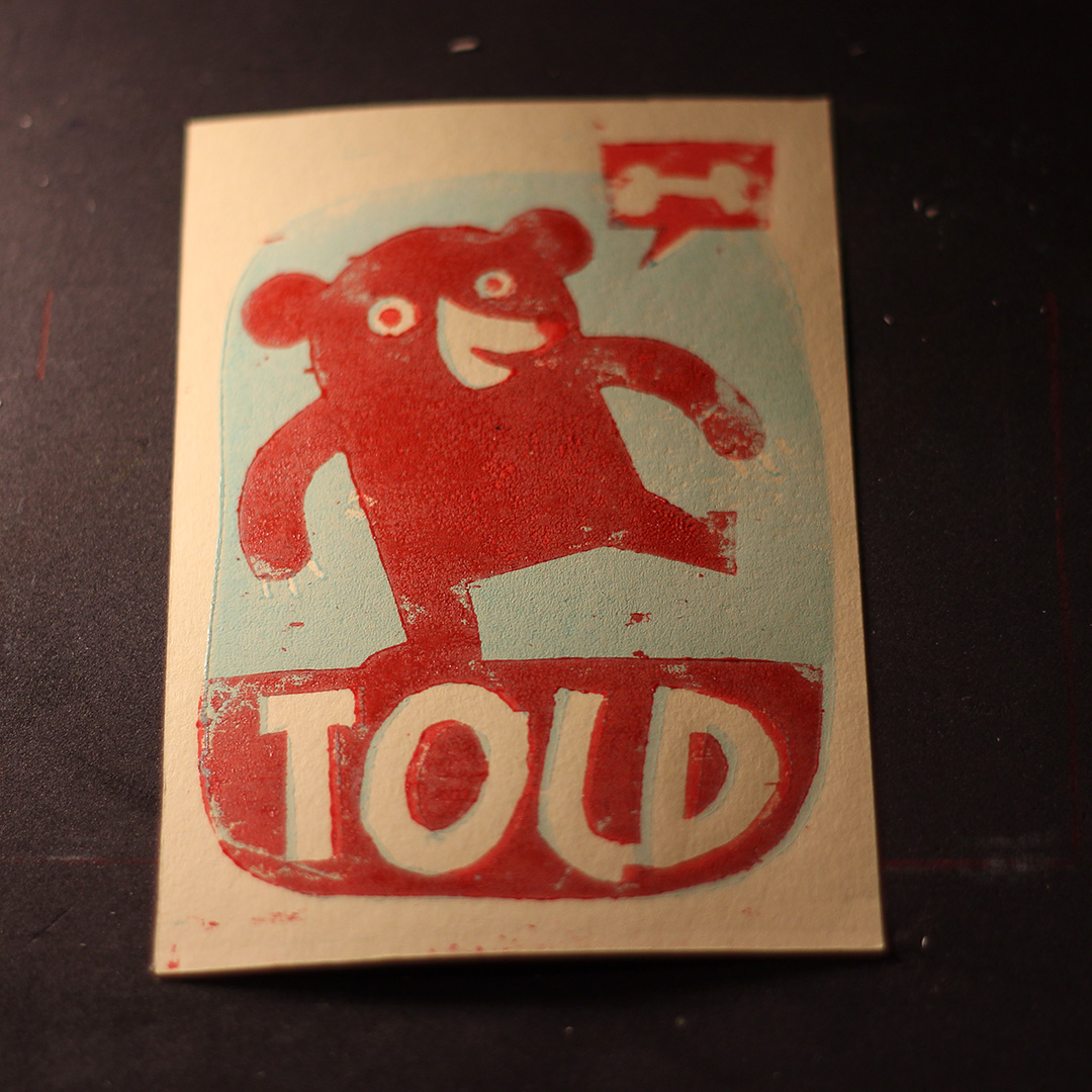
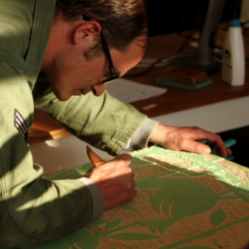
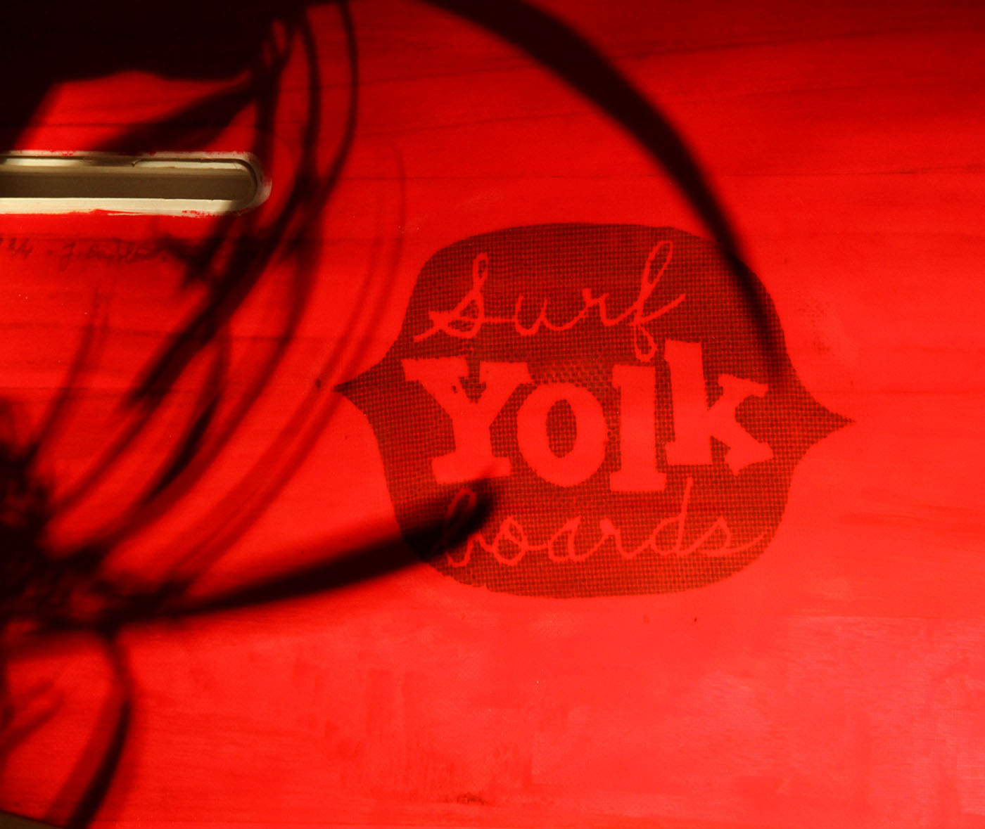
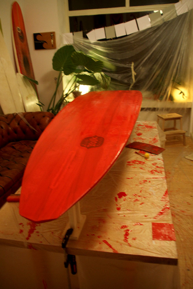
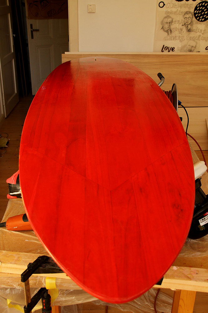
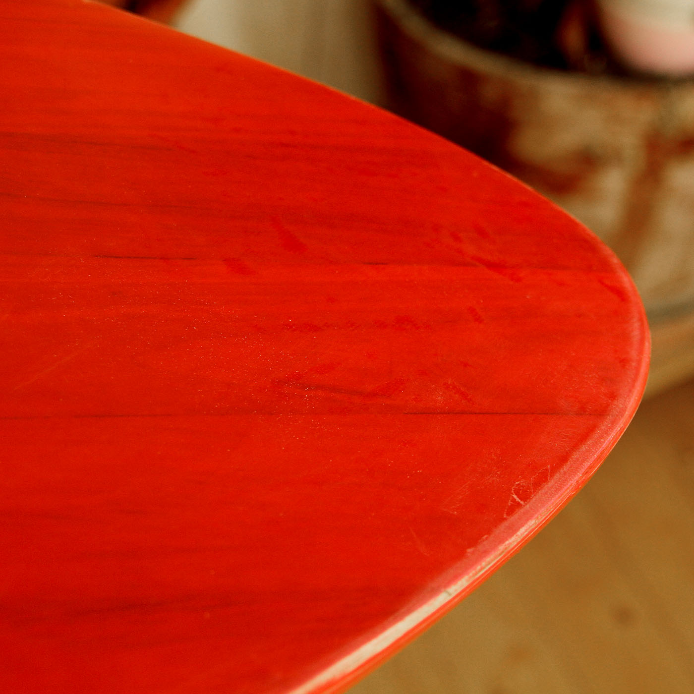
We planned on going to Portugal in December, as our last twosome trip, so I needed to get the board finished quickly. Mostly it worked out well, but it became clear that I would need a rockertable for future boards. Glassing was still difficult for me, but with more and more practice I’m quite confident that the next board will come out better. The red pigment in the resin left just enough woodstructure visible to become a subtle mix of wood and plastic. To brand it with “Yolk Surfboards” label, my fictional surfcompany, I cut out a woodprint and printed on fibreglass cloth.

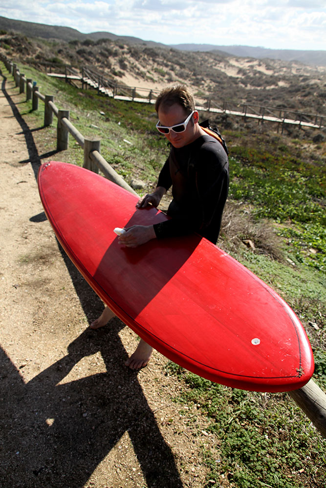
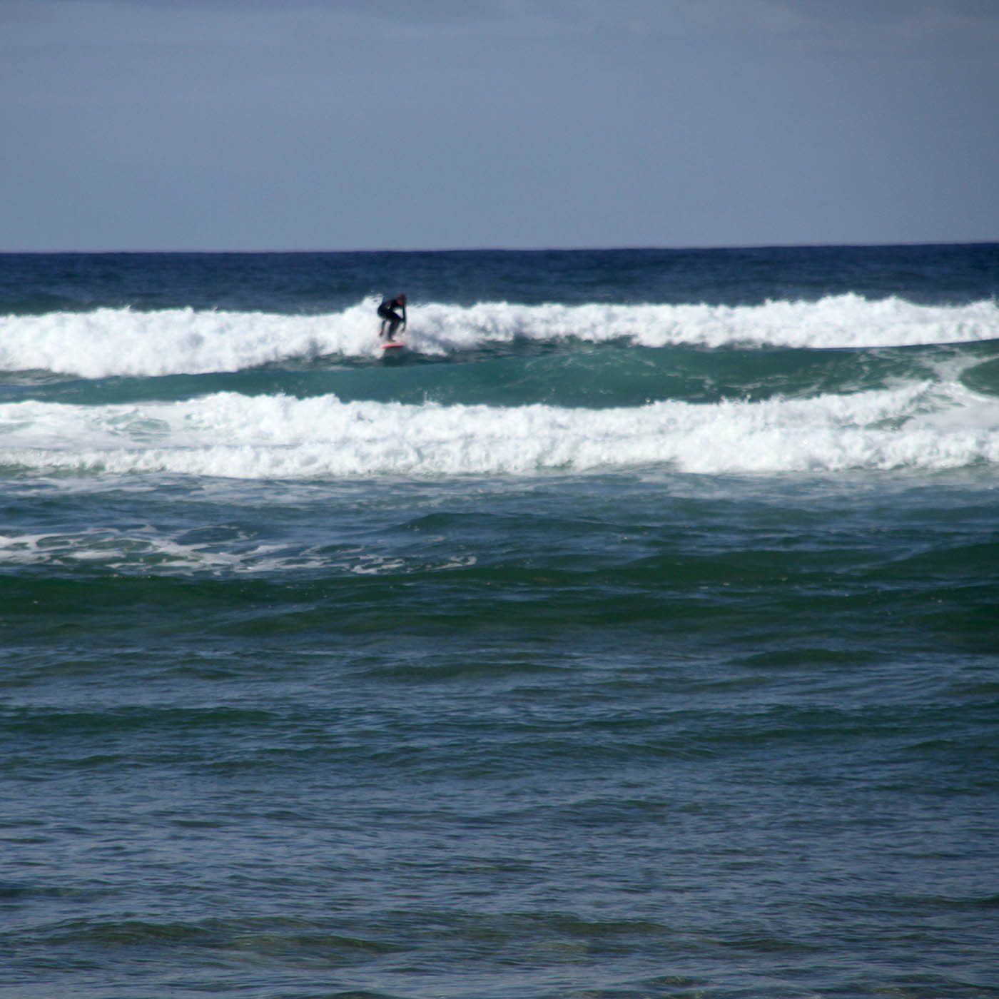
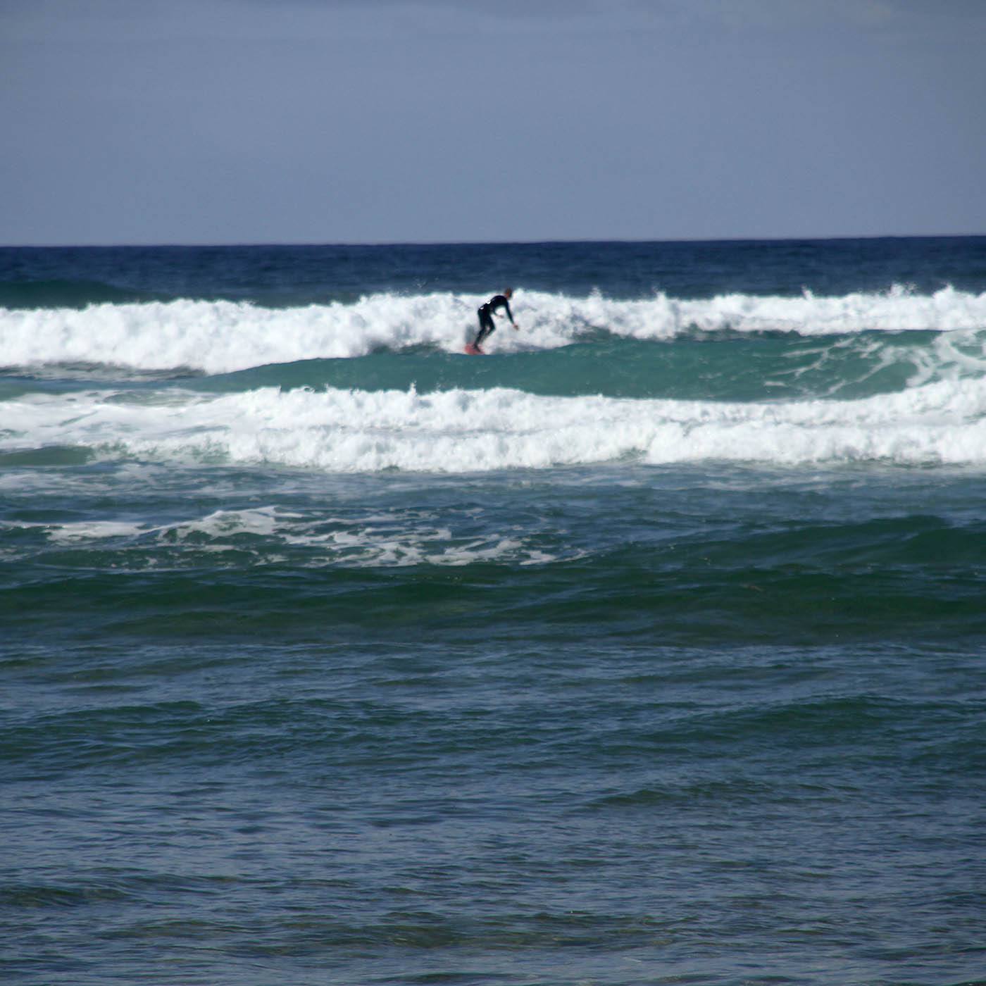
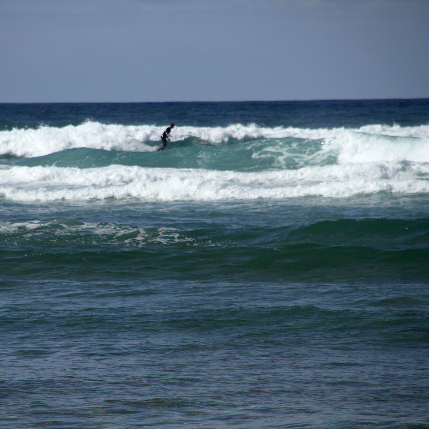
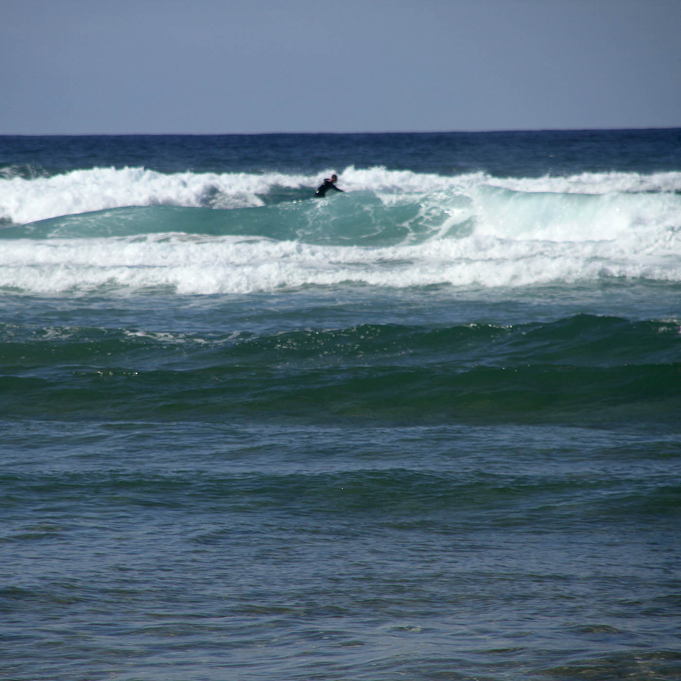
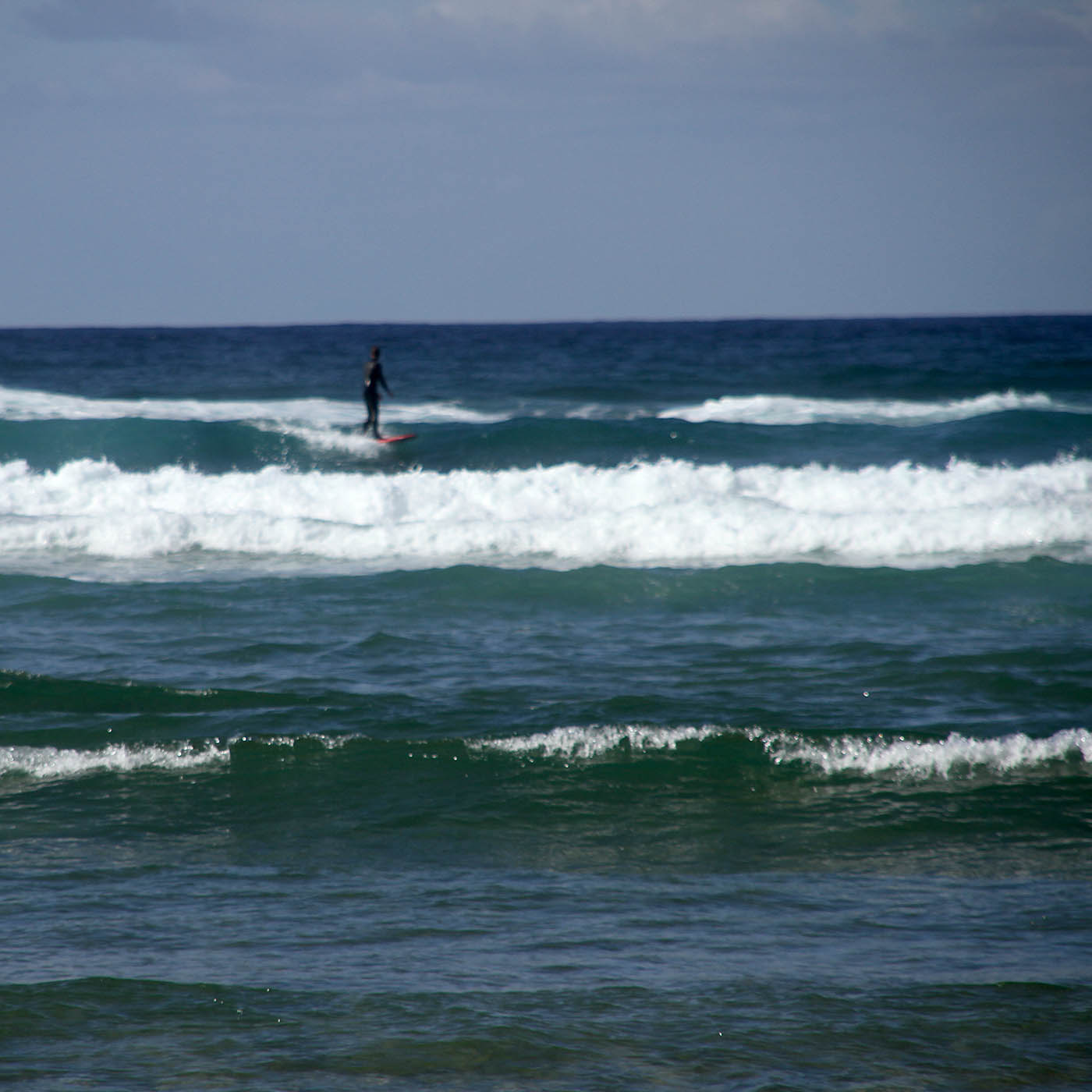
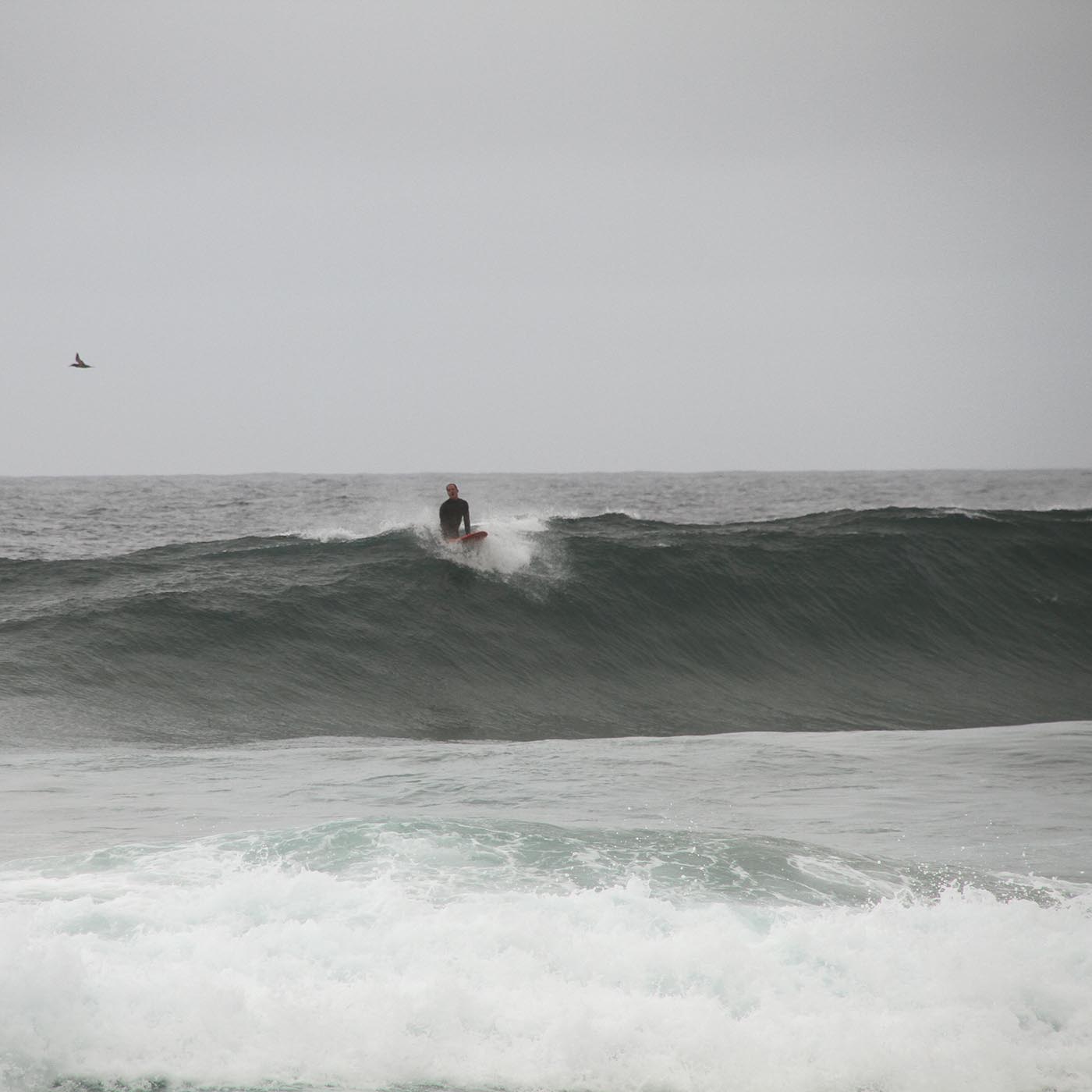
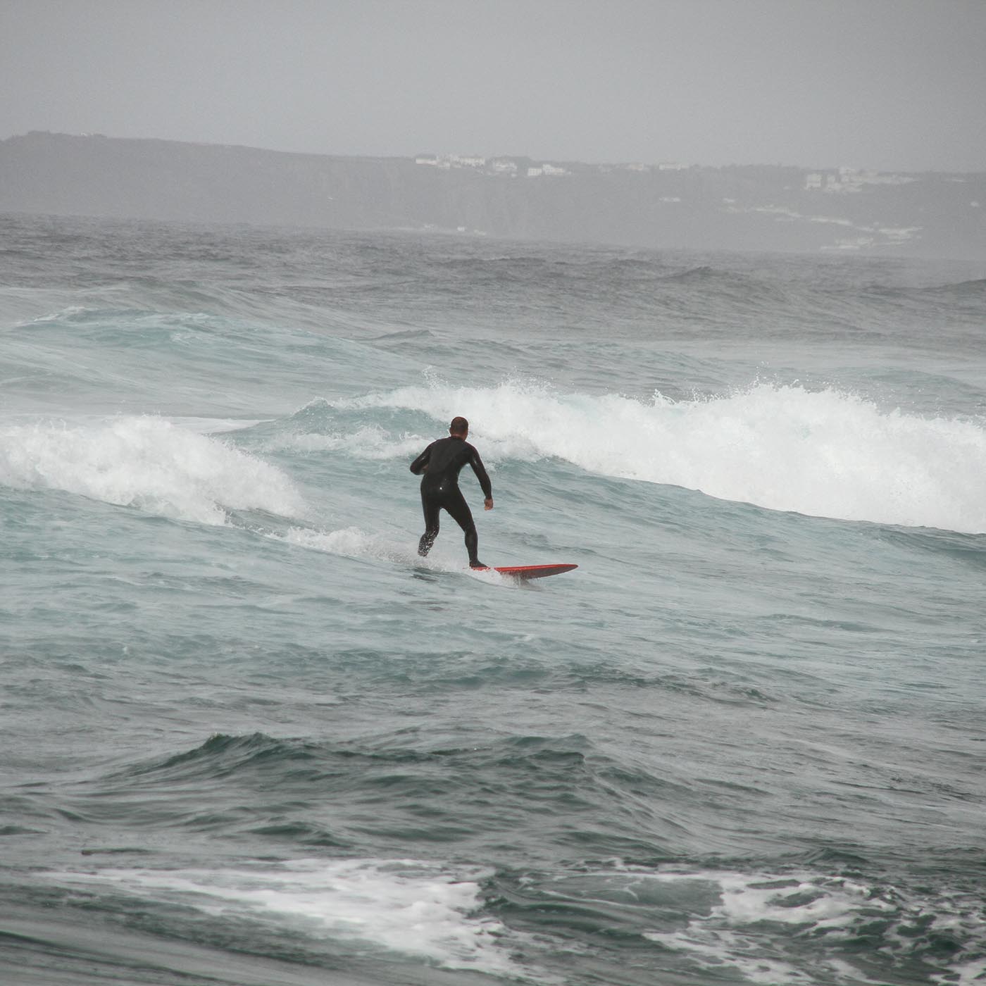
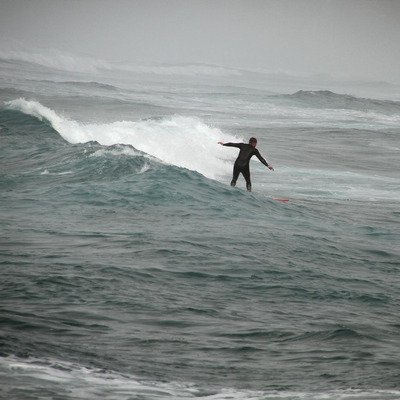
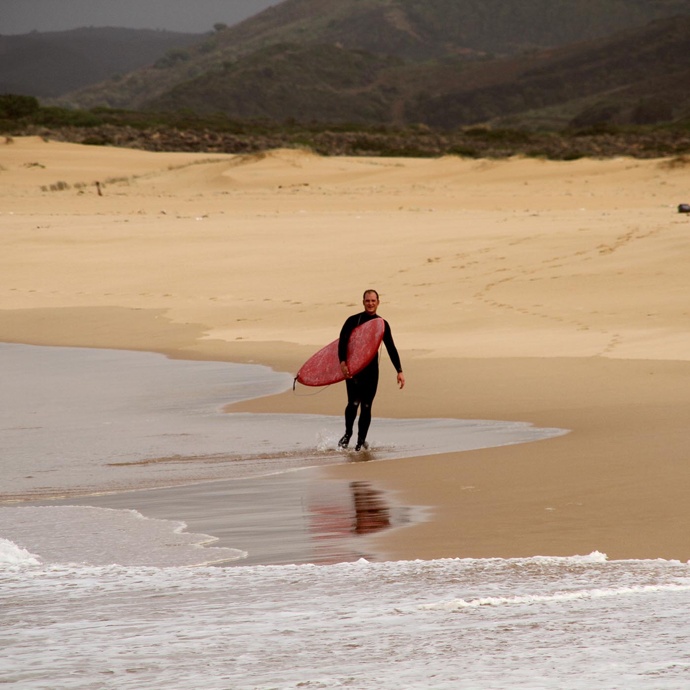
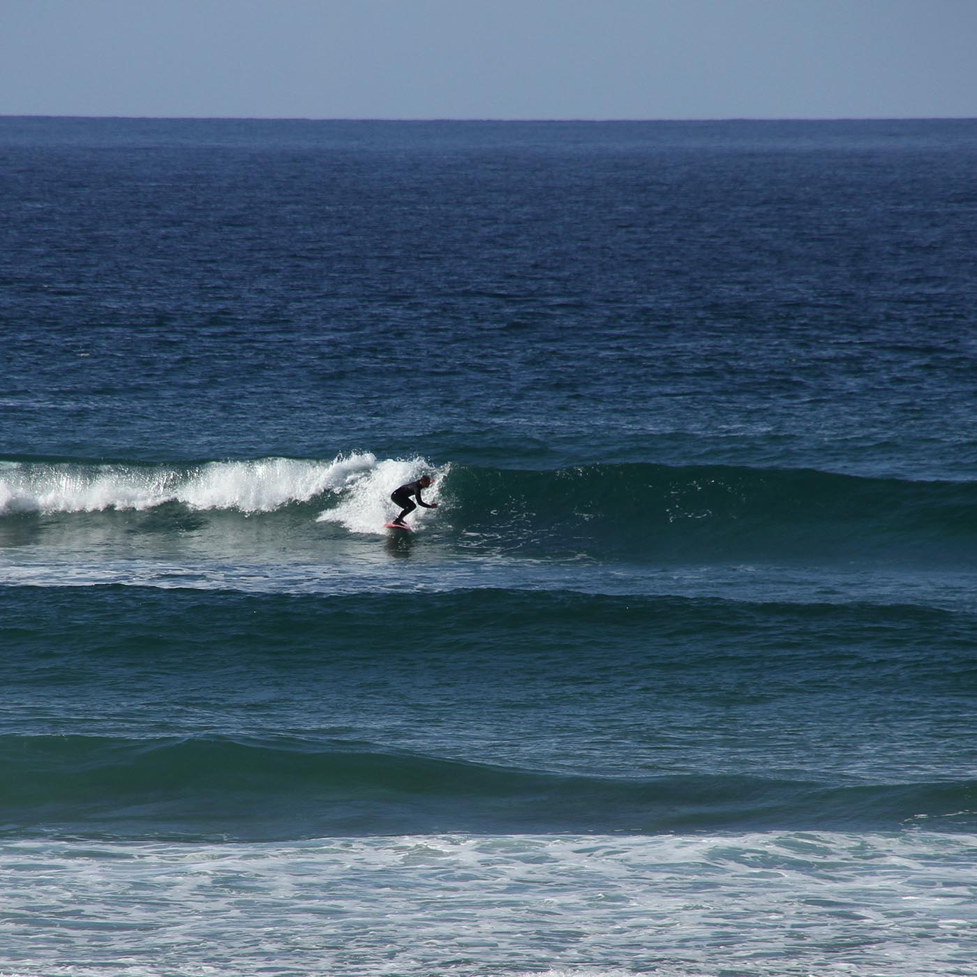
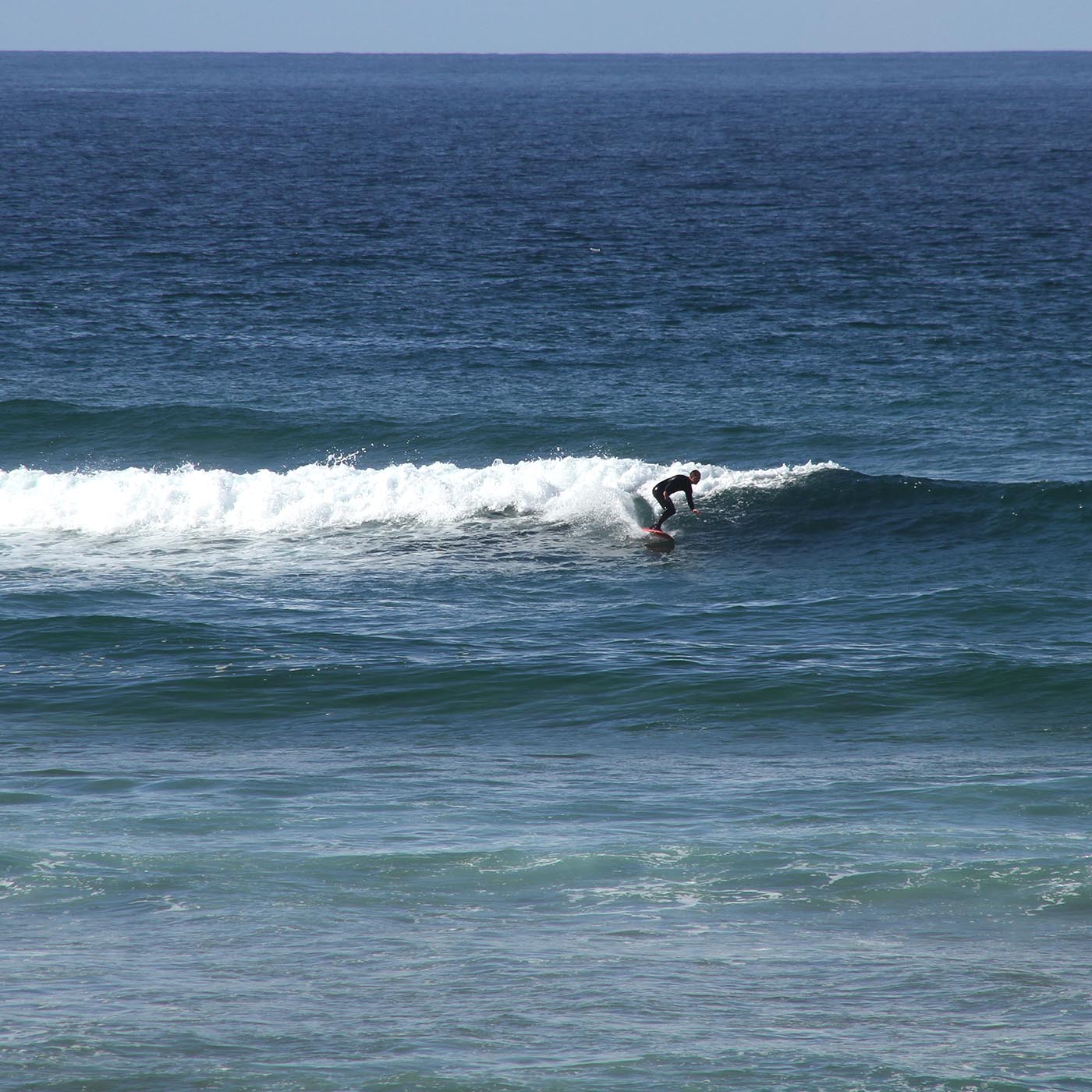
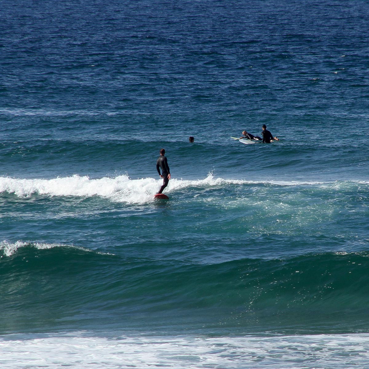
I tested it in Portugal, and I was happy right away. It is the lightes board in my quiver so far, paddels well and the moment I took off it becomes pretty fast and stays maneuverable. It works in weaker waves then my big board and also not unimportant: I’ve built it myself;)


Test

Walky


WOODPRINT WORKSHOP

Freitag 20. Juni, 17:00 – 19:00 Uhr
Auf der ILLU25:

Michael Horbach Stiftung, Wormser Str. 23, 50677 Köln

Holzdruck Workshop

Ein Stück Holz, ein einfaches Motiv, ein Schnitt, ein Druck.

In diesem Workshop schnuppern wir in die Technik des Holzdruckes und probieren es selbst aus.
Keine Vorkenntnisse erforderlich.

10 Plätze
pro TeilnehmerIn 10 €
inklusive Material

Der Workshop richtet sich an Erwachsene.

Für eine Anmeldung oder Fragen bitte eine PN an @jojoensslin oder per Mail an jojo@jojoensslin.de

Ich freue mich auf euch!

SOLO SHOW FRANKFURT

I was invited to do a sollo show in my Reps house, known as an exhibition-venue under the name “der kleine Mann mit der Kamera”.

For just a couple of days it had been quite an effort to put together but totally worth it. The vernissage was well visited and received, I was happy to meet interesting new and long not seen old friends. I was able to sell a couple of woodprints. Even to Tatort actress Barbara Philipp!

I enjoyed a couple of wonderful summer days “camping” next to the skatepark so I could enjoy a couple of rides after my daily duties.


Neighbourhood Pharmacy Gazette

For Canadas Neighbourhood Pharmacy Gazette I was assigned to do 4 Cover illustration.
Each cover represented a season and a typical canadian region with its typical architecture and features.


Client: Neighbourhood Pharmacy Gazette
Agency: Twocreative  / Shawn Samson
Anna Goodson Illustration Agency


FLUFFY ICECREAM

Together with my riend Lars we started to found a new brand: Fluffy!
We aim to produce high class icecream aand sell it via vending machines at selected spots.
Here are some first illustration and concept sketches.


HALLOWEEN!

I guess as an illustrator, halloween has got to be my favourite holiday…

And it is.


client: me myself and I


FREE

LA SANTA, LANZAROTE

I’ve spent some time with Prof. Superheiss on the lovely Island of Lanzarote and we went surfing a lot. On this trip La Santa was working most of the days and on one occasion I brought my GoPro to film myself.

That day the offshore wind was very strong making it hard to breathe while paddling and taking off.

Here’s a fun edit.

AIRPORT DÜSSELDORF

Illustration for the airport of my hometown.
I was asked to produce a couple of illustrations für Düsseldorf Airports webpages.
Am a  bit proud;)


Client: Flughafen Düsseldorf


Let’s Collab!

This clip was Originally thought to be used at the Frankfurter Buchmesse but actually became a short and nice standalone clip showcasing the diverse spectrum of kombinatrotweiss’ illutrators and linking to our group-project called “Let’s Collab!”. Of course it’s just a glimpse into the amazing work my fellow illustrators have to show.

I had just about two days to do it, so from the beginning it was clear that I will have to reduce and focus on few elements in this animation. As I was trying out a new character rigging and a totally new mouth-rig, I was eager to try it out in this project.

Svetlana Jakel @kombinatrotweiss did the voice recording herself and Christoph von Chamier did the music and sound design. The rigging worked very well and it was nice to see, that in a relatively short amount of time it was possible for me to provide lip-synced animation. I was also very glad, that Svetlana liked my character design of herself, as I often find this to be the hardest part.


client: kombinatrotweiss illustration
voice over: Svetlana Jakel
music and sound design: Christoph von Chamier

Woodprint for Rocktrust

Rock Trust is an Edinburgh based organiziation fighting youth homelessness in a very active and creative way.

Bi-annually they organize an art exhibition showcasing donated artwork on postcards they send out to selected artists.

For over ten years now I was happy to regularly participate and provide additional artwork for some of their events. This years topic was “untold”, and I decided I wanted to make a three colour woodcut.
I had been sketching a lot with color pencils in the past couple of weeks mostly using three colors: blue, red and turquoise. I liked the roughness of the drawings and wanted to transport it to the woodprint, so my thought was that using three plates would add some imprecision. I could also use the overlap of colors, something that normally isn’t possible in the “lost cut” technique I normally use.

Even though it was more actual cutting than normally I am very happy with the outcome. I used lino printing colors instead te oil based colors which I normally use and for this motif I love the “dusty” look the paint has on the paper.


I documented the whole creative process and cut it down to a qick minute tutorial: