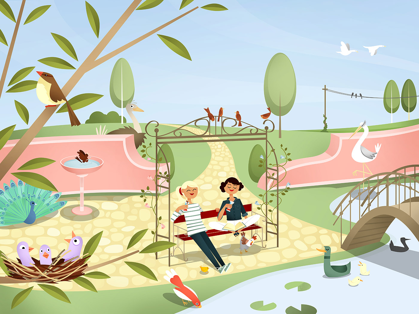


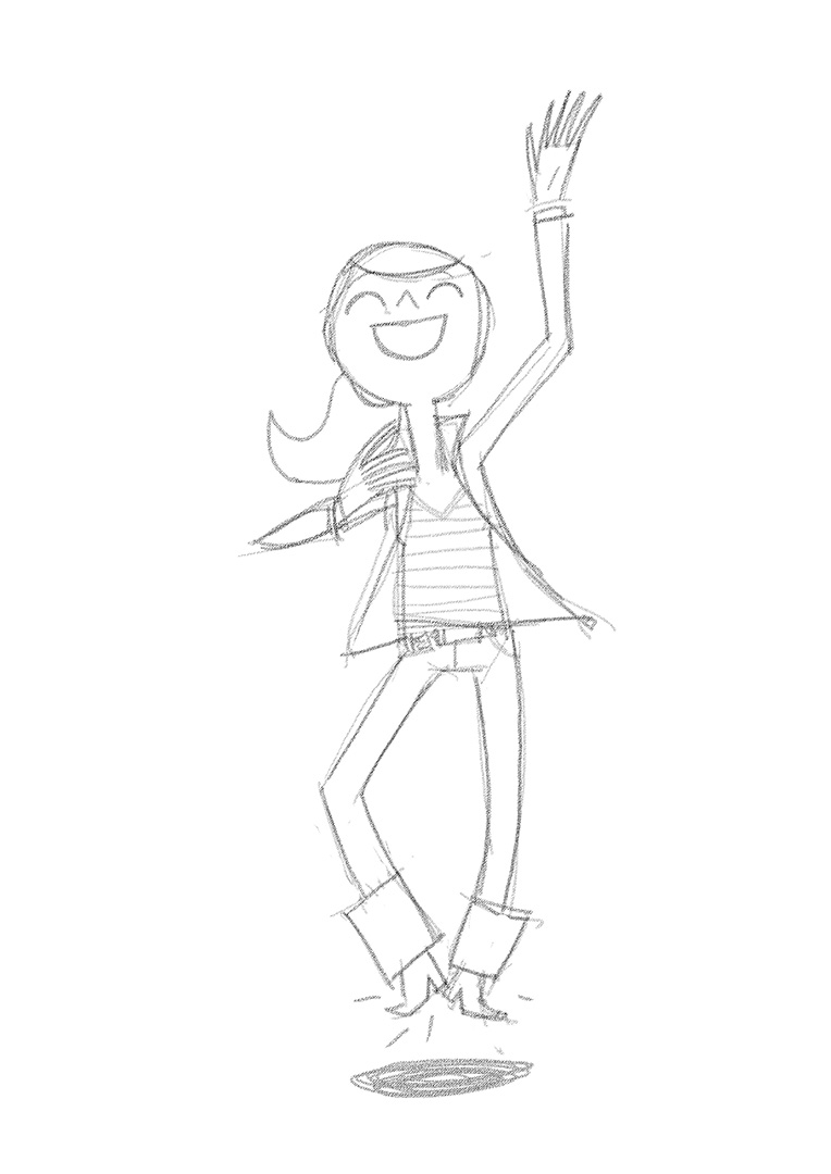


What did Iva do in 2015?
I regularly provide Illustration for La Viva, a lifestyle Magazine. Here are some of 2015’s Issues.
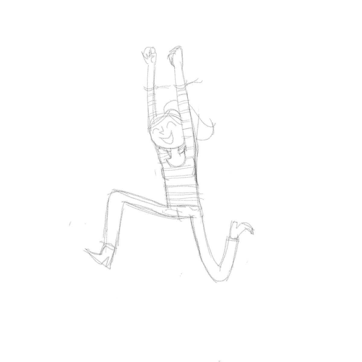
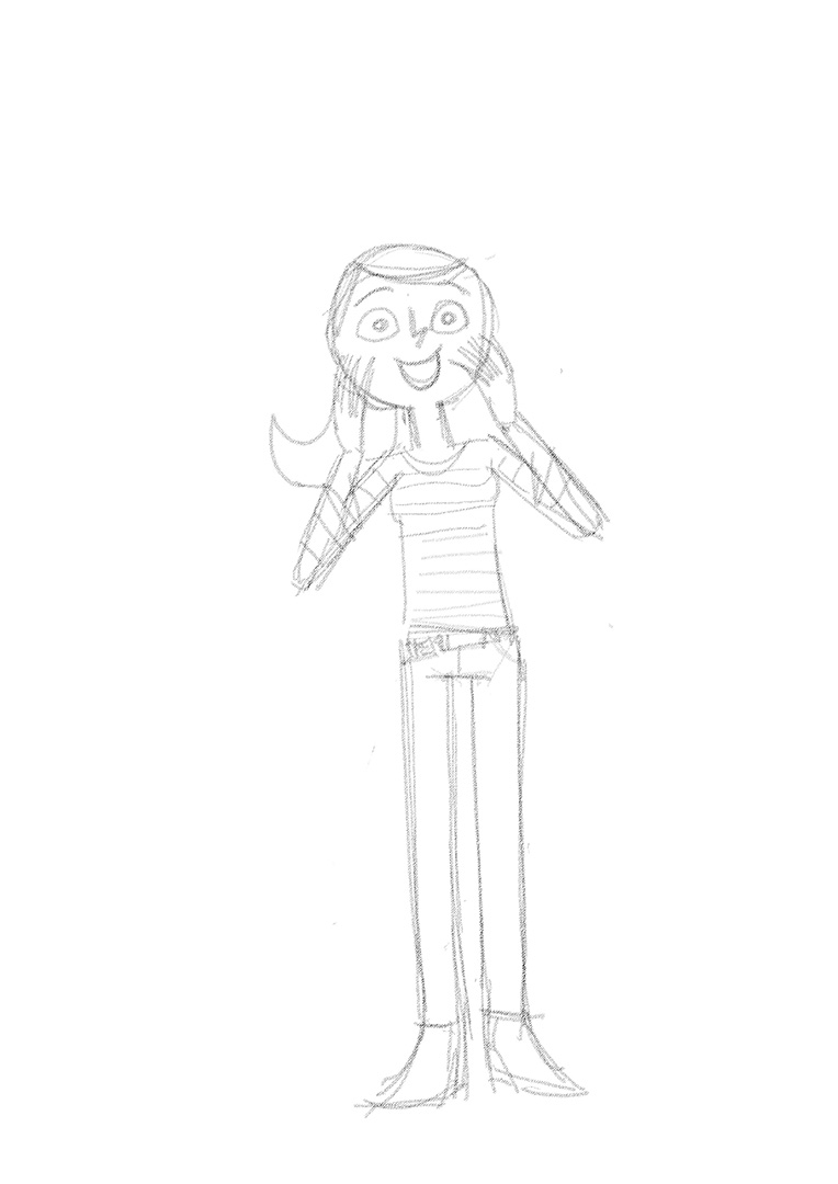
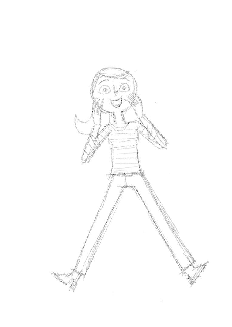
Sometimes I really like rejected drafts. SoI included some for you as well.
Client: La Viva Magazine
Agency: Gruner & Jahr
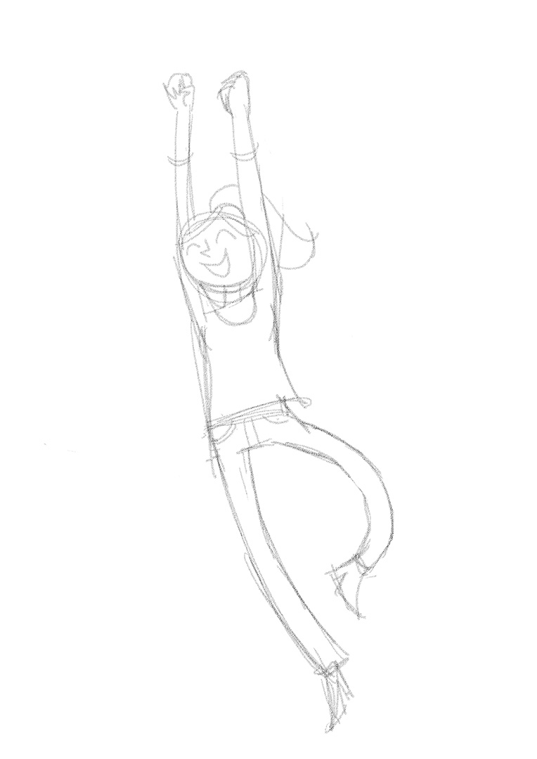
What did Iva do in 2015?
I regularly provide Illustration for La Viva, a lifestyle Magazine. Here are some of 2015’s Issues.
Sometimes I really like rejected drafts. SoI included some for you as well.
Client: La Viva Magazine
Agency: Gruner & Jahr
and how they keep their cool.
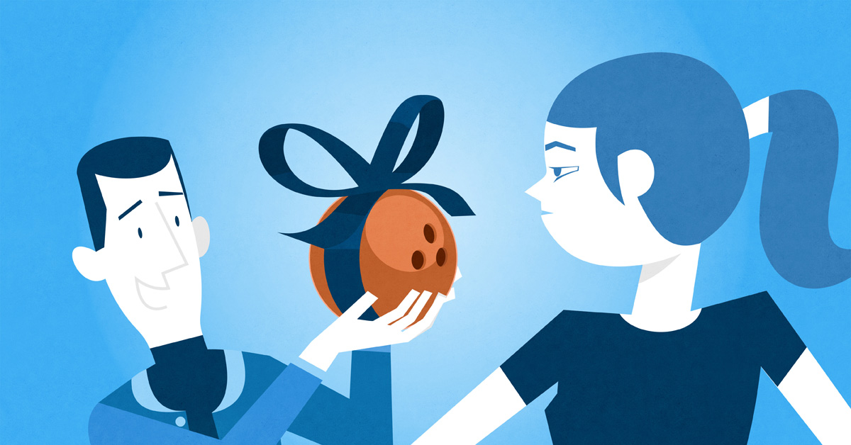
I was assigned to create a couple of animated clips for Nivea Men Stress Protect Deodorant and a bunch of illustration to run as a poster campaign alongside.
The topic was men in strange and awkward situation and how thay, thanks to this deodorant, stay cool.
Client: Nivea Men Stress Protect
Agency: La Red Hamburg
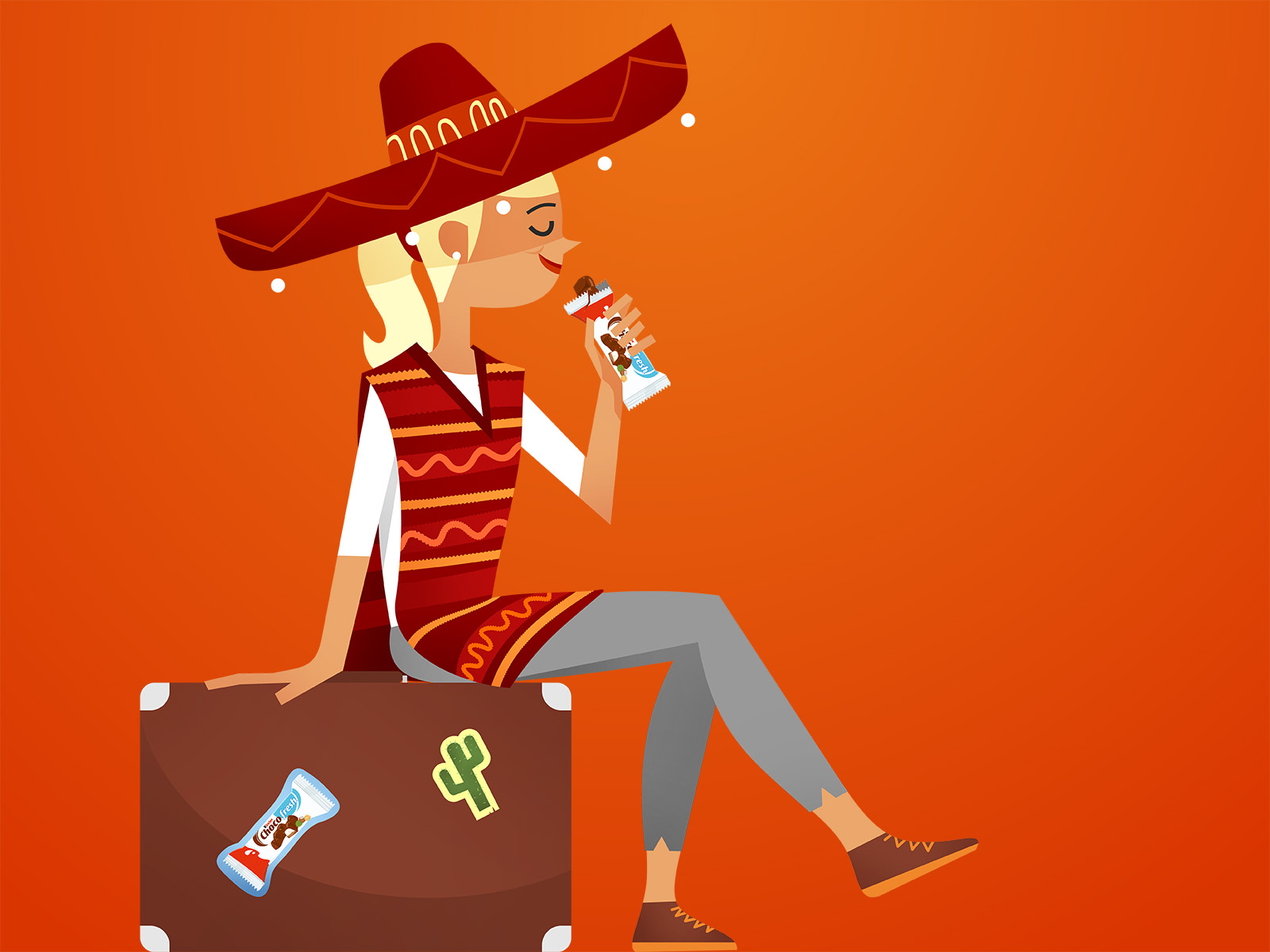
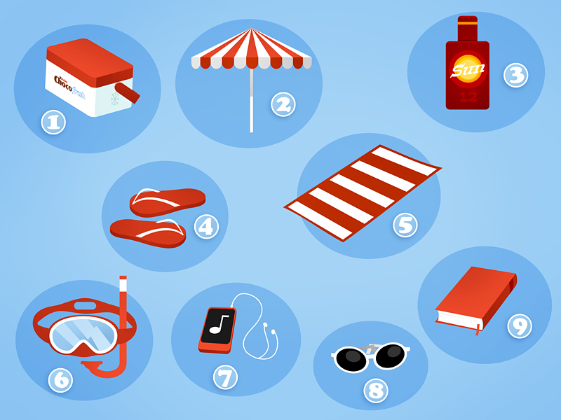
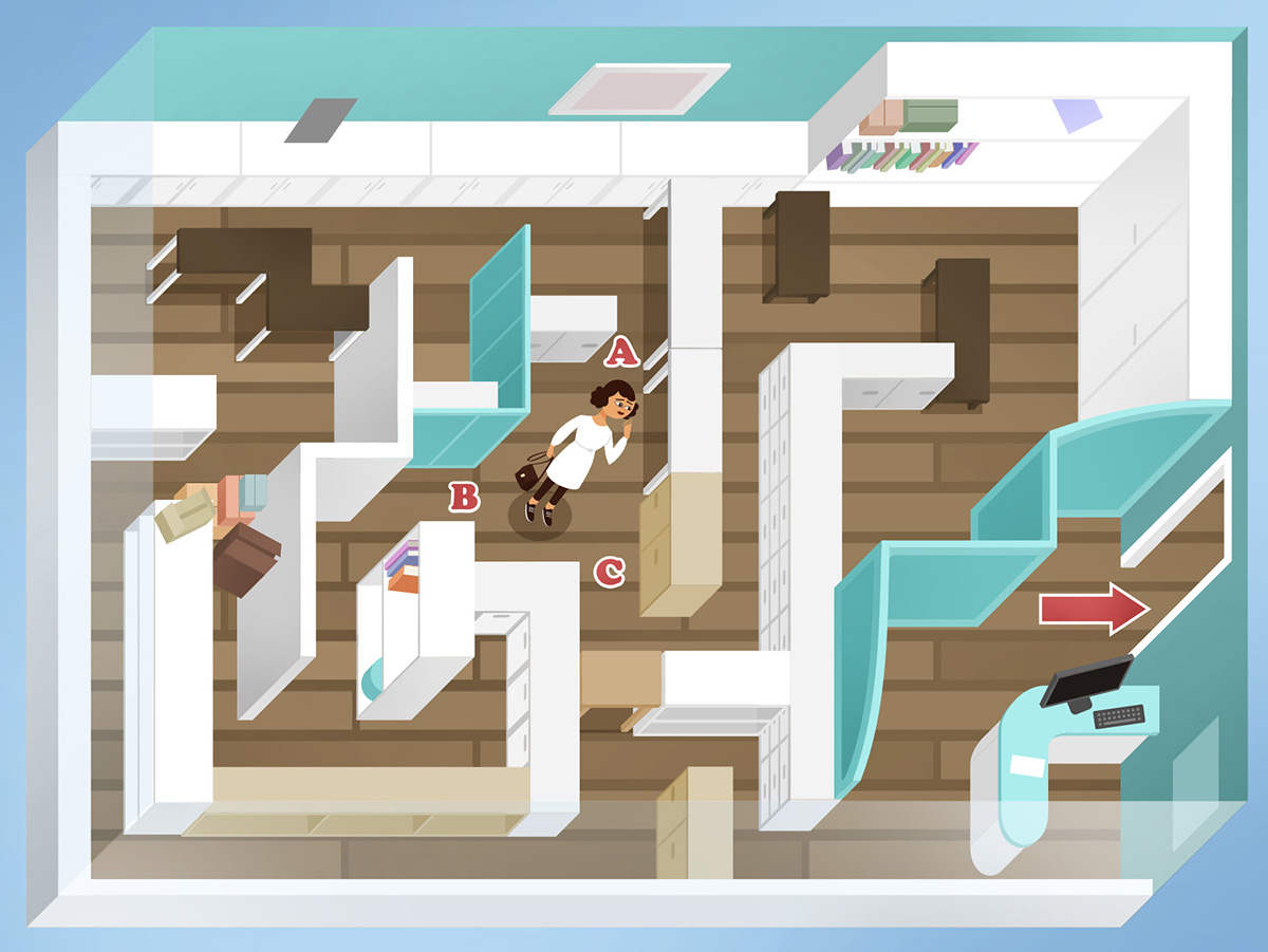
I regularly provide Illustration for Ferrero Chocofresh’s Websites. Mostly they feature seasonal topics, mixed with quizzes, mazes and polls. Targeting young women they are quite successfull on Facebook.
Here’s a selection of the Summer illustration.
Client: Ferrero Chocofresh
Agency: La Red Hamburg/Berlin
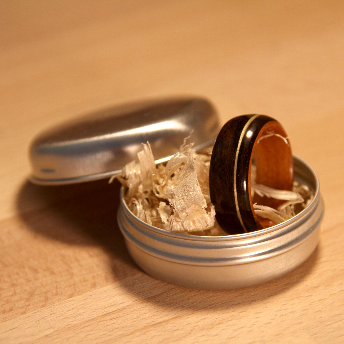
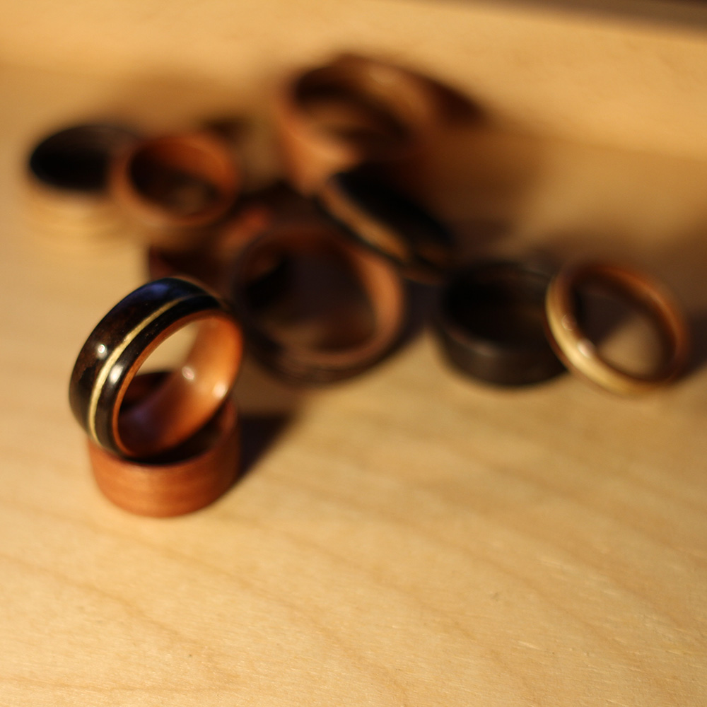
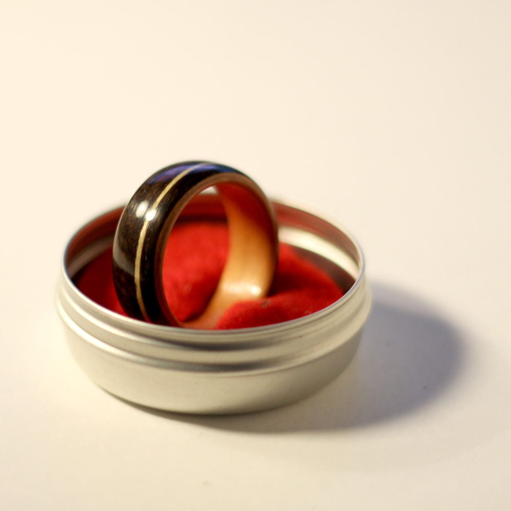
Or wedding rings became weak, especially mine suffered a lot from taking it off for for sanding and filing.
So it was time build new ones.
I tried out different woods, bending them with heat around a ring mandrel and glued them together with ca glue. This way I produced blanks, much wider than needed and cut them into smaller blanks to put on the mini lathe. I experimented with differen thicknesses and types of wood, even managed to put some inlays of white cedar into dark wenge. With a couple of layers of CA-glue and polishing they came out very shiny and glossy, just linseed oil and waxing also produced a beautiful surface and slightly different look.

I was asked to do an editorial illustration for Connected Rogers about roaming costs in the US.
Client: Roam Like Home
Agency: Connected Rogers

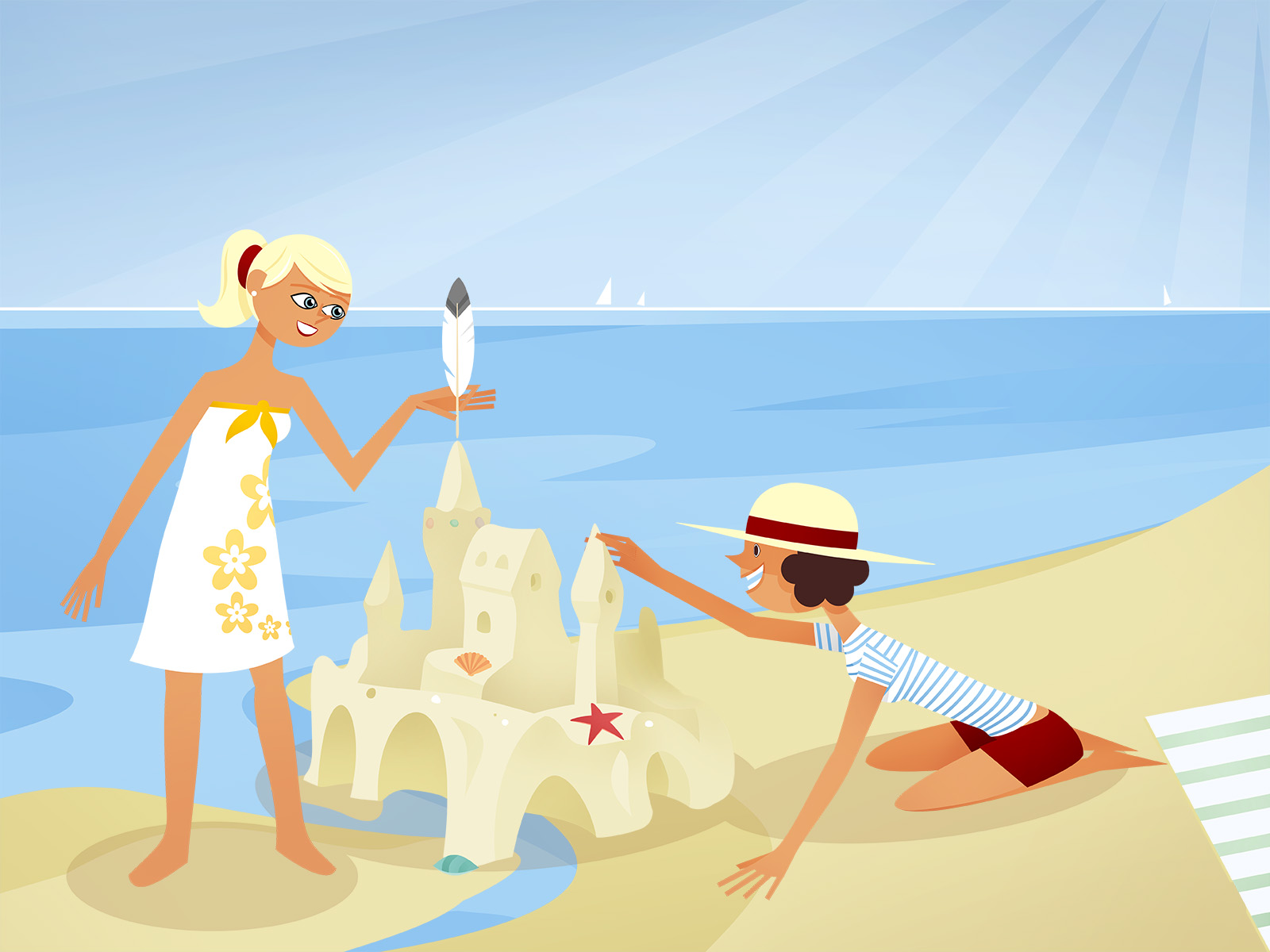
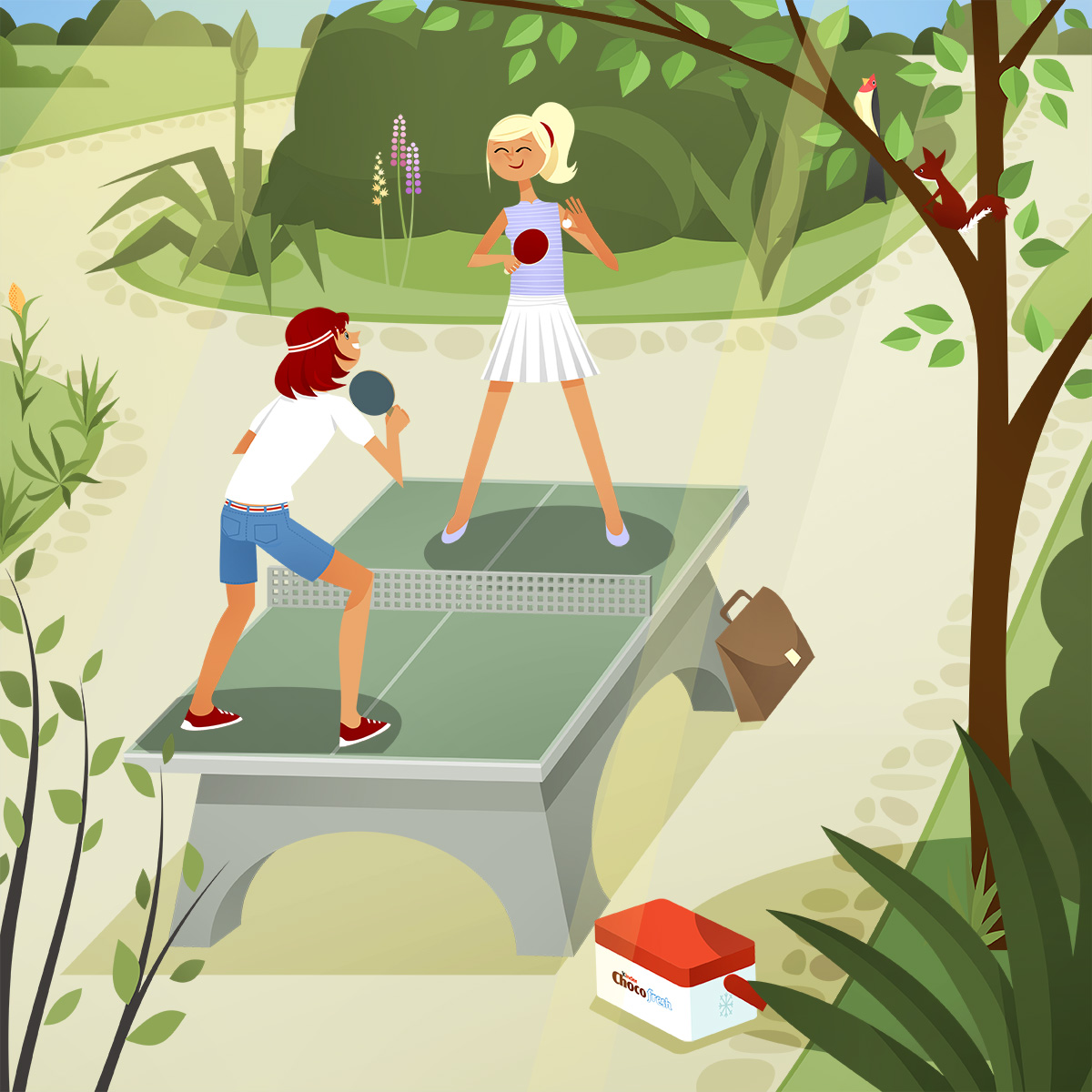
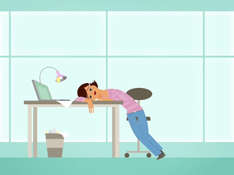
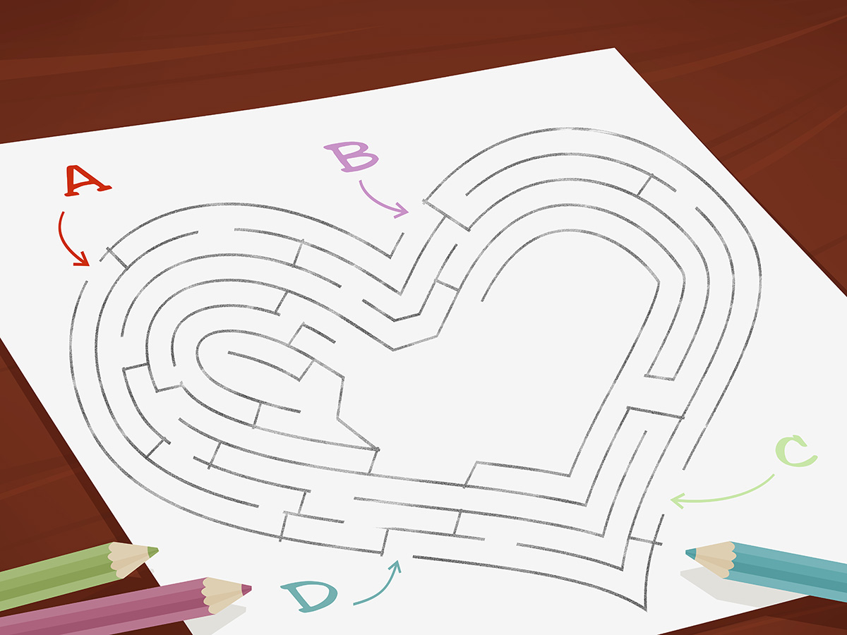
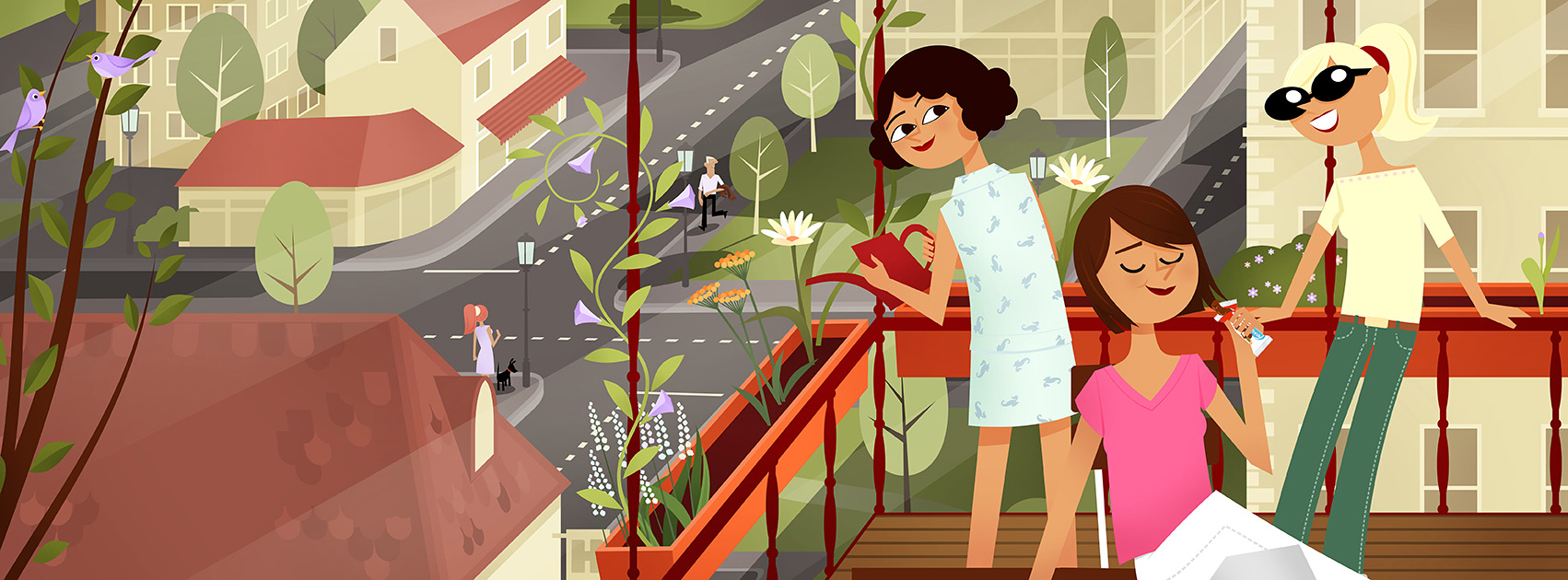
Spring in Ferreroland!
The girls skip work, go on a roadtrip, get lost in mazes, have to count birds, solve some quizzes, do a bikeride and finally relax on the balcony. What a life!
Client: Ferrero Chocofresh
Agency: La Red Hamburg/Berlin
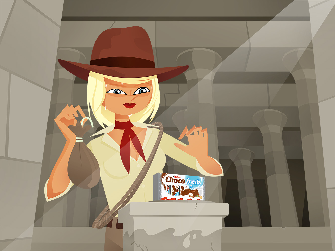
It’s wintertime in fictional Ferreroworld!
The girls play in the snow, dream of tropical islands, hunt treasures like Diana Jones, buy shoes, perform as magicians and celebrate carnival.
Client: Ferrero Chocofresh
Agency: La Red Hamburg/Berlin

“Will you marry me?” – women proposing.
The Baltimore Sun assigned me to do a full page illustration about women proposing for marriage. I thought this might be the right way.
The editors liked it so much that it was adapted and used for a second, tab sized weekly magzine of Baltimore Sun.

Read the article here.
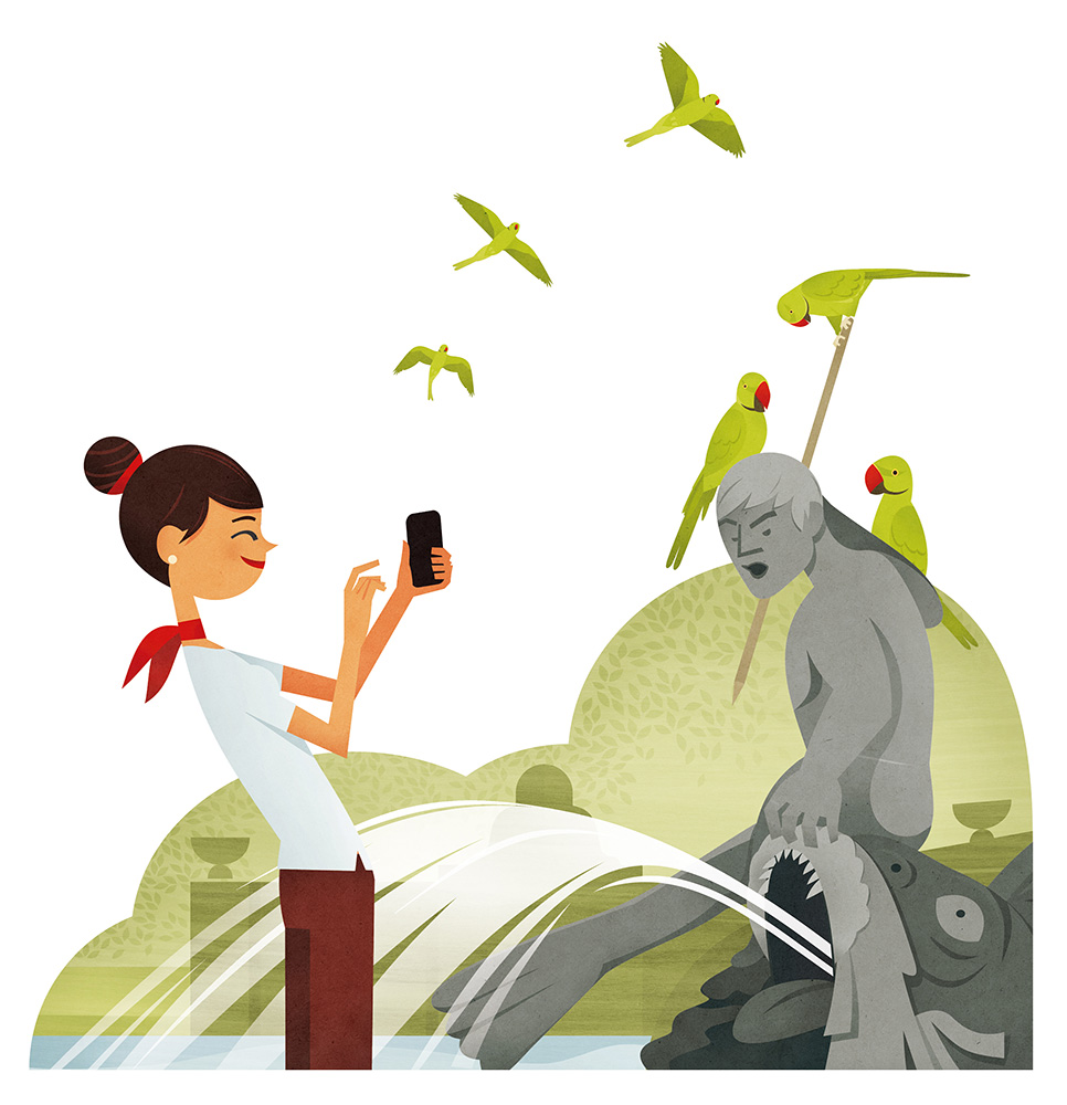
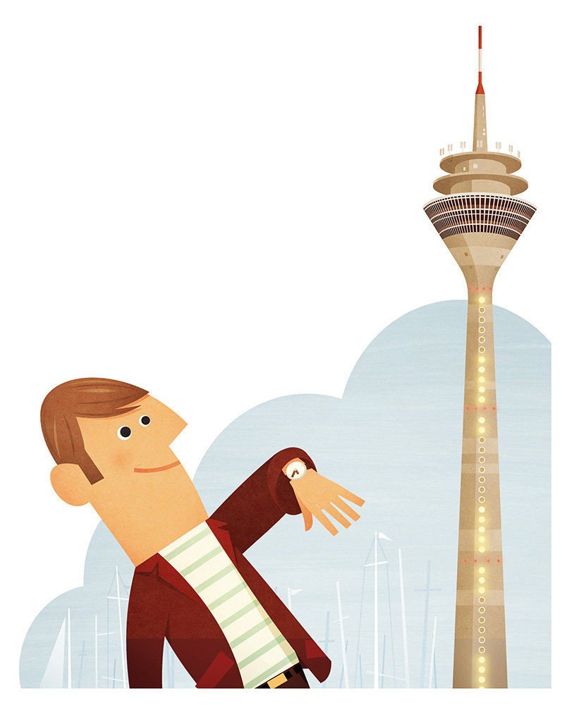
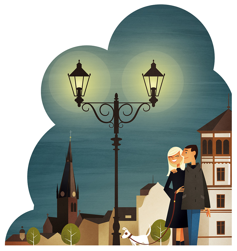
The Department for Tourism and Marketing, City of Düsseldorf produced a new brochure about Düsseldorf, and I was asked to provide some artwork. Boy, did I want to!
The illustration highlight some special features of the city. For example, did you know that the lamps on the outside of our broadcasting tower show the time? Or, that we have a large population of green ring-necked parakeets living in our Parks?
Working on these illustration the wish to create a whole book about Düsseldorf arose. If only I find the time for it…
Client: Stadt Düsseldorf
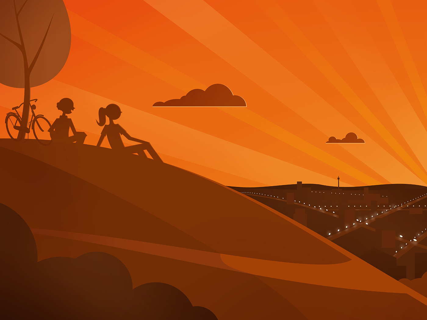
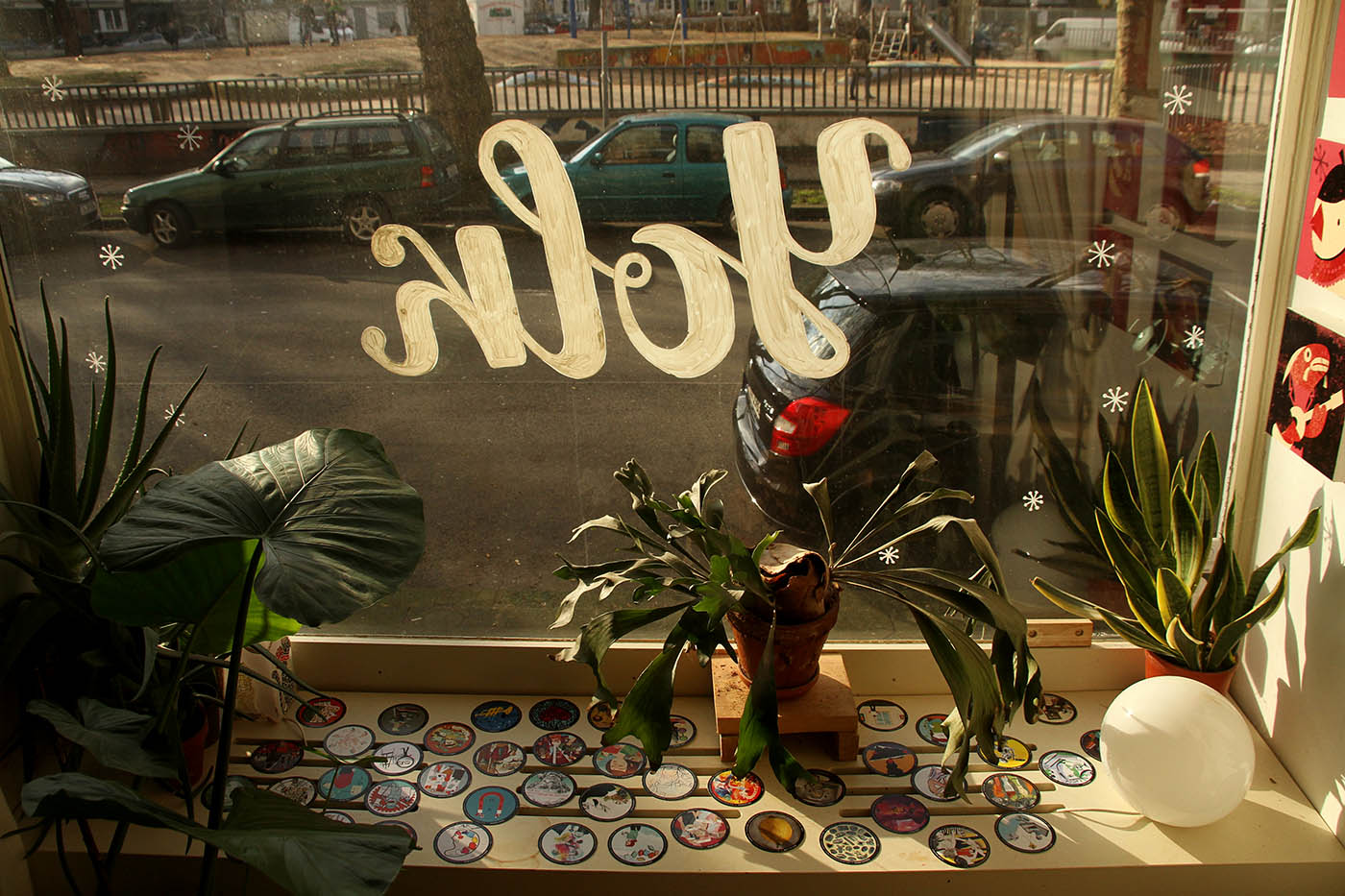
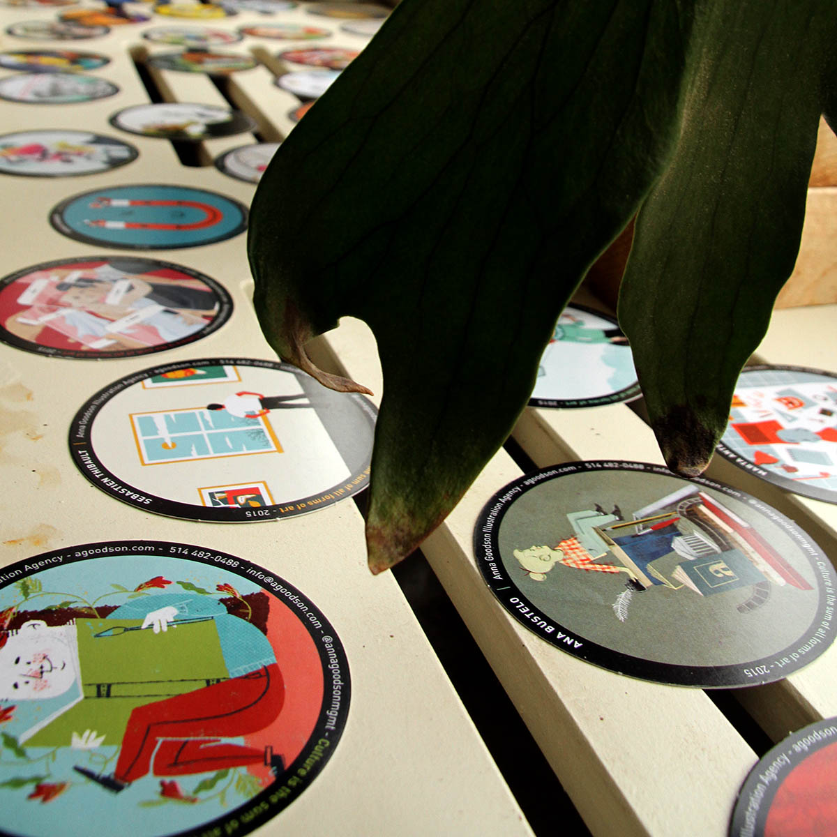
Anna Goodsons annual coaster sendout.
Anna Goodsons new Coaster arrived, and they are gorgeous. So I used his Workshop window for a small “Coaster Exhibition”.
Big thanks to the whole Group.

JOJO ENSSLIN
jojo@jojoensslin.de
www.jojoensslin.de
PHONE +49 211 468 480 09
Represented in North America und the UK by
![]()
Anna Goodson Illustration Agency
Please contact my agent,
Sylvie Hamel for commission inquiries
Represented in Mainland of Europe by
![]()
info@kombinatrotweiss.de
www.kombinatrotweiss.de
PHONE +49 69 75 66 55 0
Jojo Ensslin works as an illustrator, animator, filmmaker and artist.
He lives in Düsseldorf, Germany.
For 5 years Jojo held a lectureship for animation, film and sound at the University of Applied Science / Peter Behrens School of Arts in Düsseldorf, Germany.
![]()
![]()
![]()
![]()
![]()