


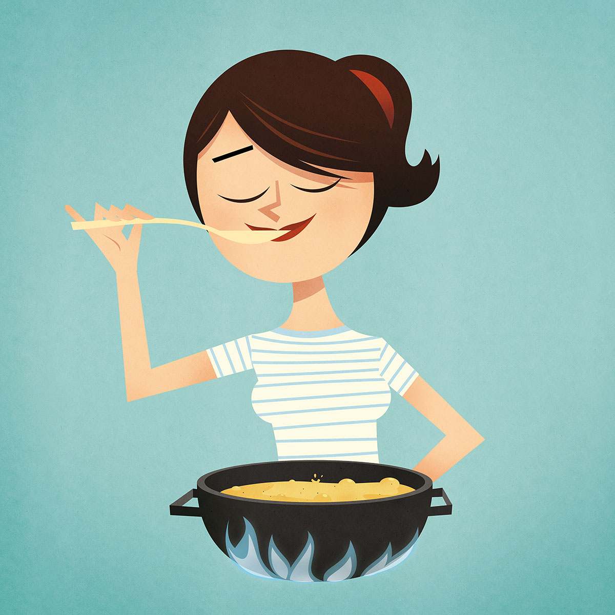


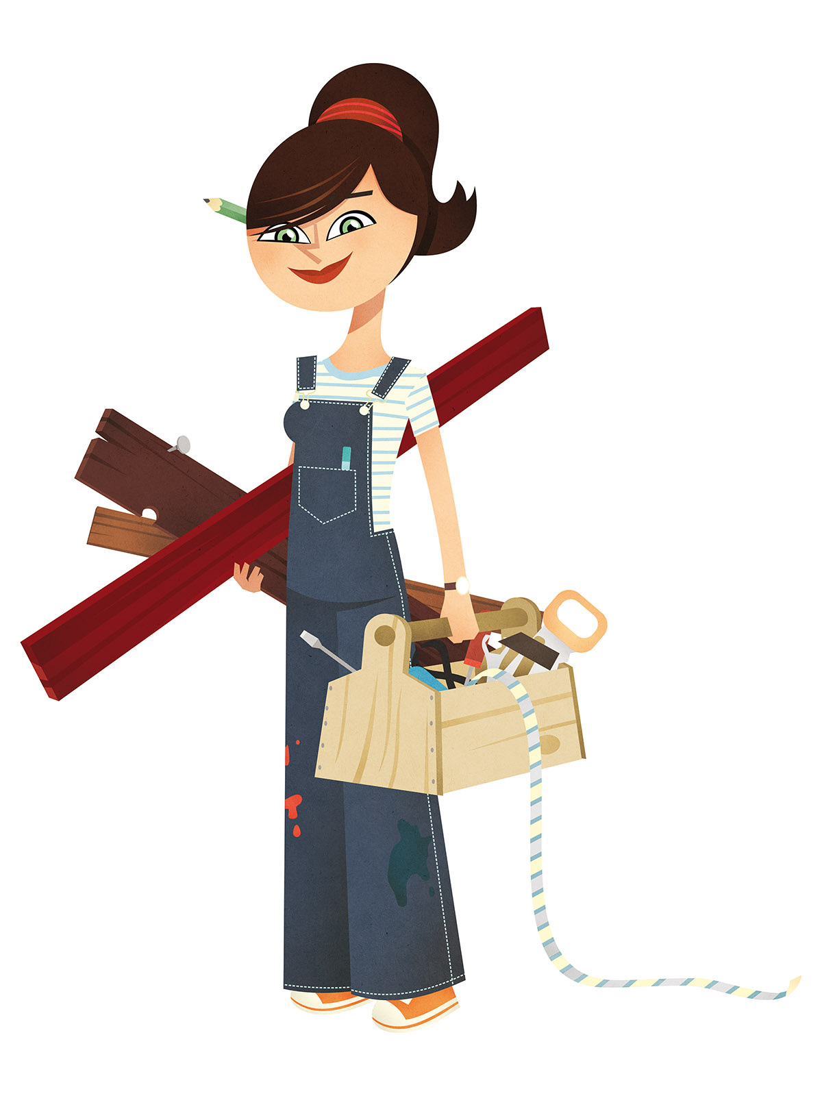

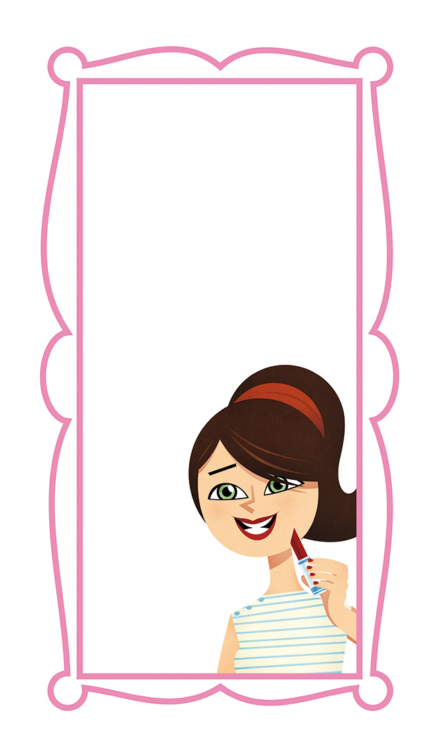
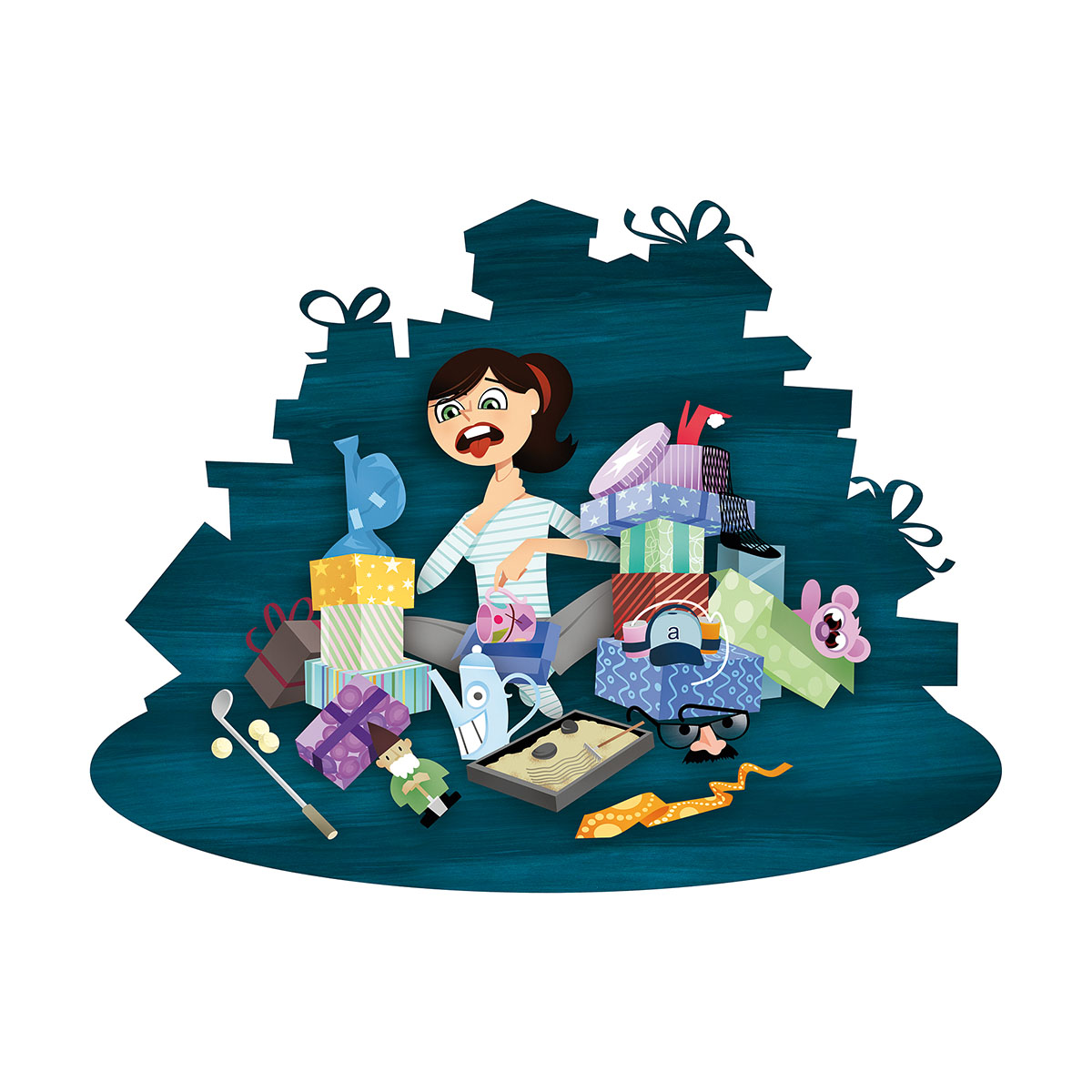
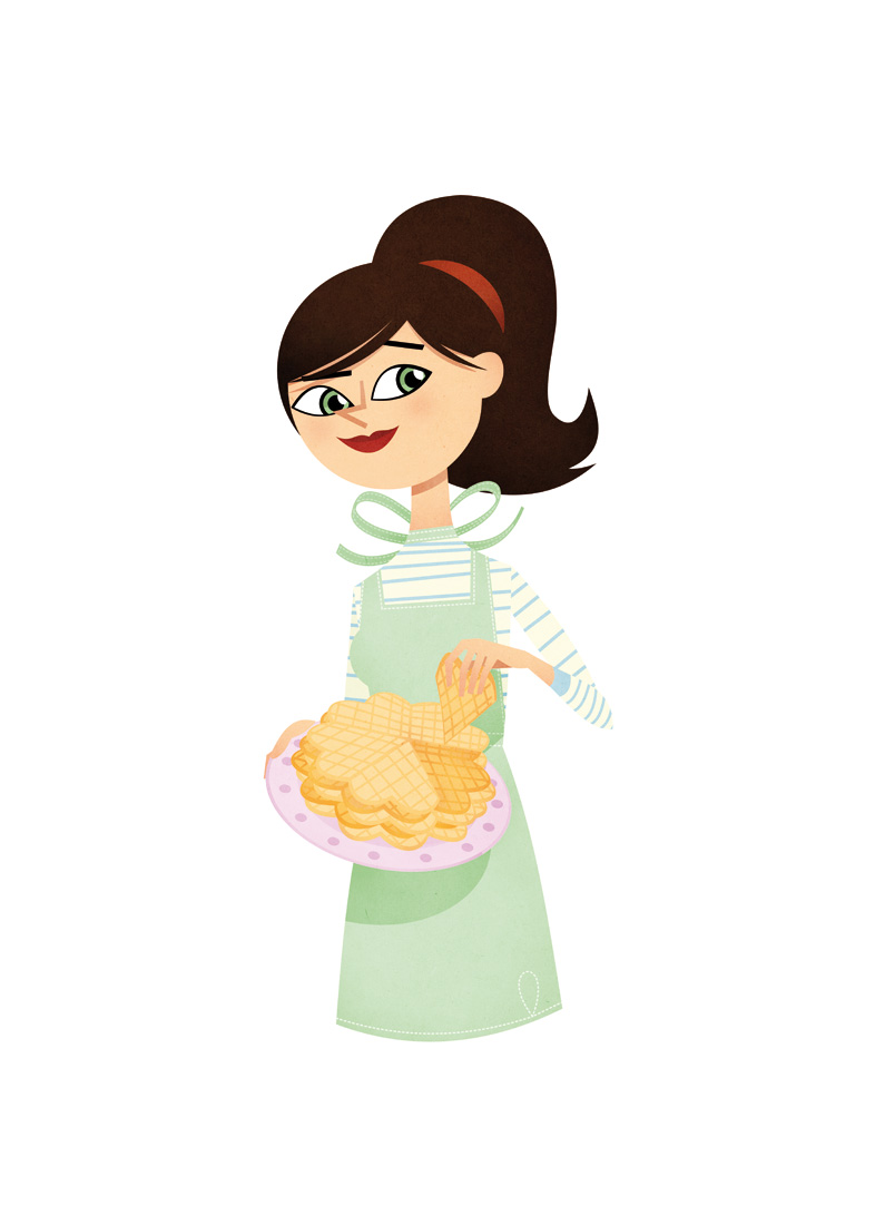
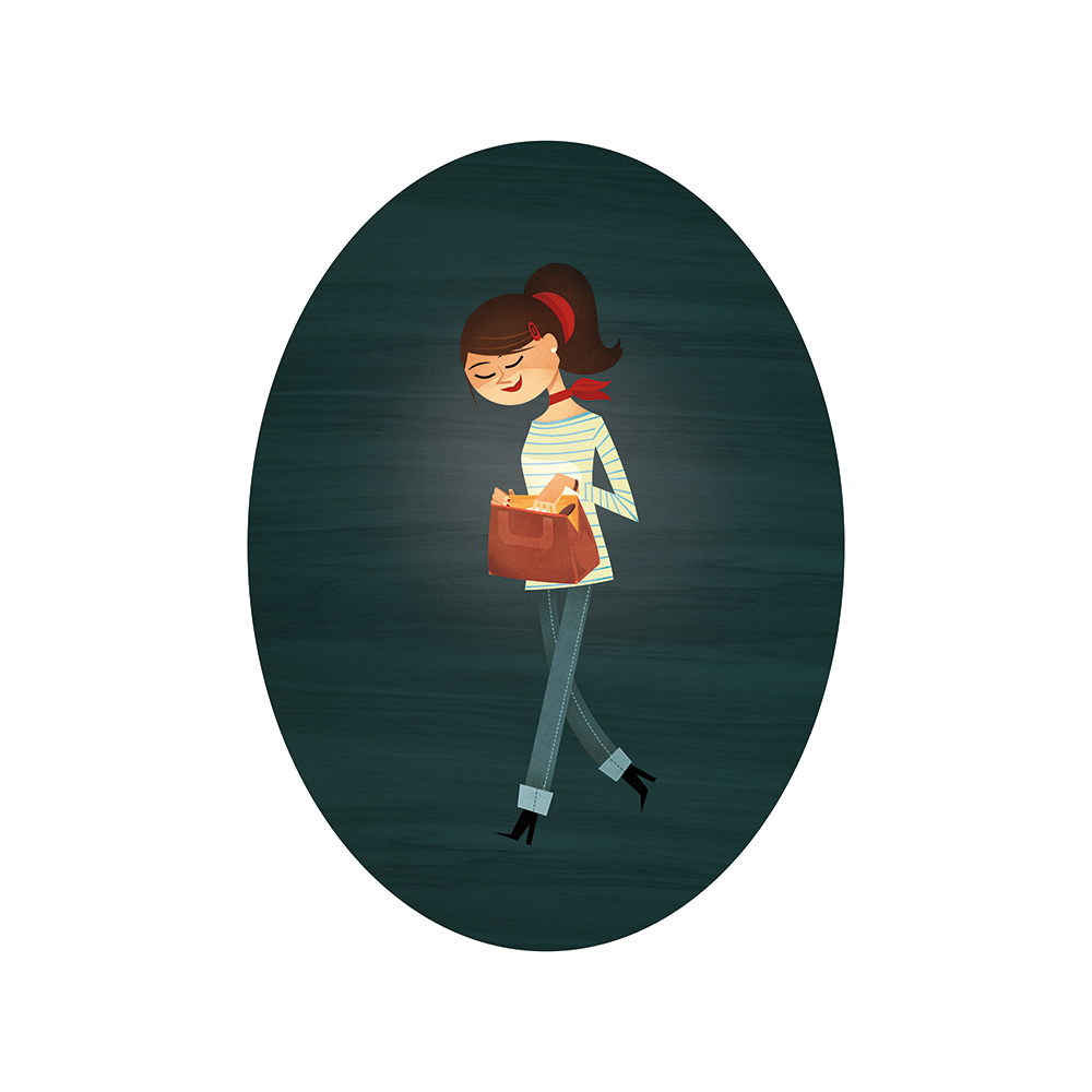
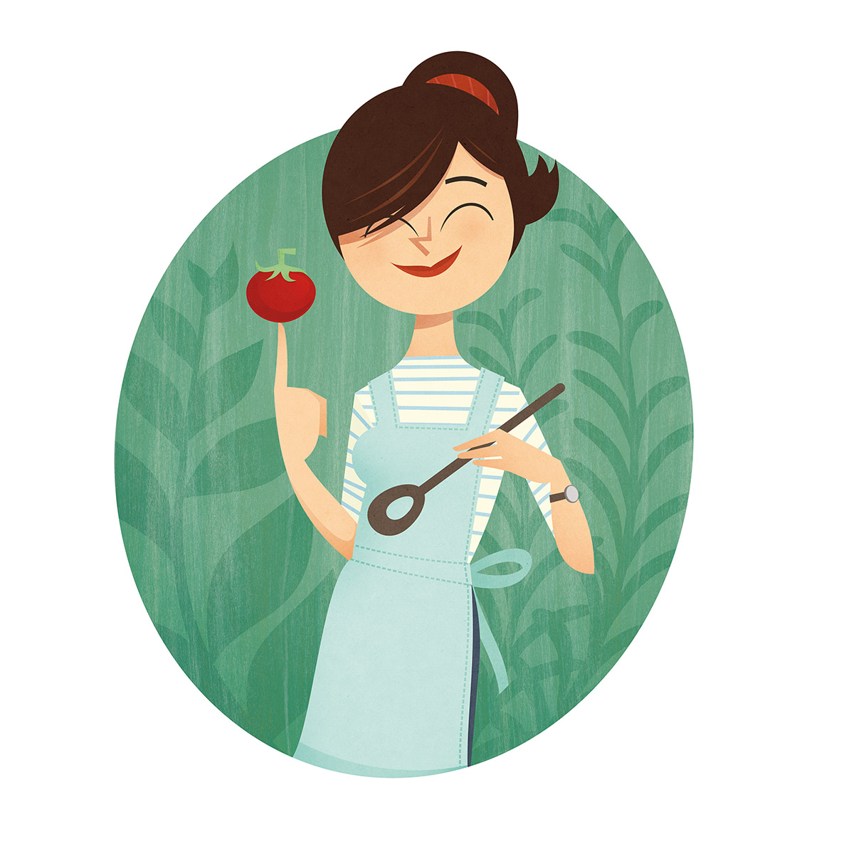
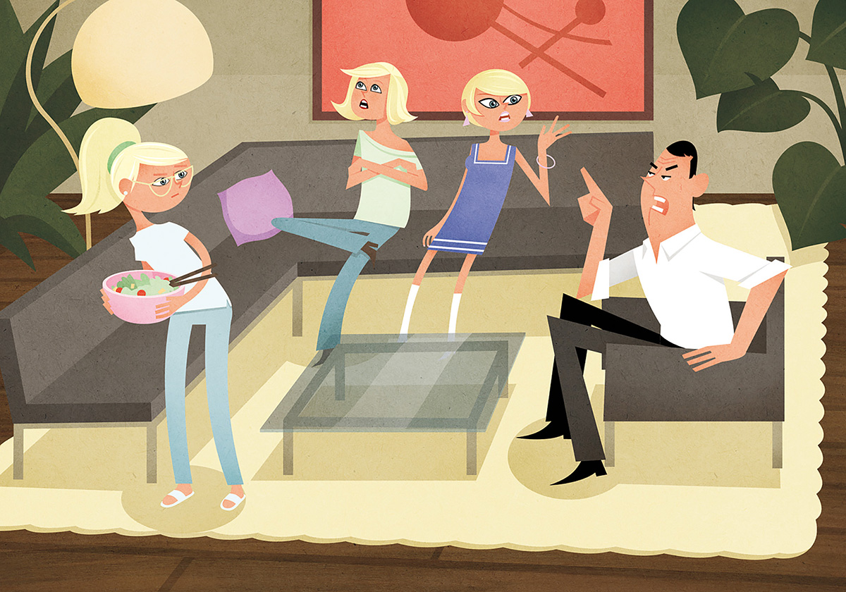
For La Viva, a lifestyle Magazine I created Iva, the main character leading through the Mag.
So on a regular basis I provide new adaptations and illustrations around Iva’s worldof cooking, beauty products, the right fit for a jeans etc.
Here are some from the past few months.
Iva


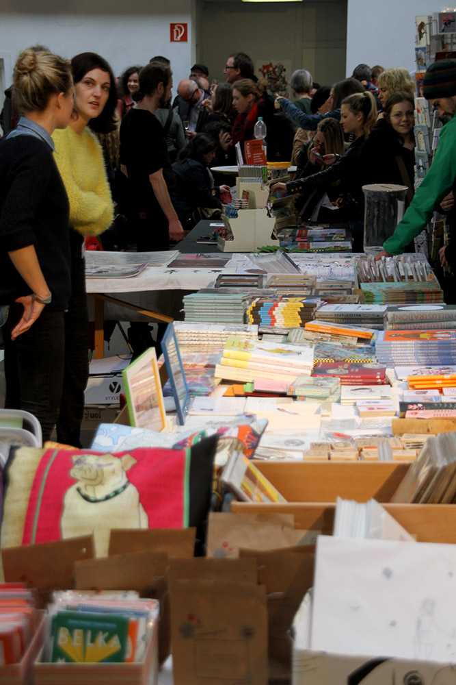


Illu 14 Cologne
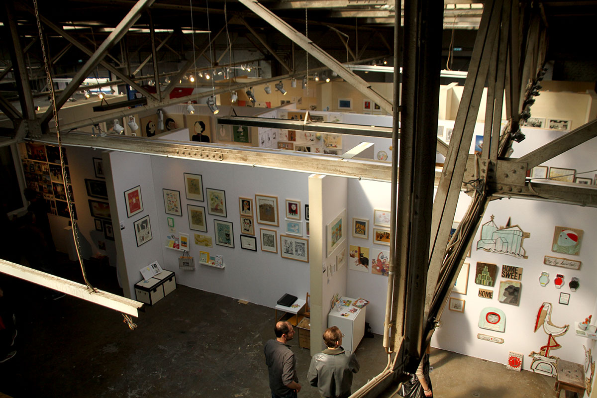
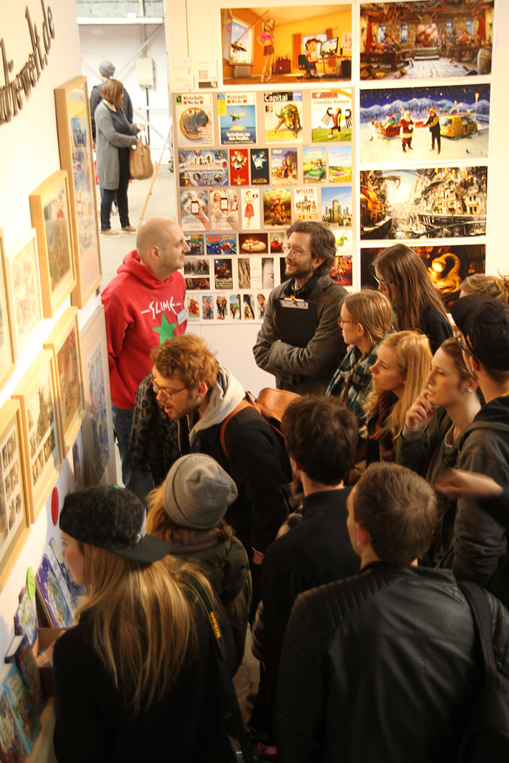
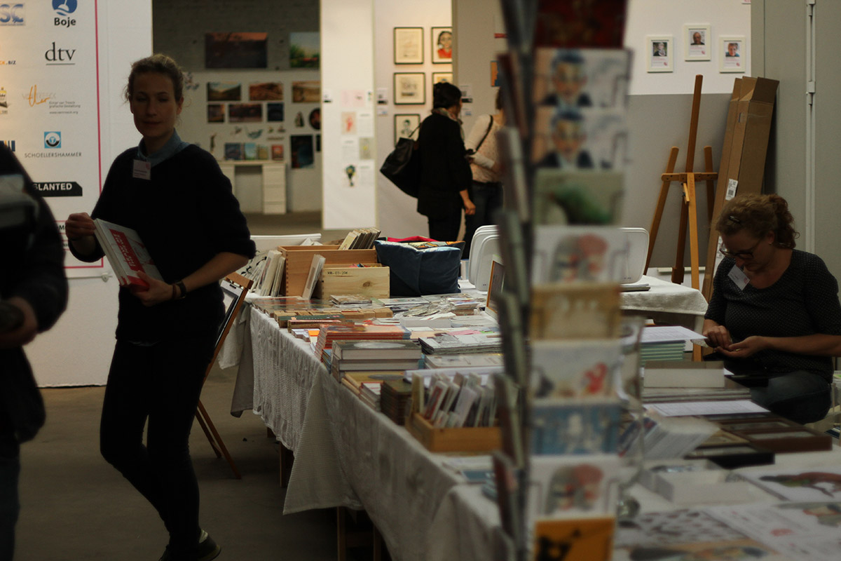
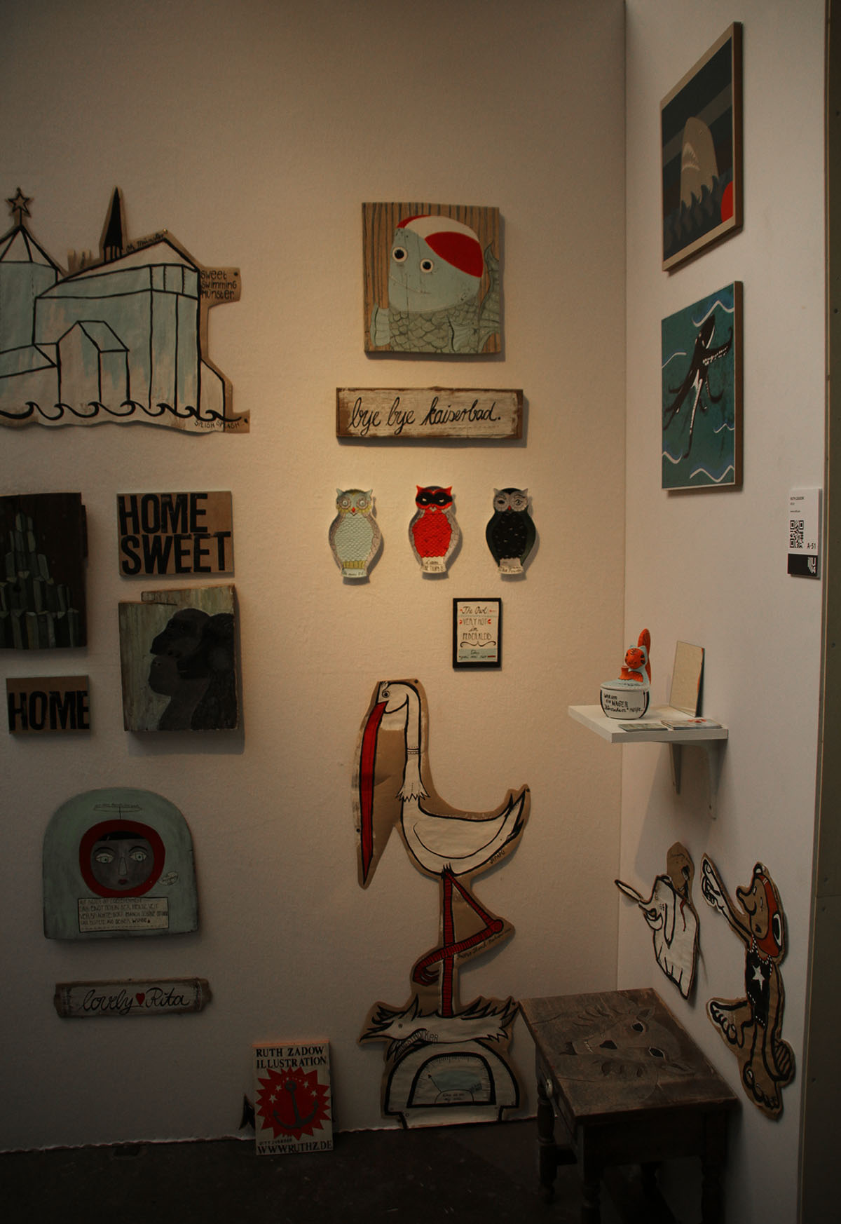
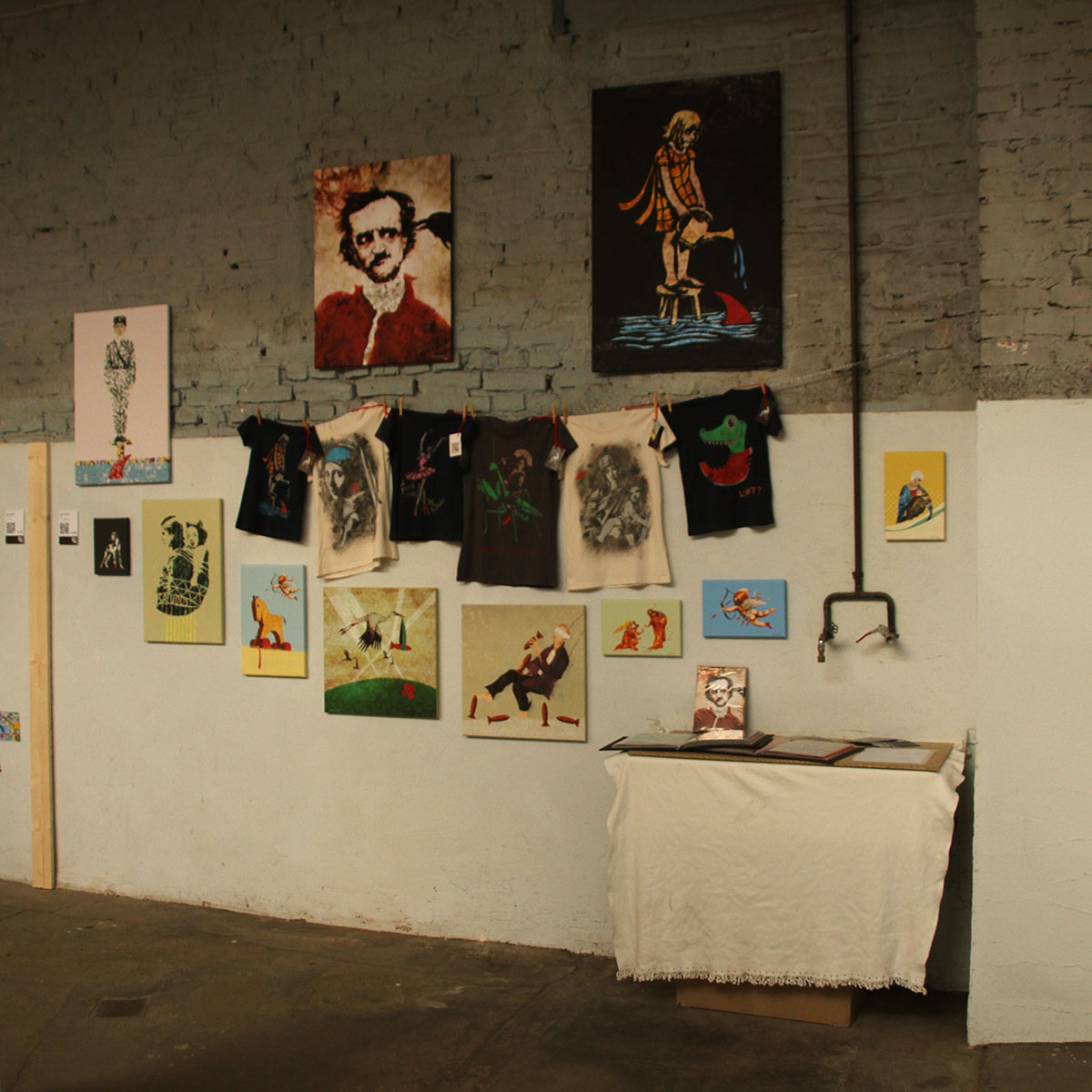
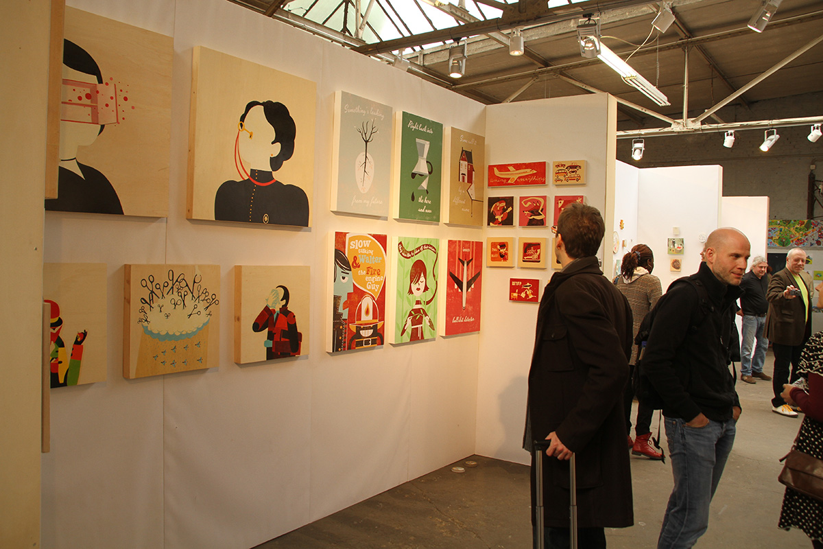
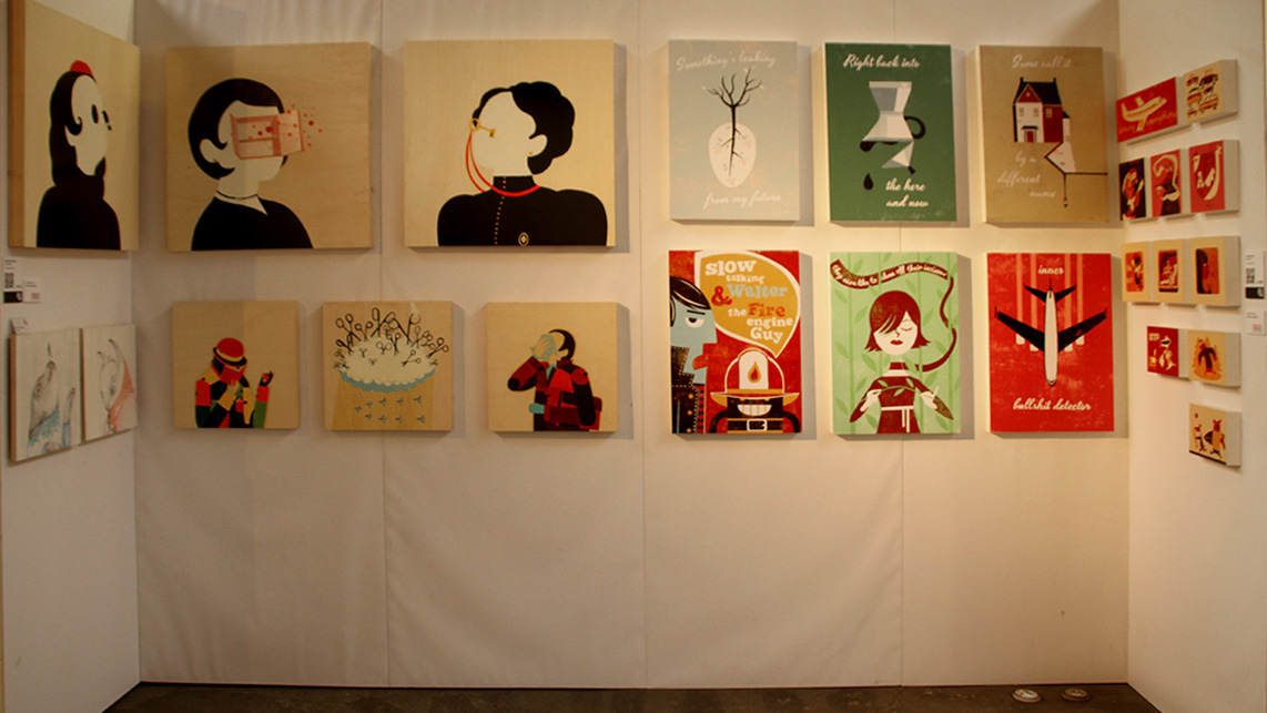
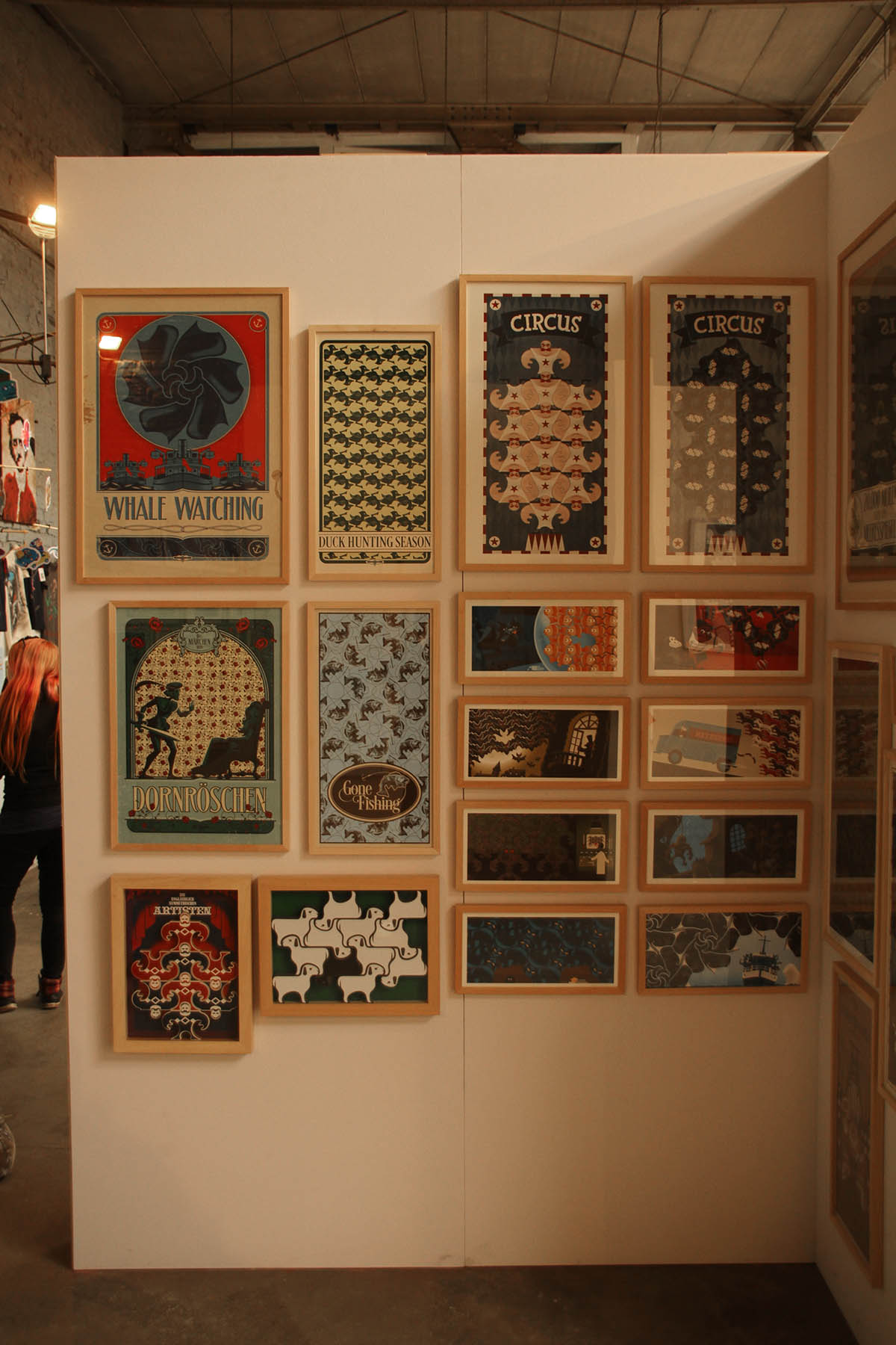
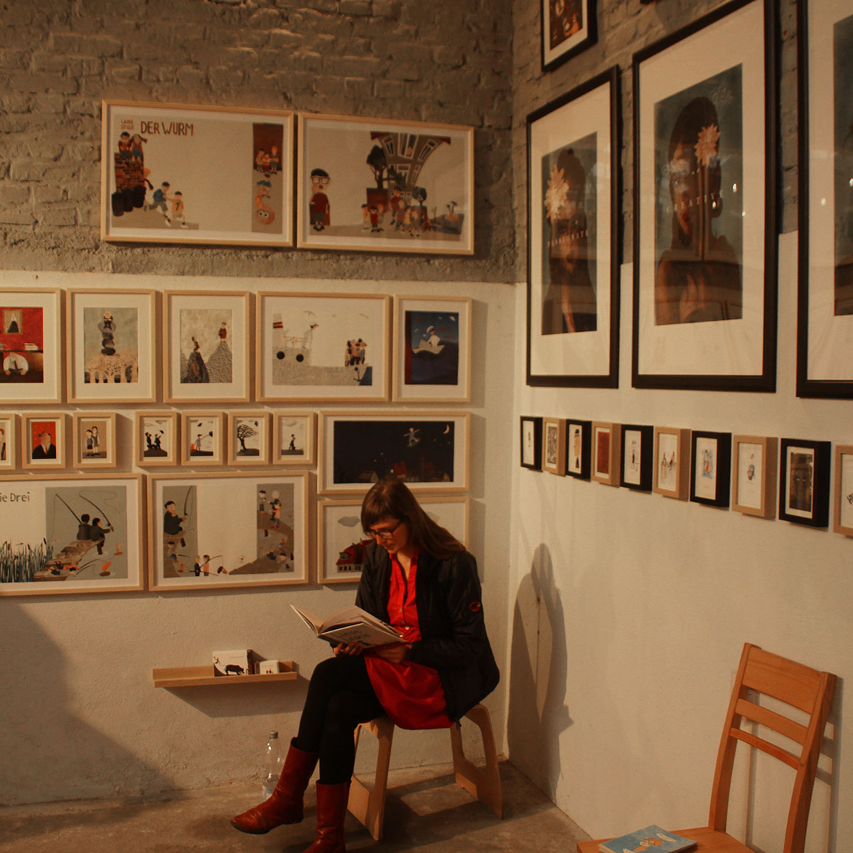
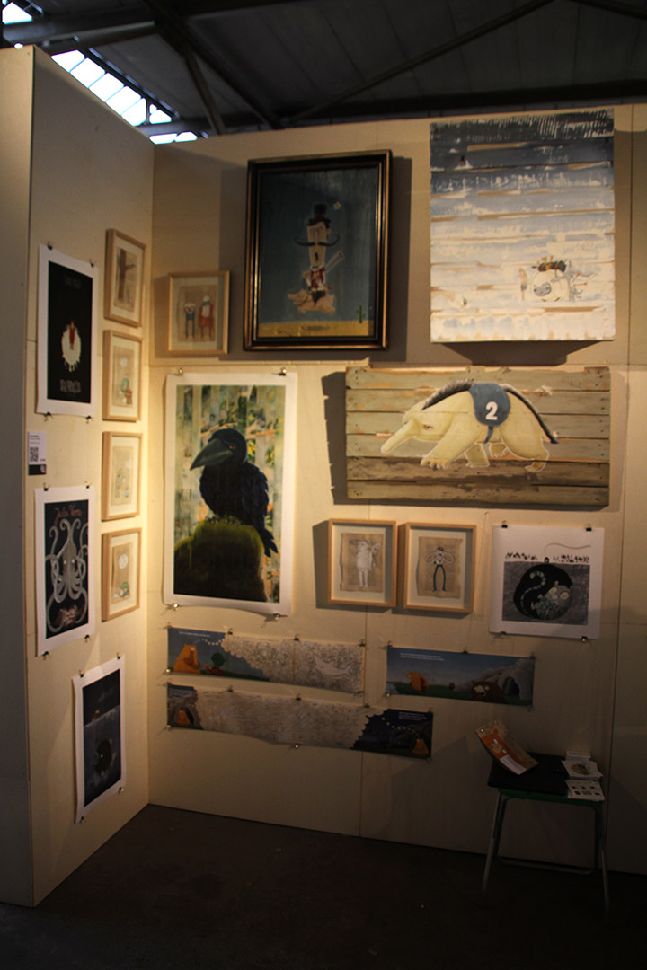
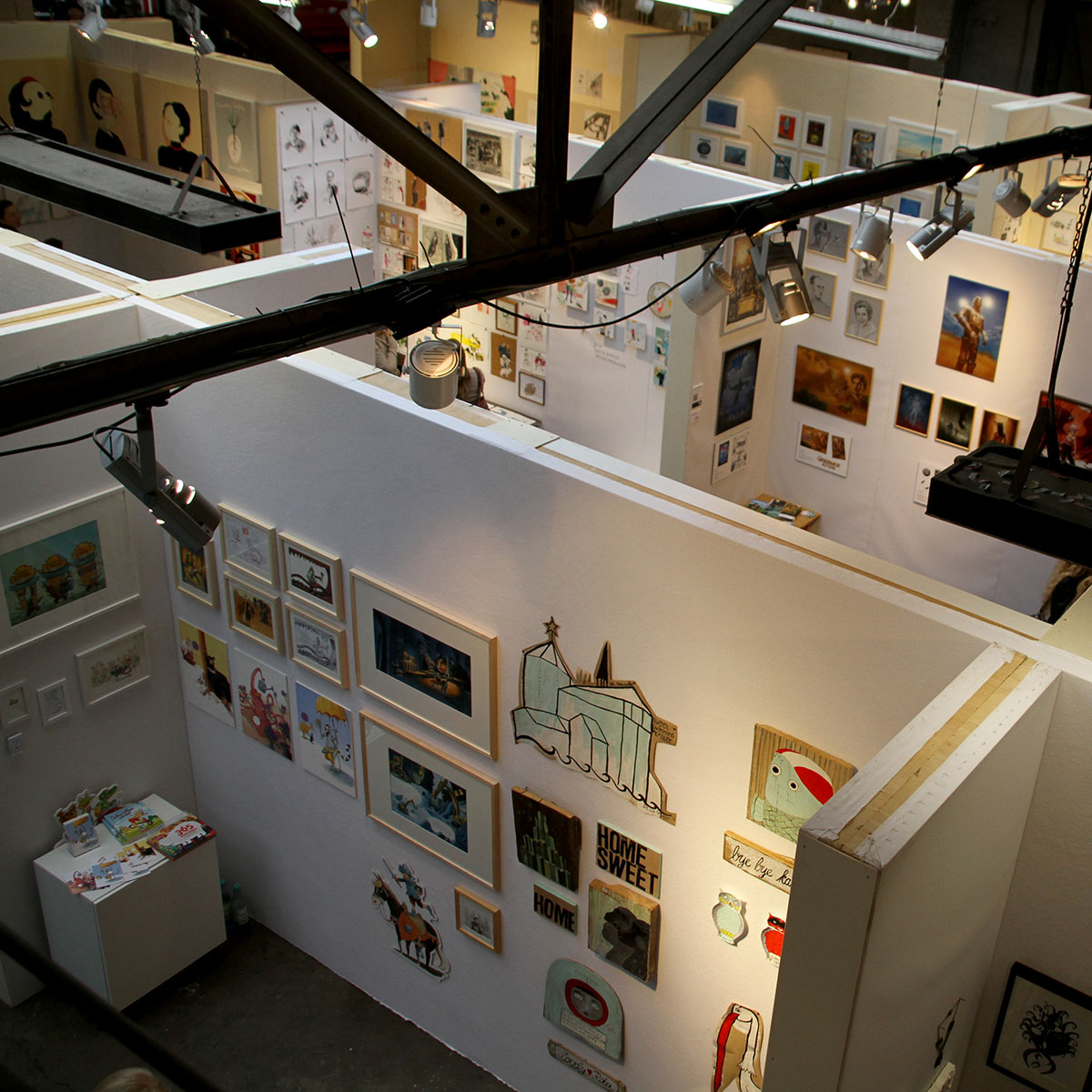
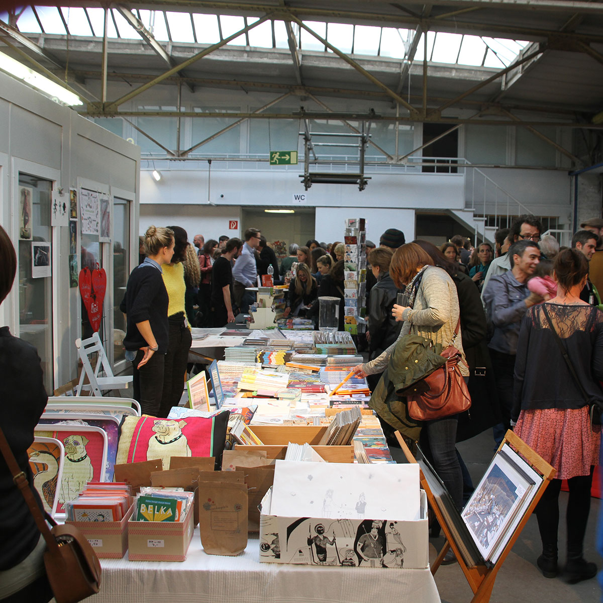
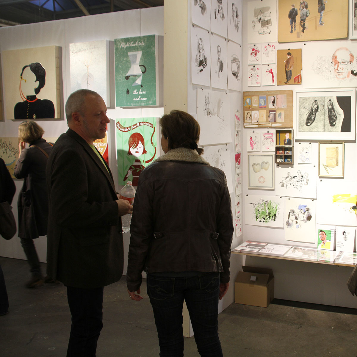
For the second time the Illustratoren-Festival invited for the big group show.
I aplied and – woohoo! – was selected by the Jury to participate. My wife Dasha also got selected, so we decided to share one wall.
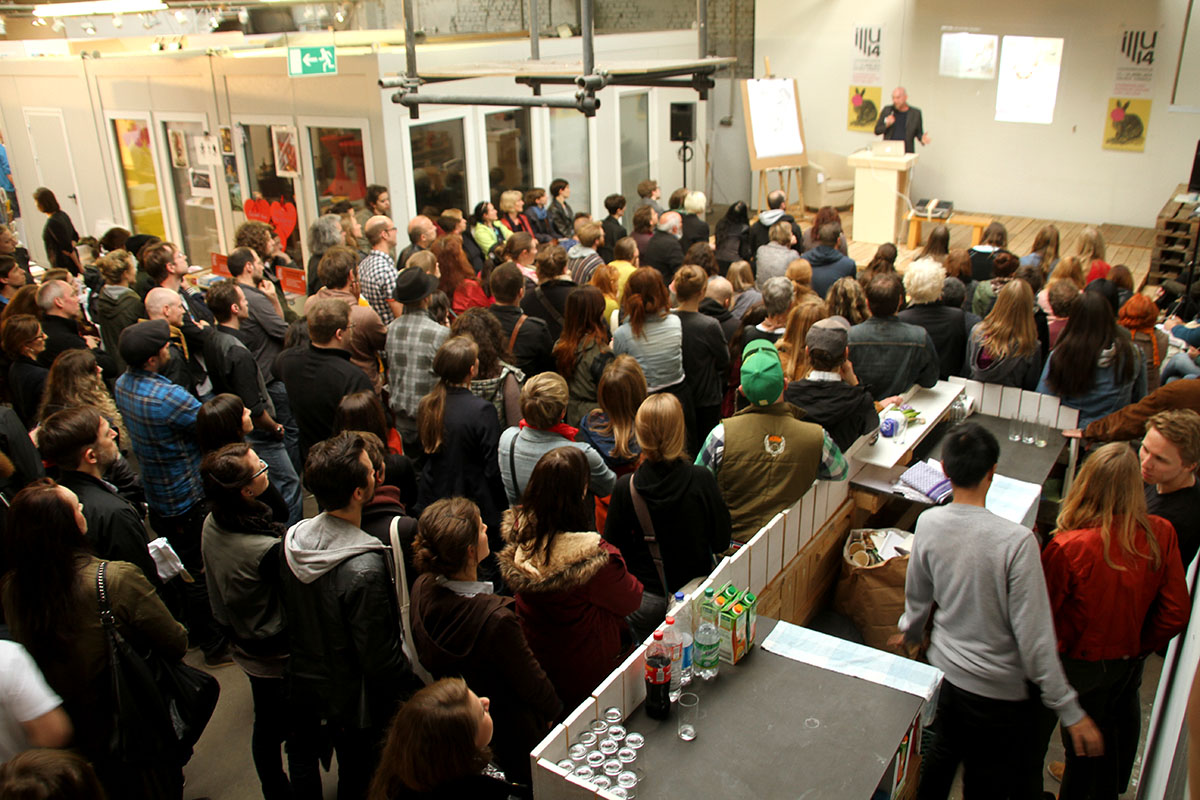
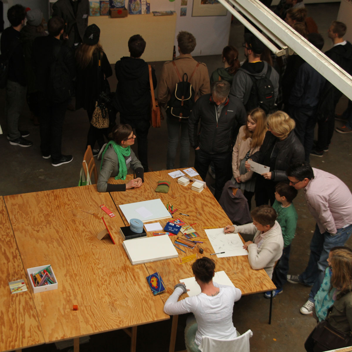
Always nice to meet your fellow illustrators. Around 50 Artists participated and the quality of the exhibition was pretty good. And it attracted a huge crowd of visitors, estimated around 2000 in three days. I brought Mike of “oneofthem” into play and he put up his mobile serigraphy booth, which was a big success and loved by the visitors. There had been a couple of lectures and workshops like Bürgies “Zeichenfee” or my Woodprint workshop. Funny and challenging to get about 15 people to produce a woodprint in about two hours. Luckily woodprint – specialist Thomas Peters of “kunstraumdreizwanzig” came by and jumped in helping participants with all their questions.

k.jgkhvkjvbkbkjbljn
Yummy!
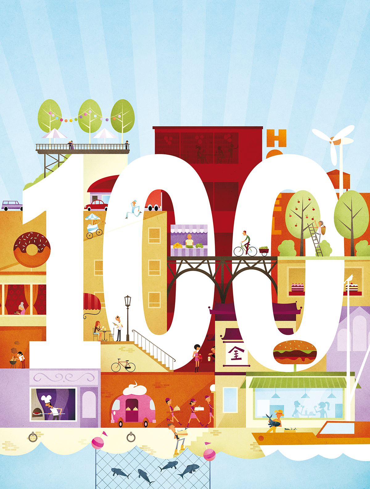
Canadas Food Magazine 100th Issue.
And I did the cover-ilustration – Youpi!

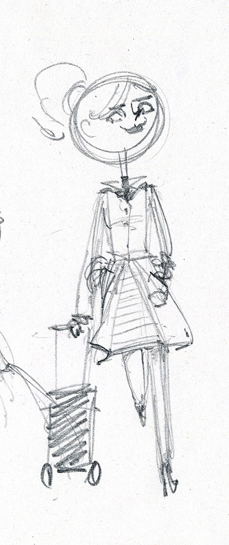
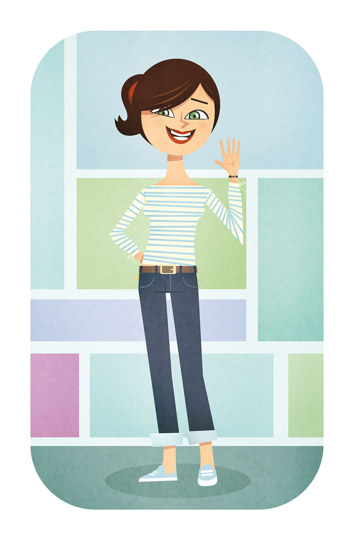

Iva for La Viva
The Editors of G&J asked me to create a character for their Magazine “La Viva”.
After a short pitch and some stages of finetuning I’m happy to present to you: Iva La Viva!
Client: La Viva Magazine
Agency: Gruner & Jahr

Single Parents
Jojo Ensslin provided two illustrations for an article about single parents and blended families for “Thriving Family Magazine”.
Client: Thriving Family Magazine
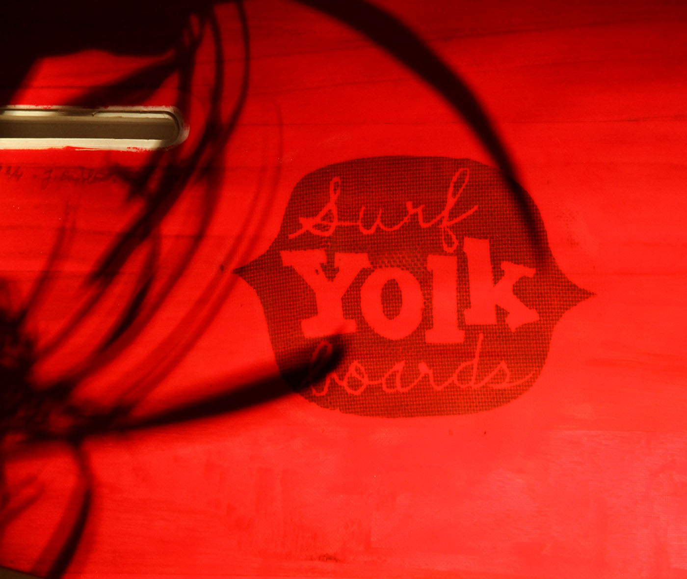
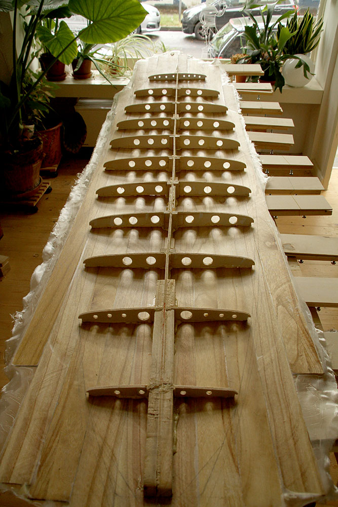

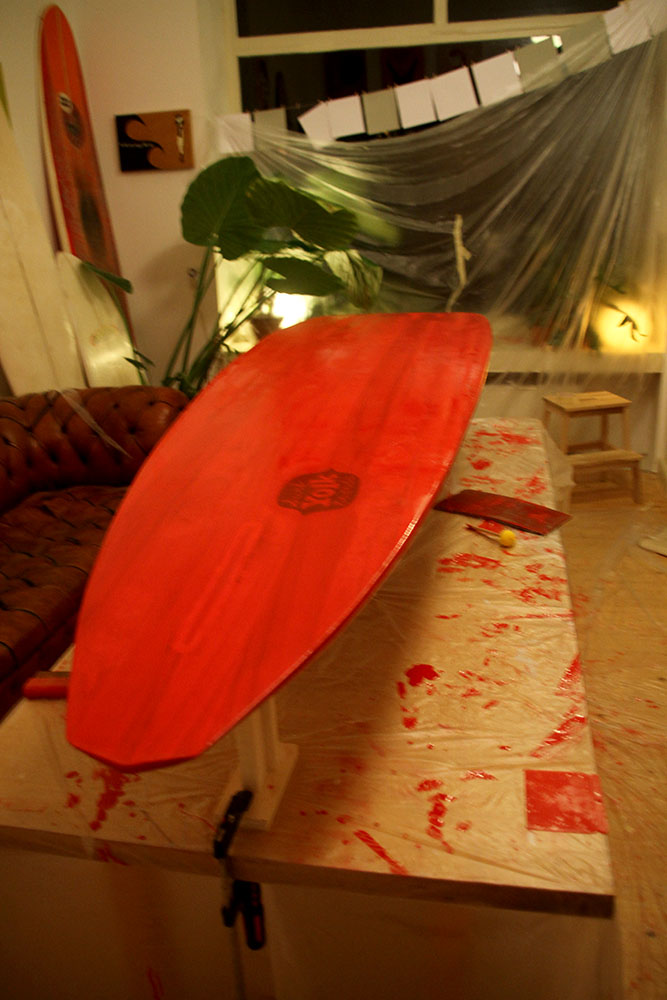
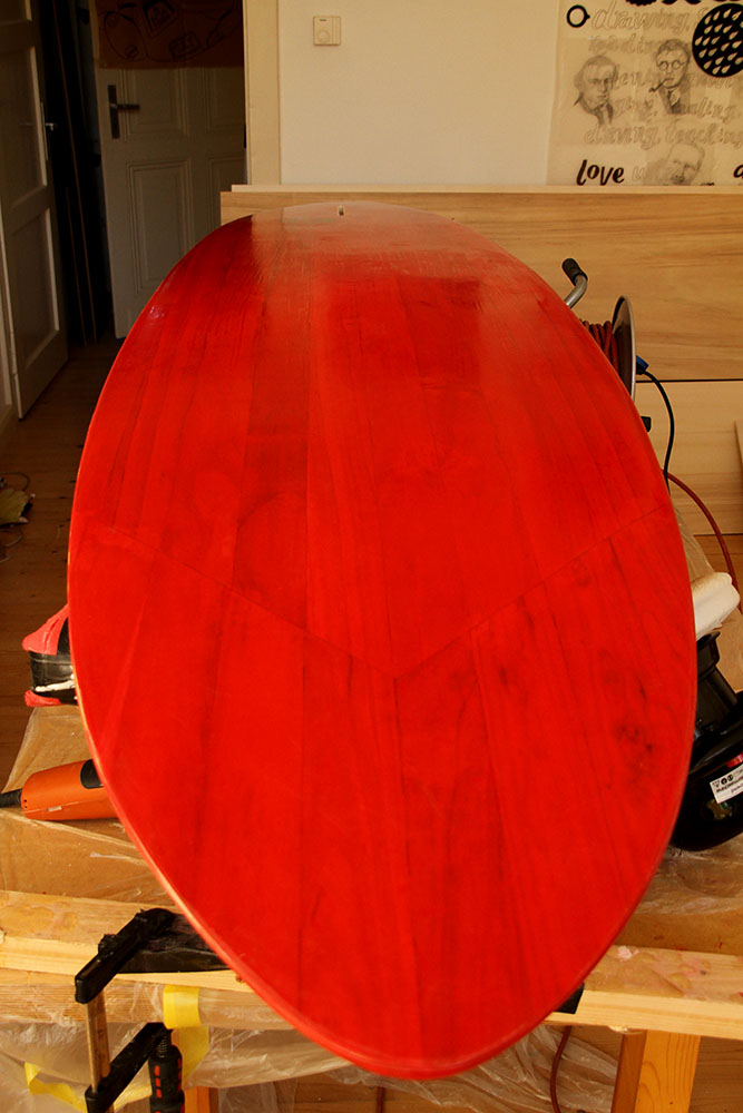
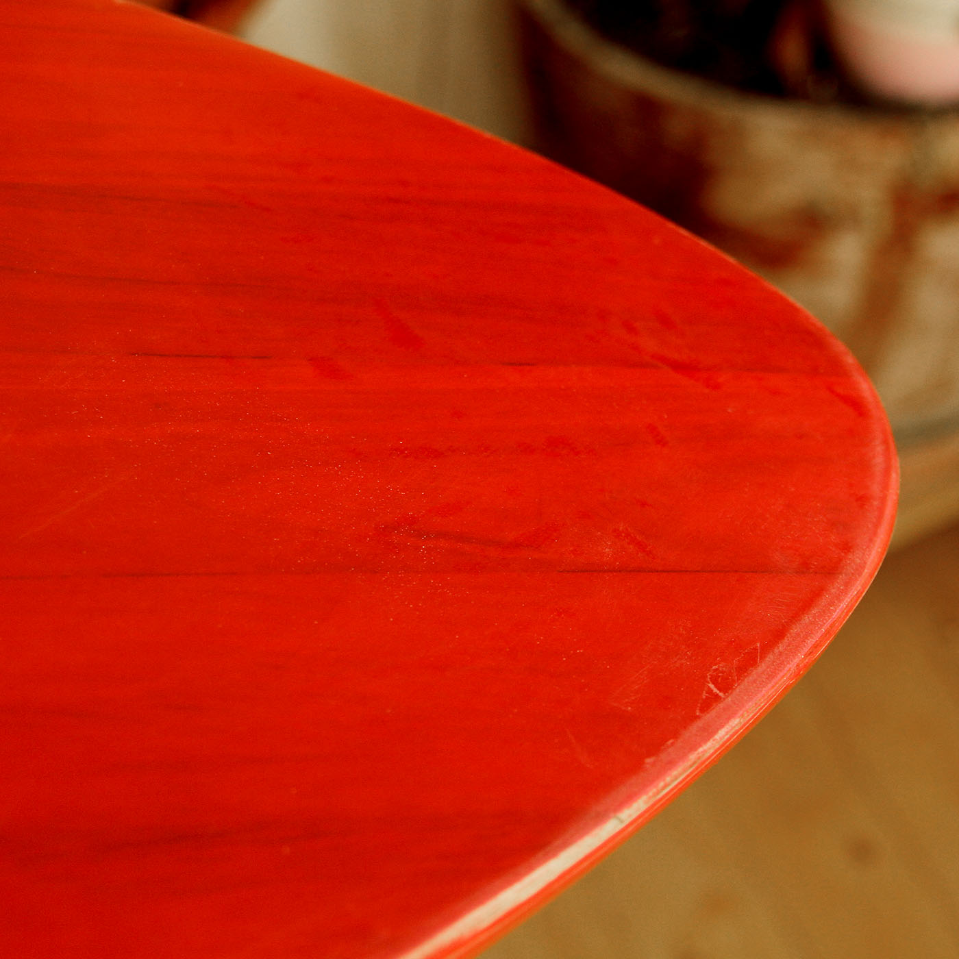
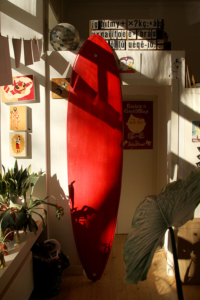

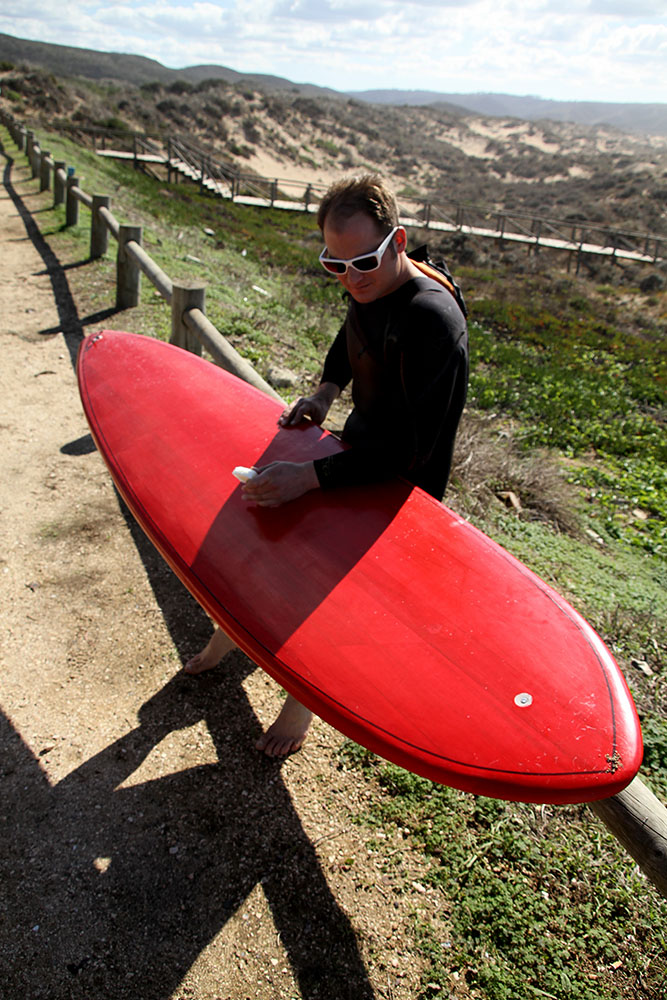
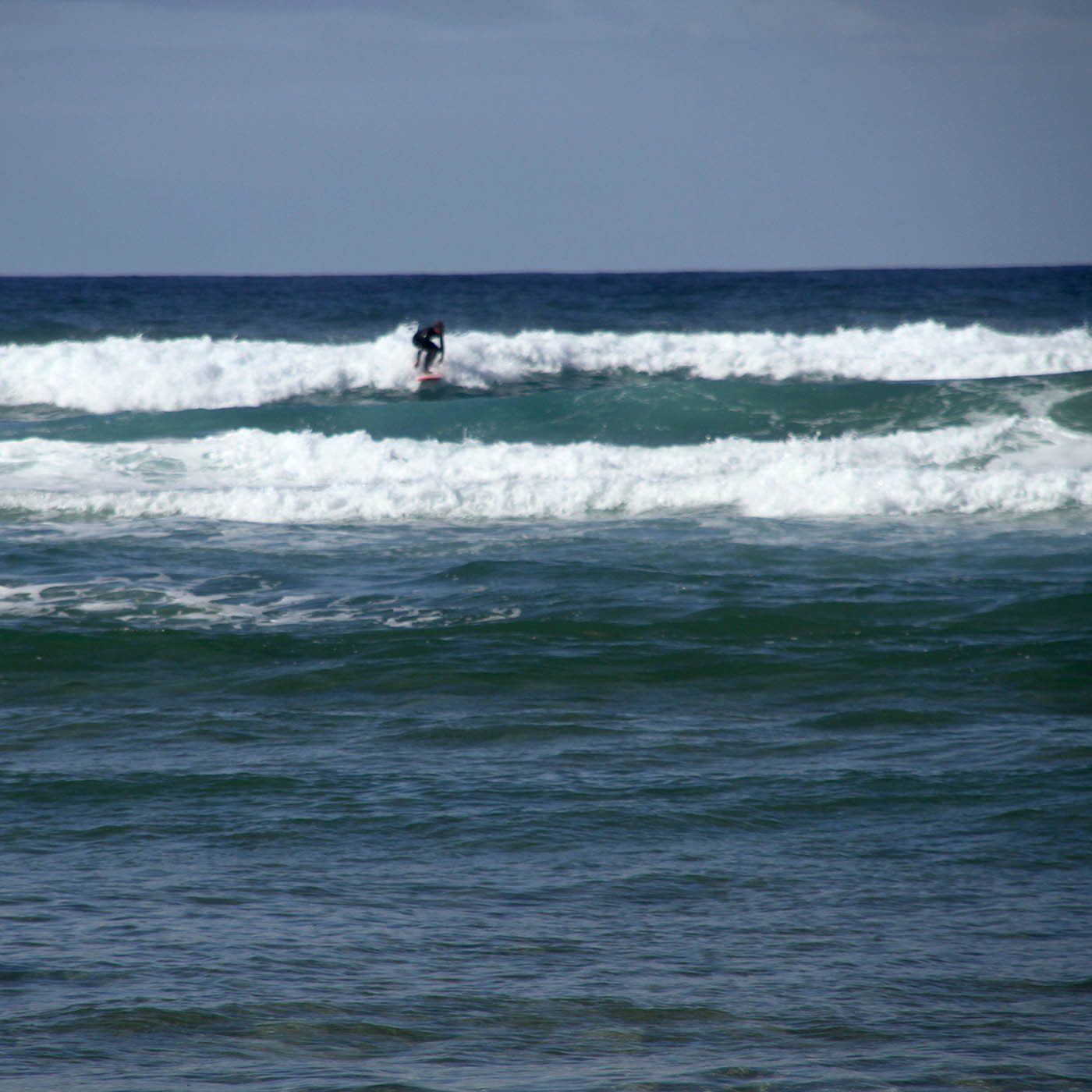
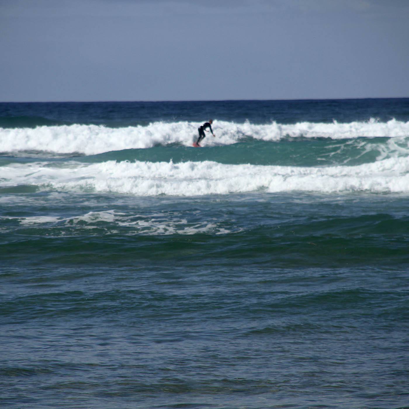
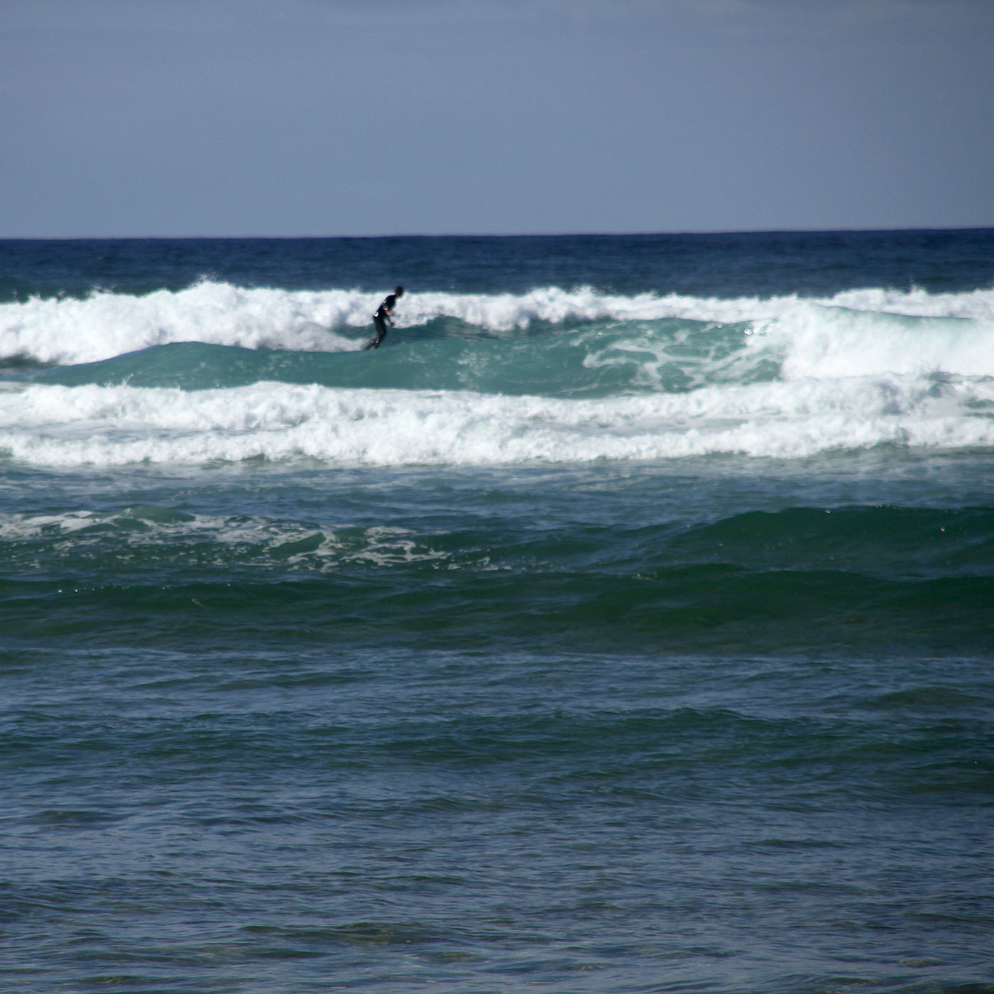
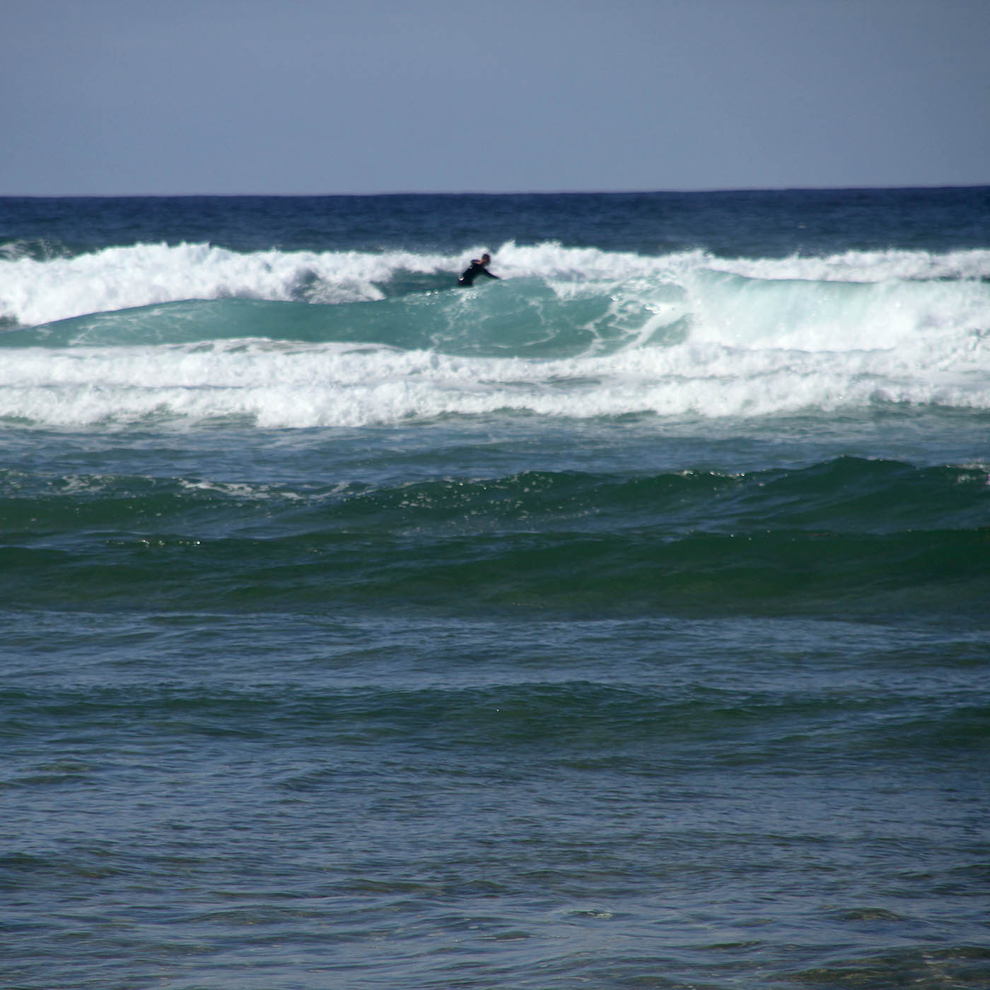

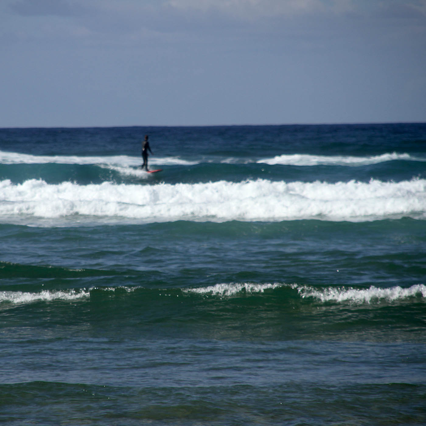
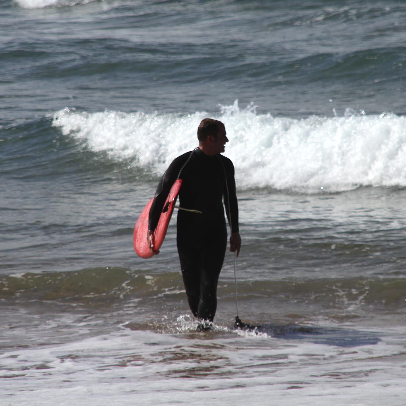

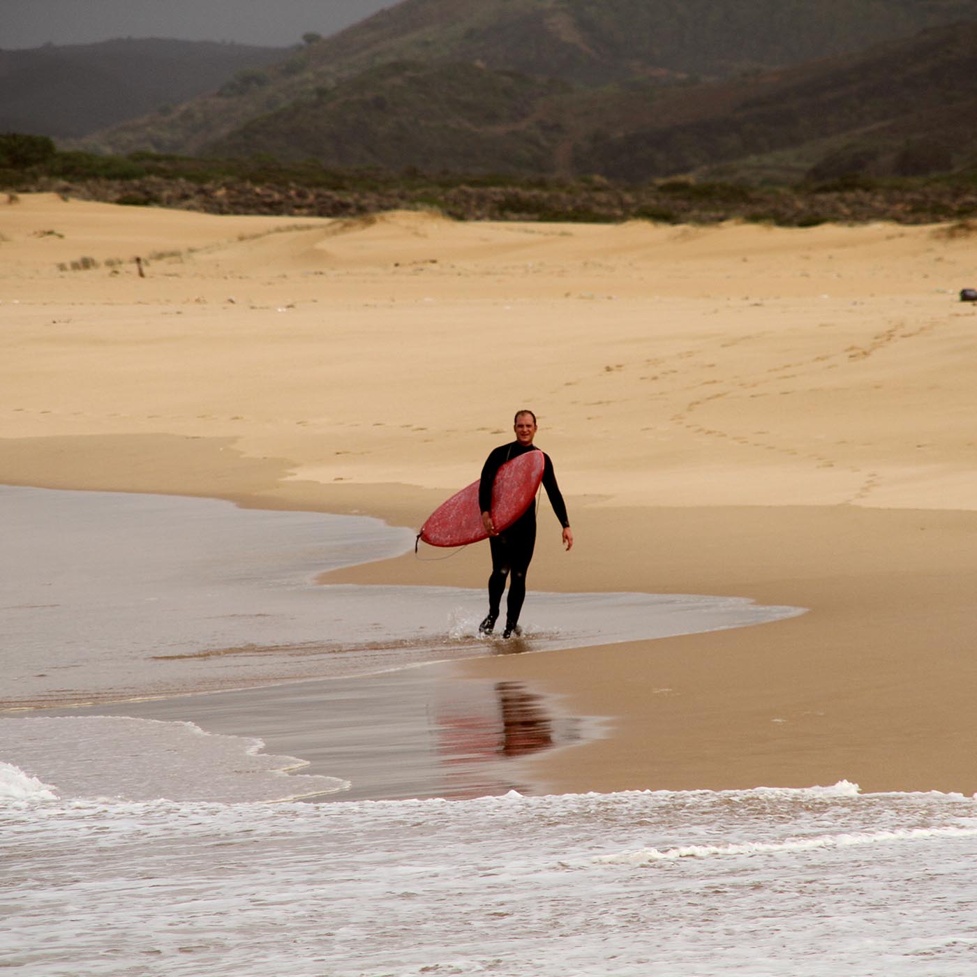
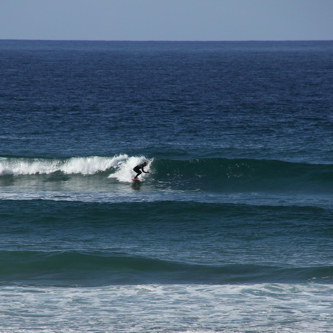
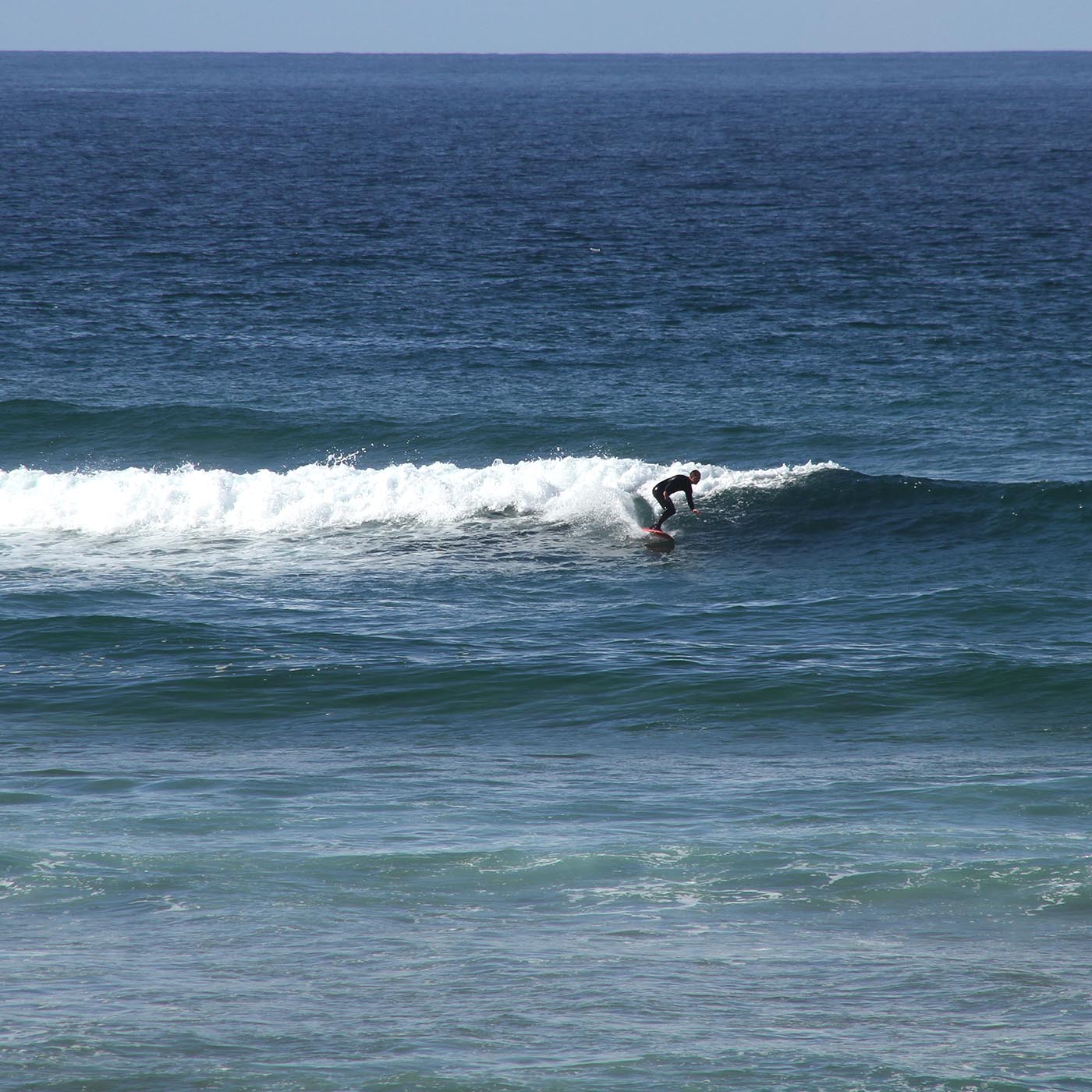
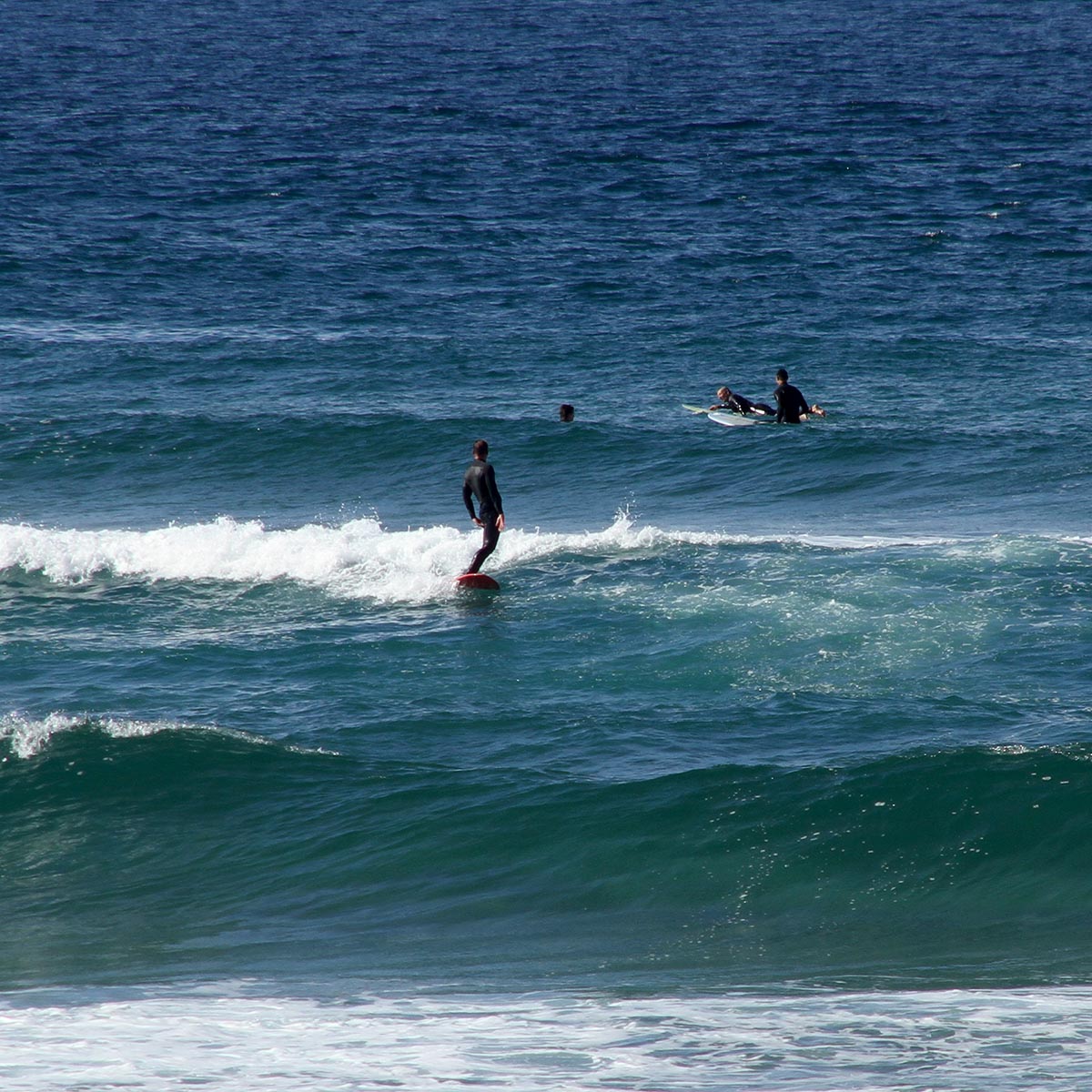
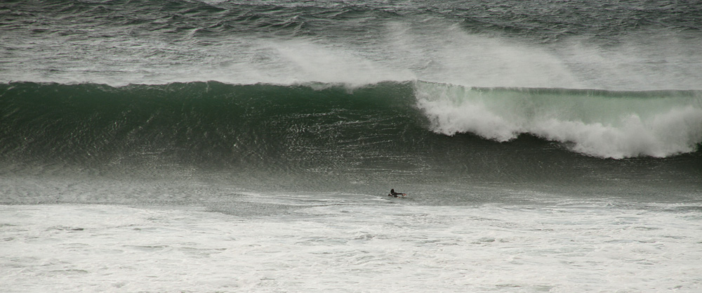
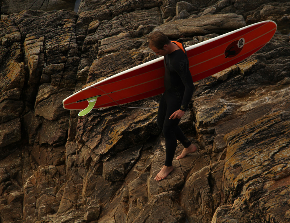
8.2 ft, single fin, red
I needed a new Board.
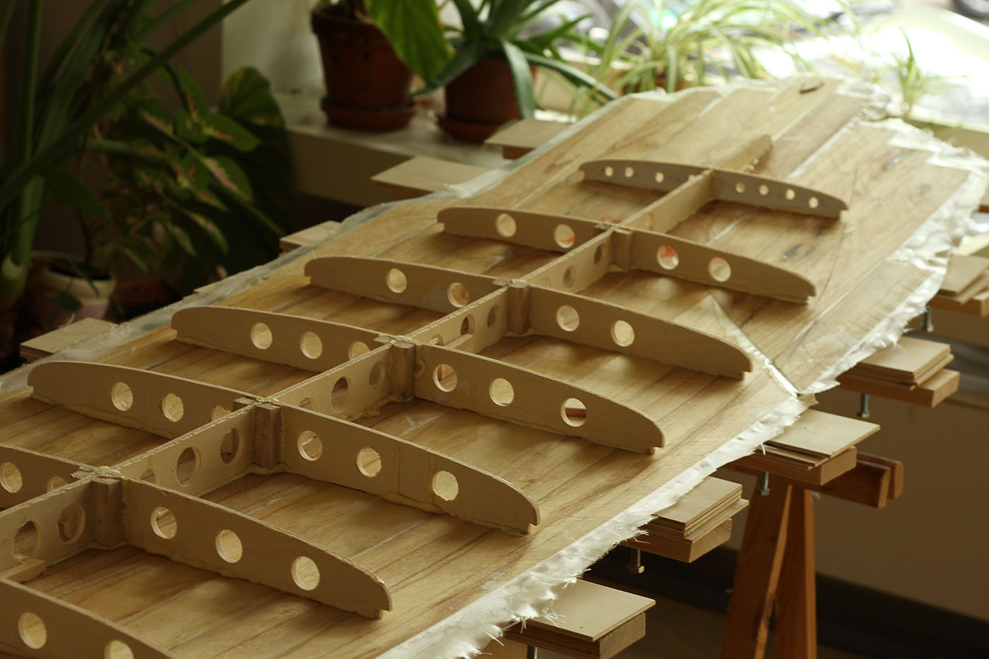
My “Wack Board”, shaped by Hubert of crank surfboards still does his job, but due to its rocker it needs waves with a bit of punch or size. And when it’s a bit windier, due to it’s size it’s really hard to carry over sharp rocks or wiggly and slippery pebbles. So I wanted my new board to be a bit smaller, lighter, a bit less rocker but also with enough volume to compensate for the arms and the tummy. And I wanted it to be red.
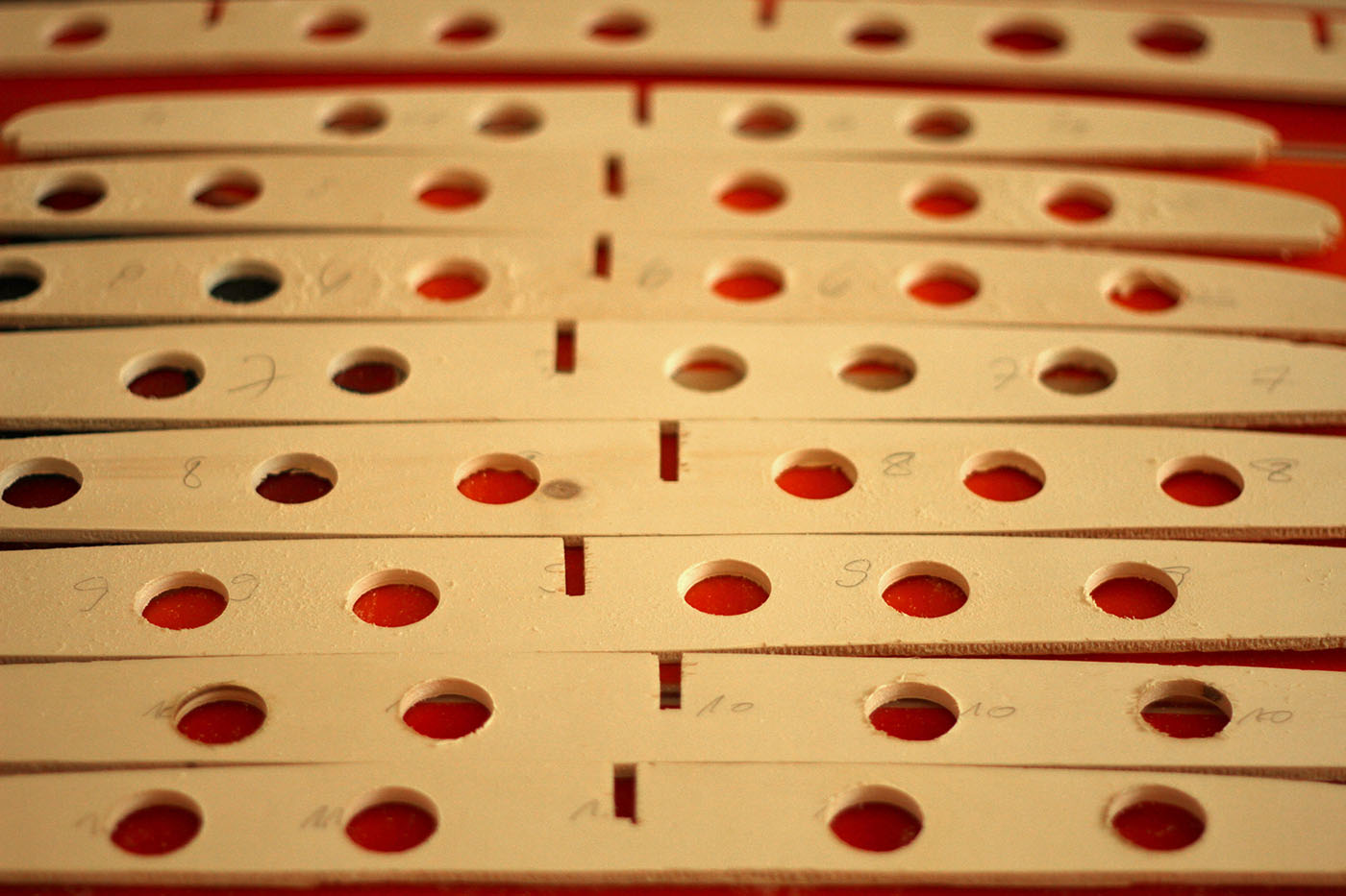
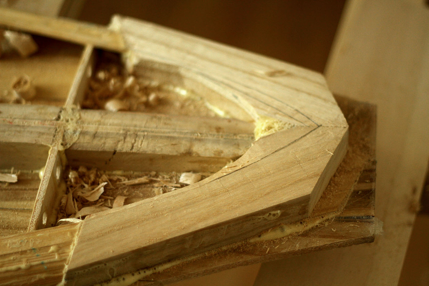
I found a suitable plan online, altered the rocker and the shape a bit, printed out the ribs and spine on A4 sheets and glued them back together. Of course I could have ordered a large print, but this method worked fine before and I didn’t want to wait any longer before I could start. I still had enough paulownia planks and thin cedar strips for the rails, just needed some plywood for the ribs and stringer.
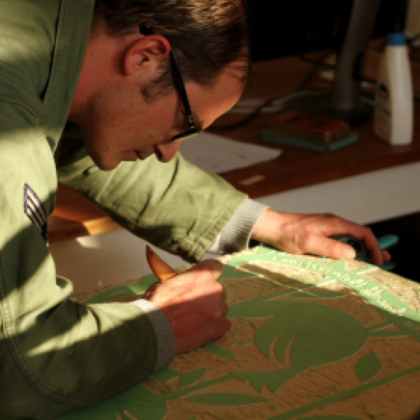
We planned on going to Portugal in December, as our last twosome trip, so I needed to get the board finished quickly. Mostly it worked out well, but it became clear that I would need a rockertable for future boards. Glassing was still difficult for me, but with more and more practice I’m quite confident that the next board will come out better. The red pigment in the resin left just enough woodstructure visible to become a subtle mix of wood and plastic. To brand it with “Yolk Surfboards” label, my fictional surfcompany, I cut out a woodprint and printed on fibreglass cloth.
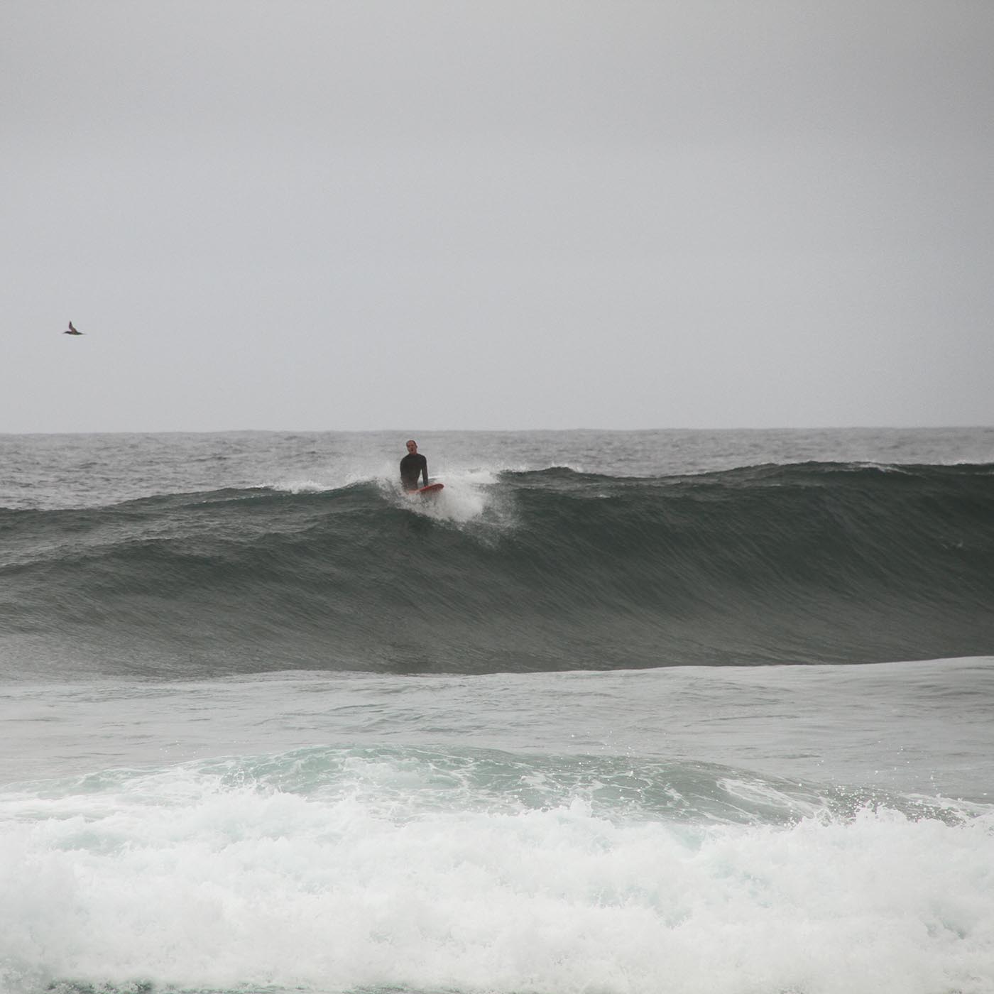
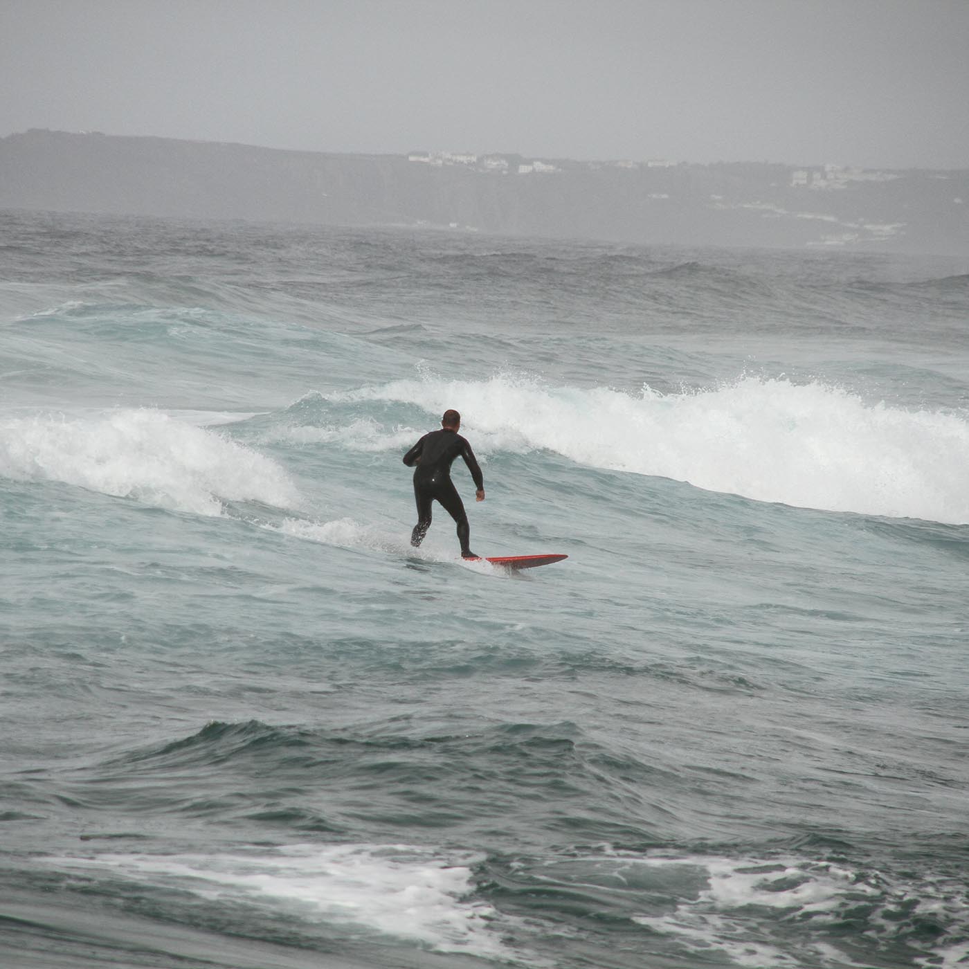
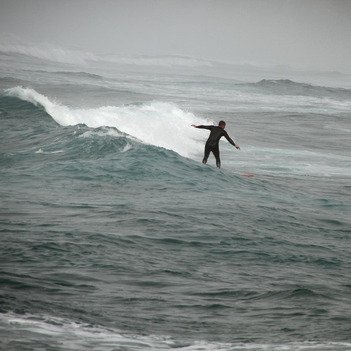
I tested it in Portugal, and I was happy right away. It is the lightes board in my quiver so far, paddels well and the moment I took off it becomes pretty fast and stays maneuverable. It works in weaker waves then my big board and also not unimportant: I’ve built it myself;)

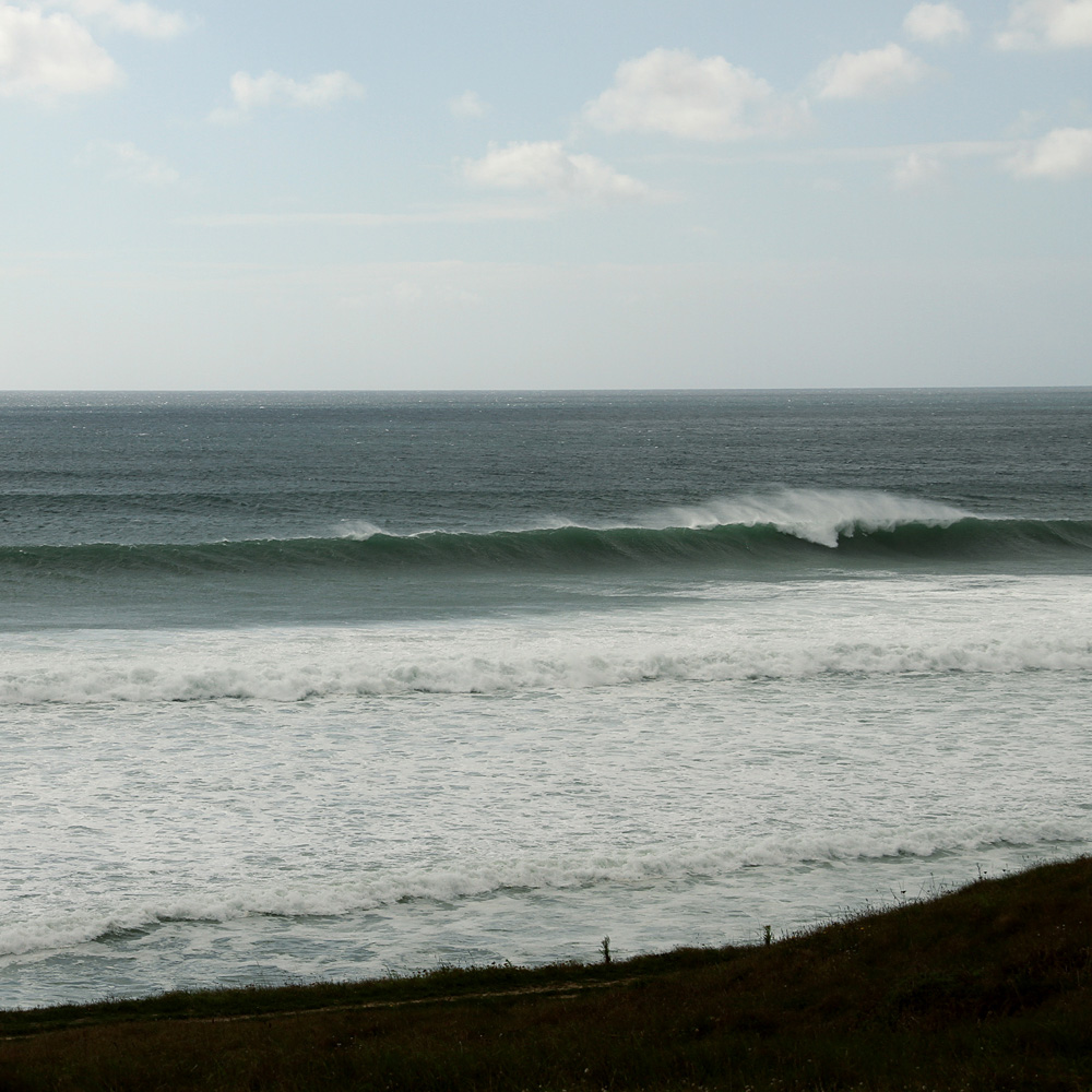
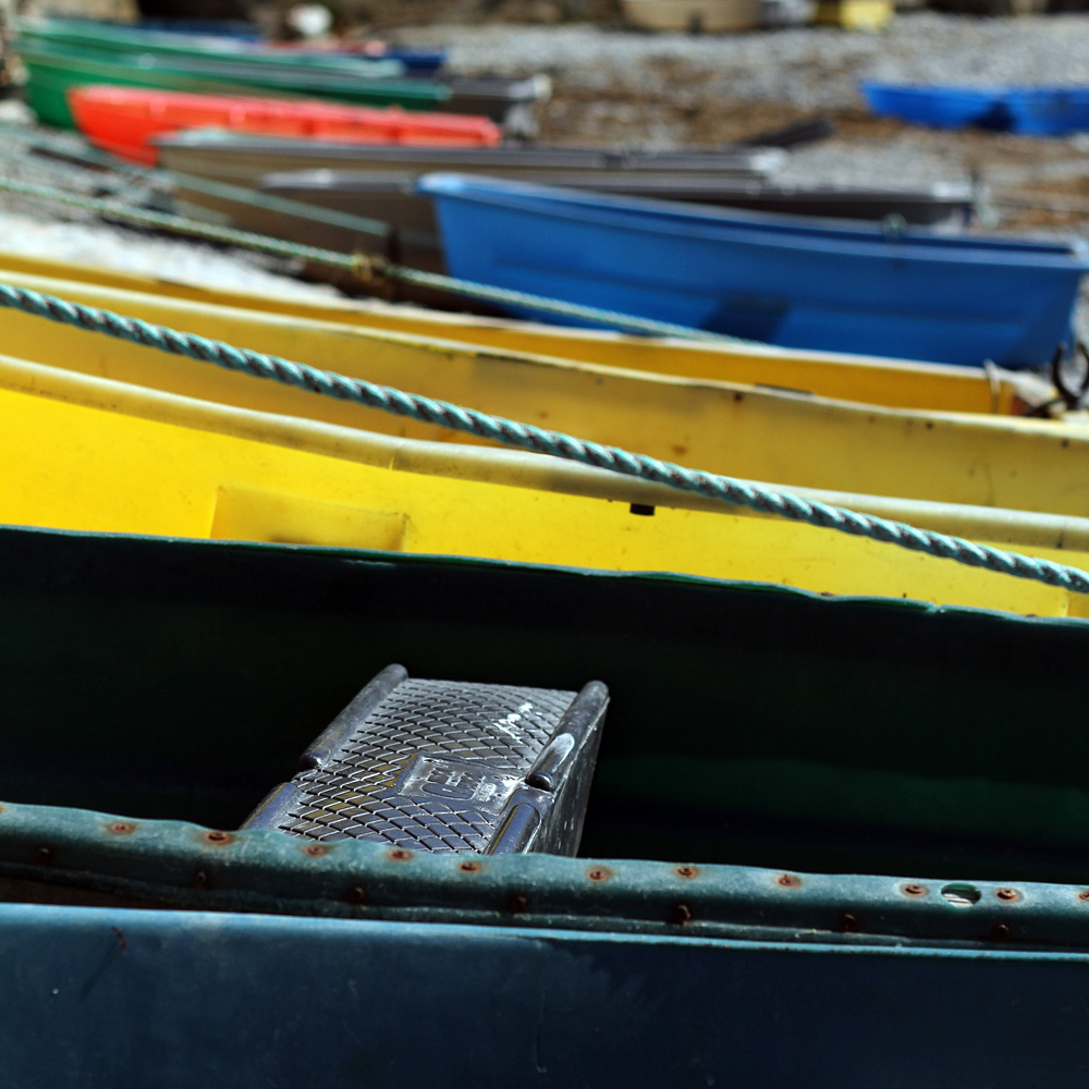
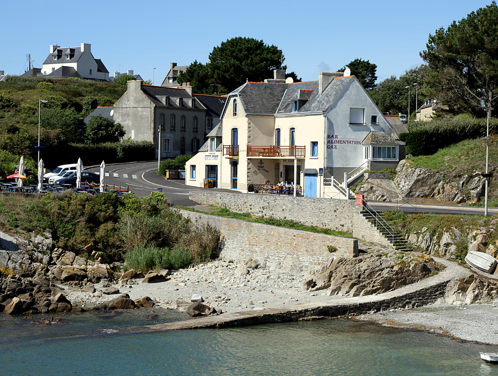
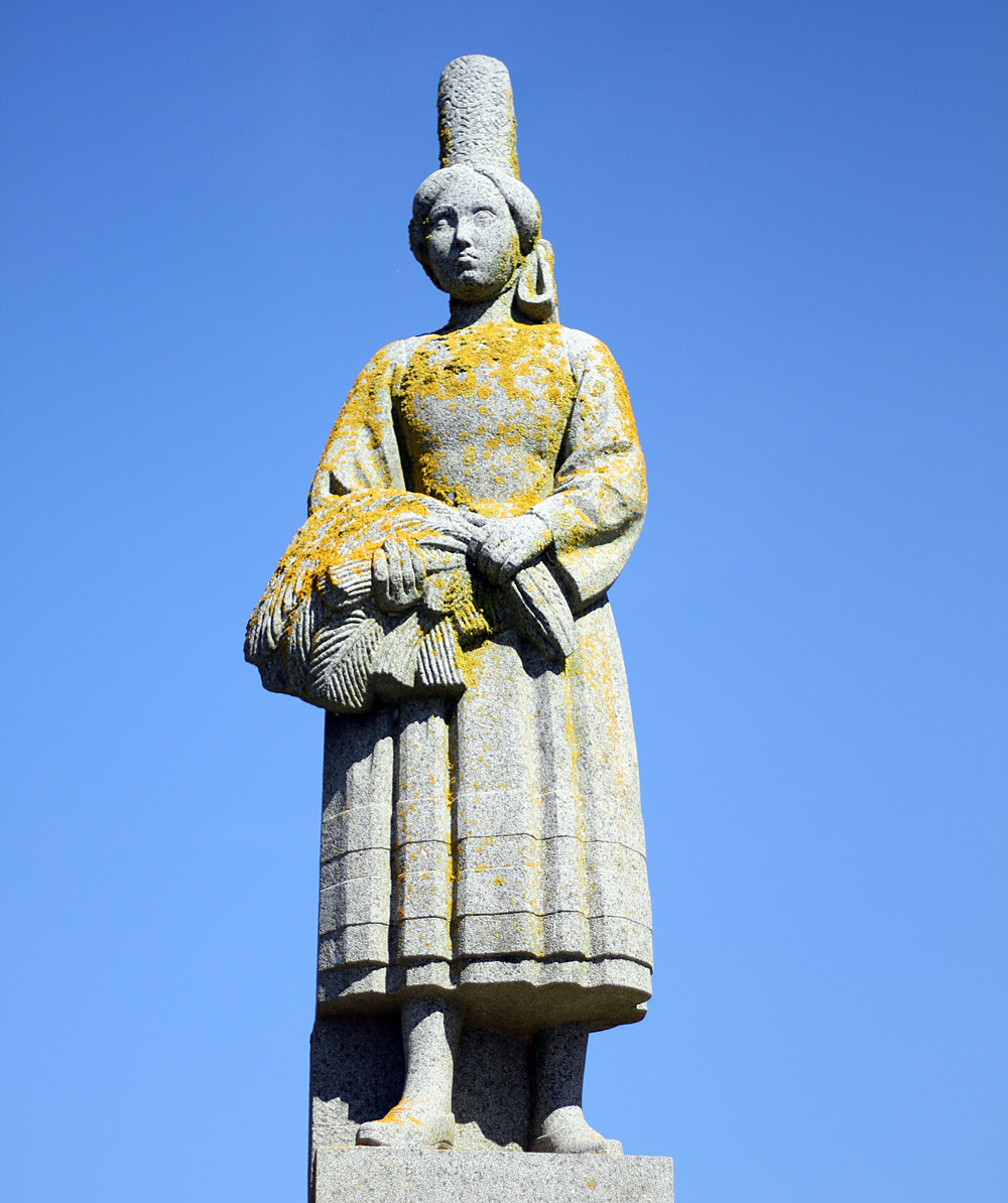
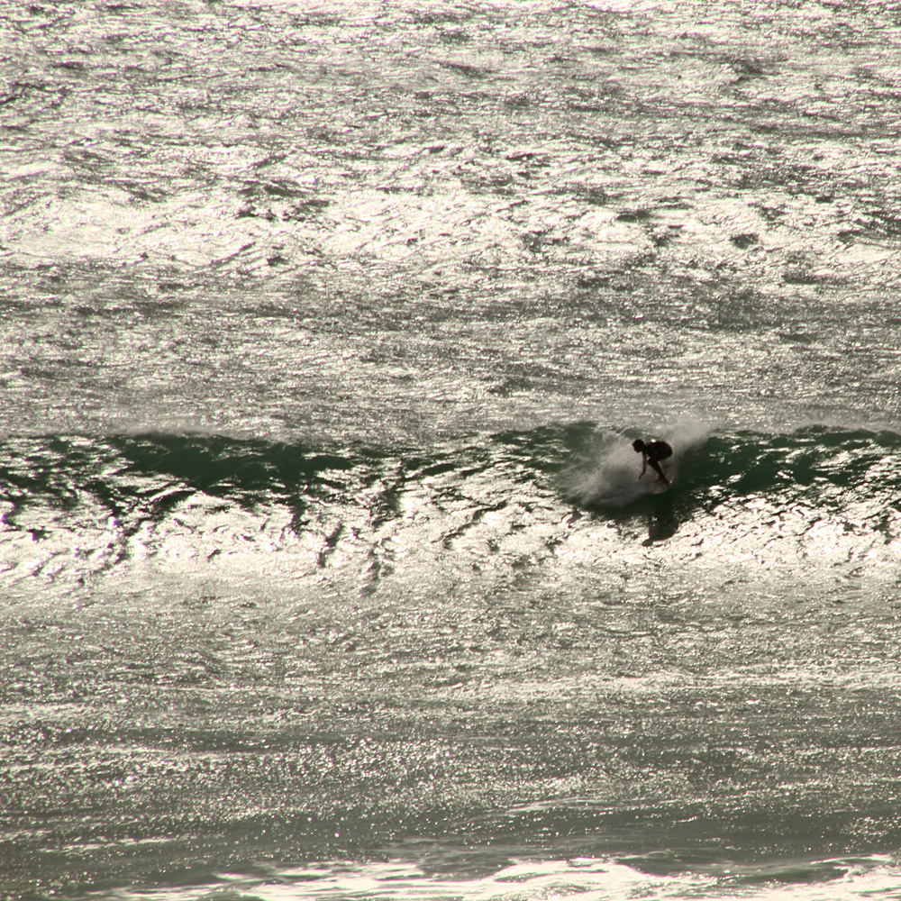
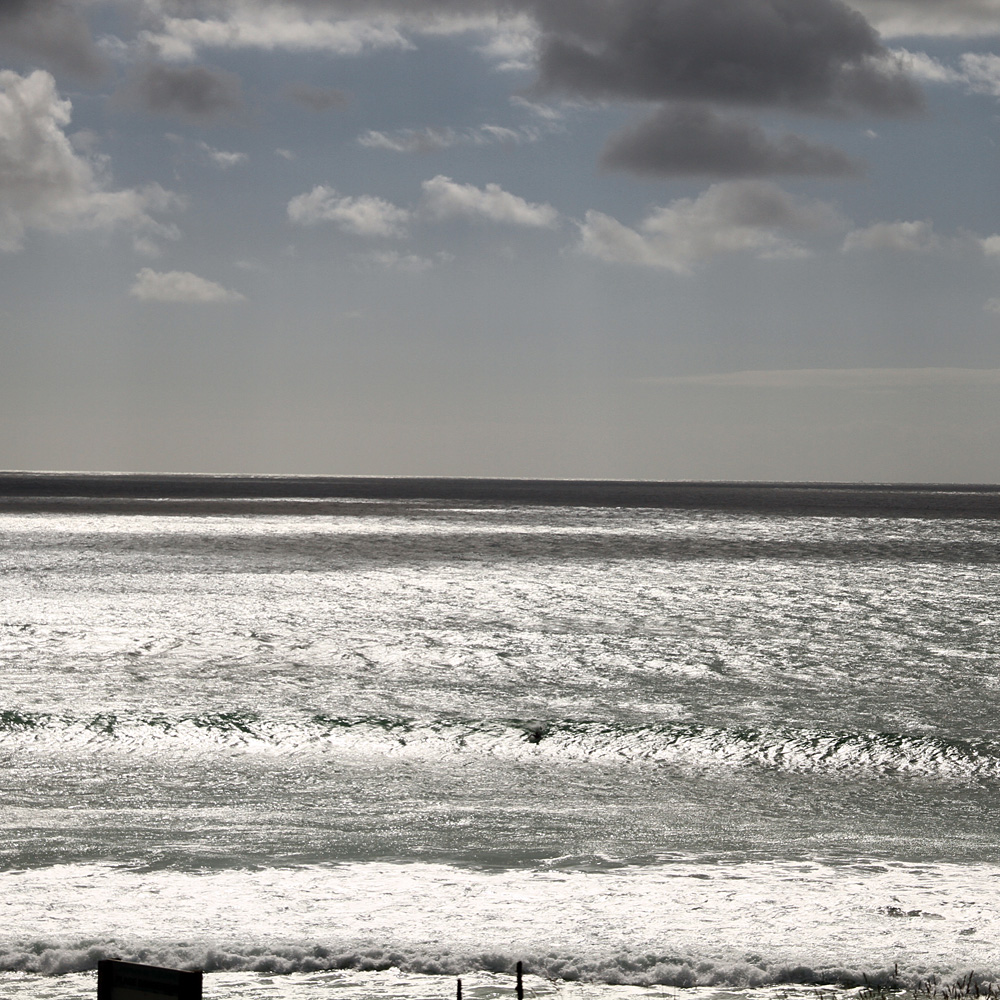
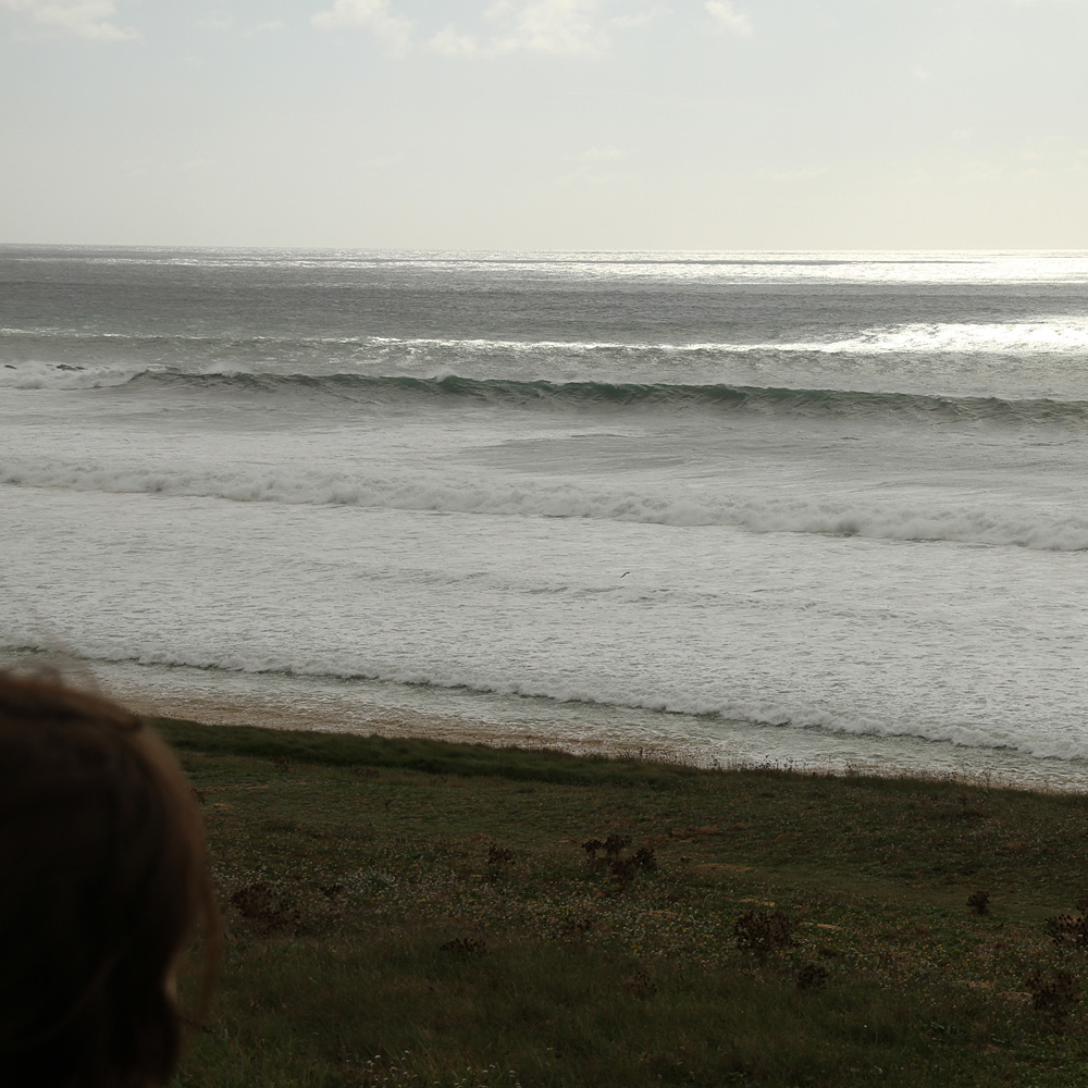
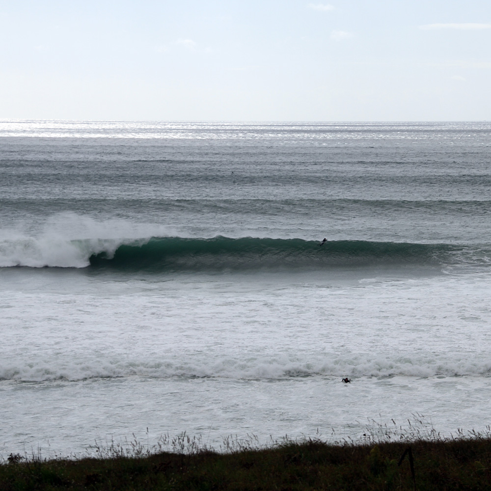
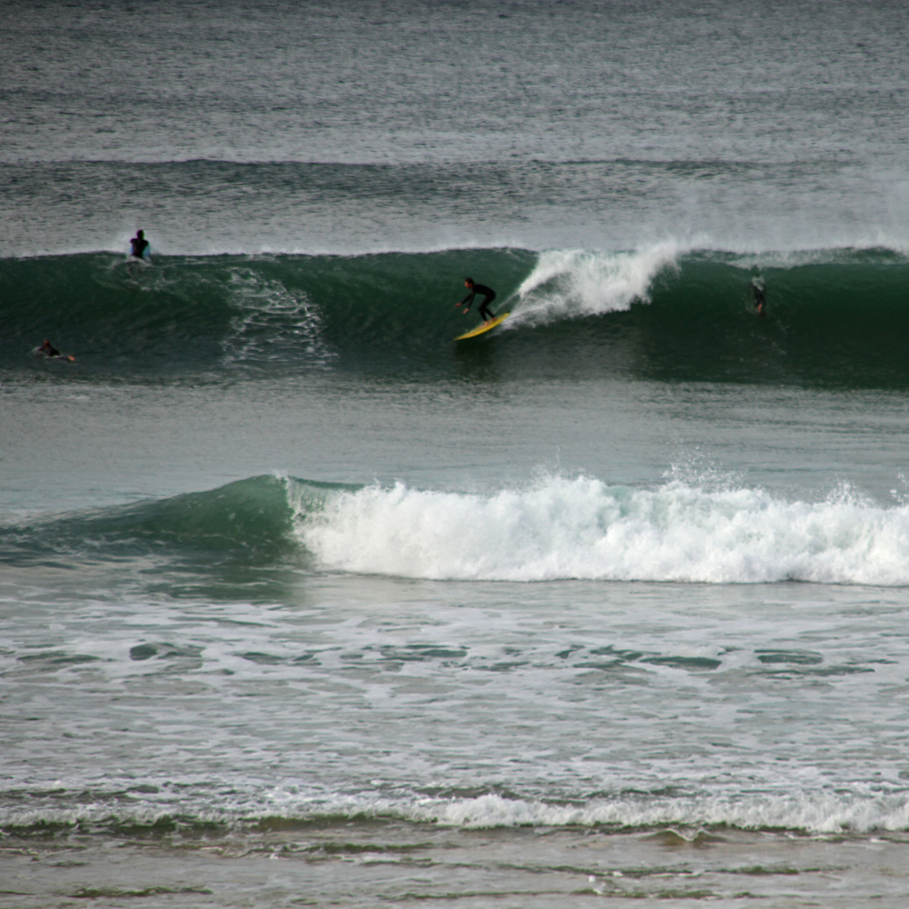
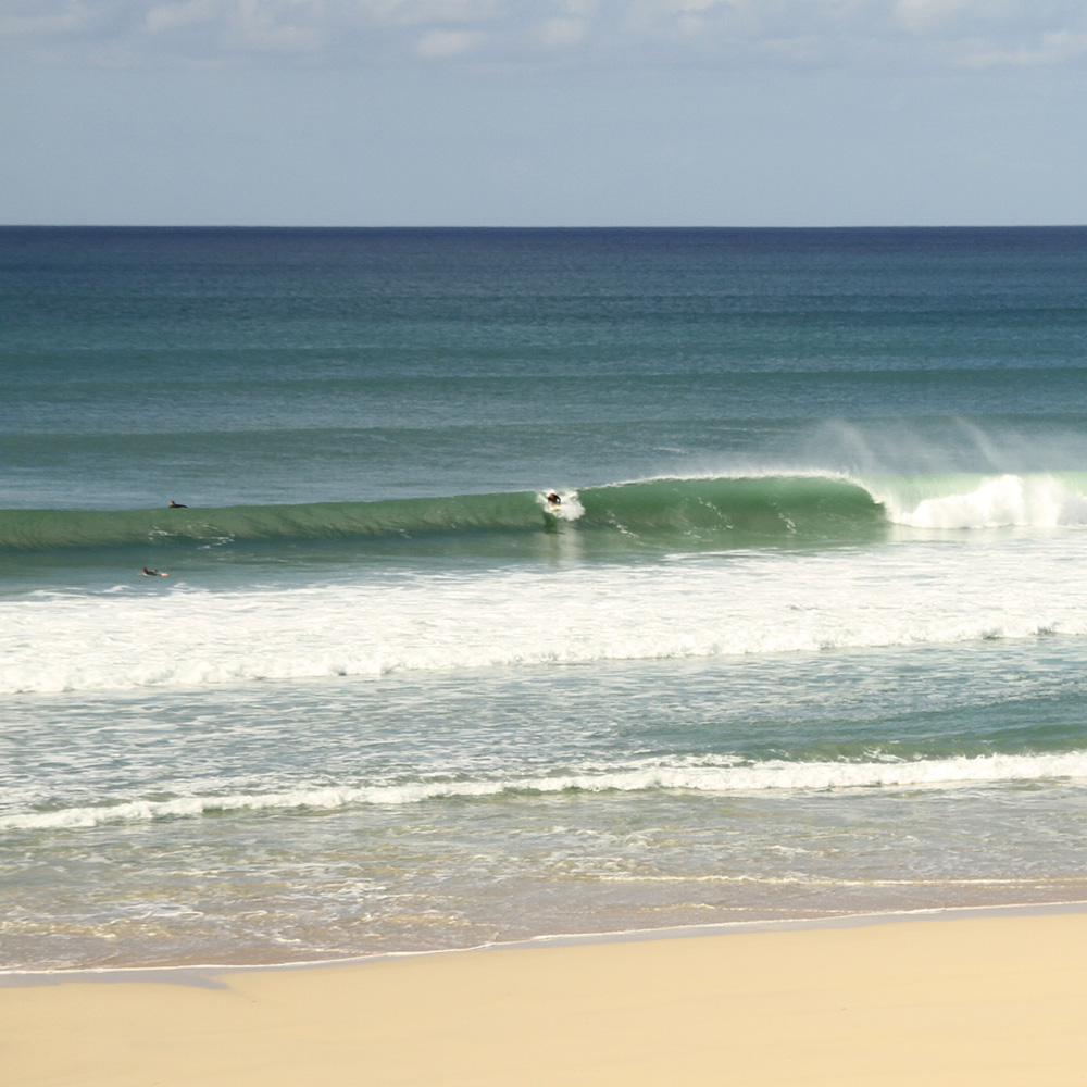
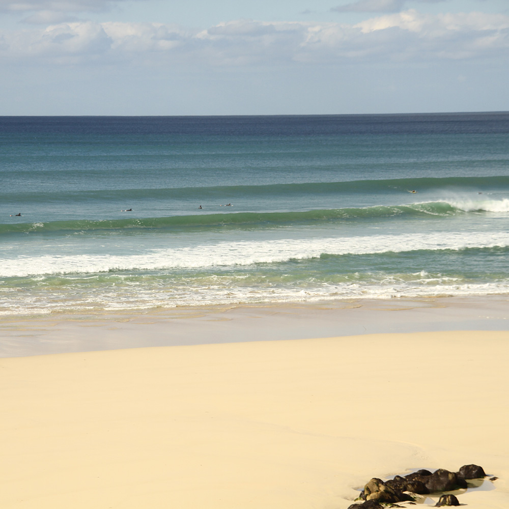
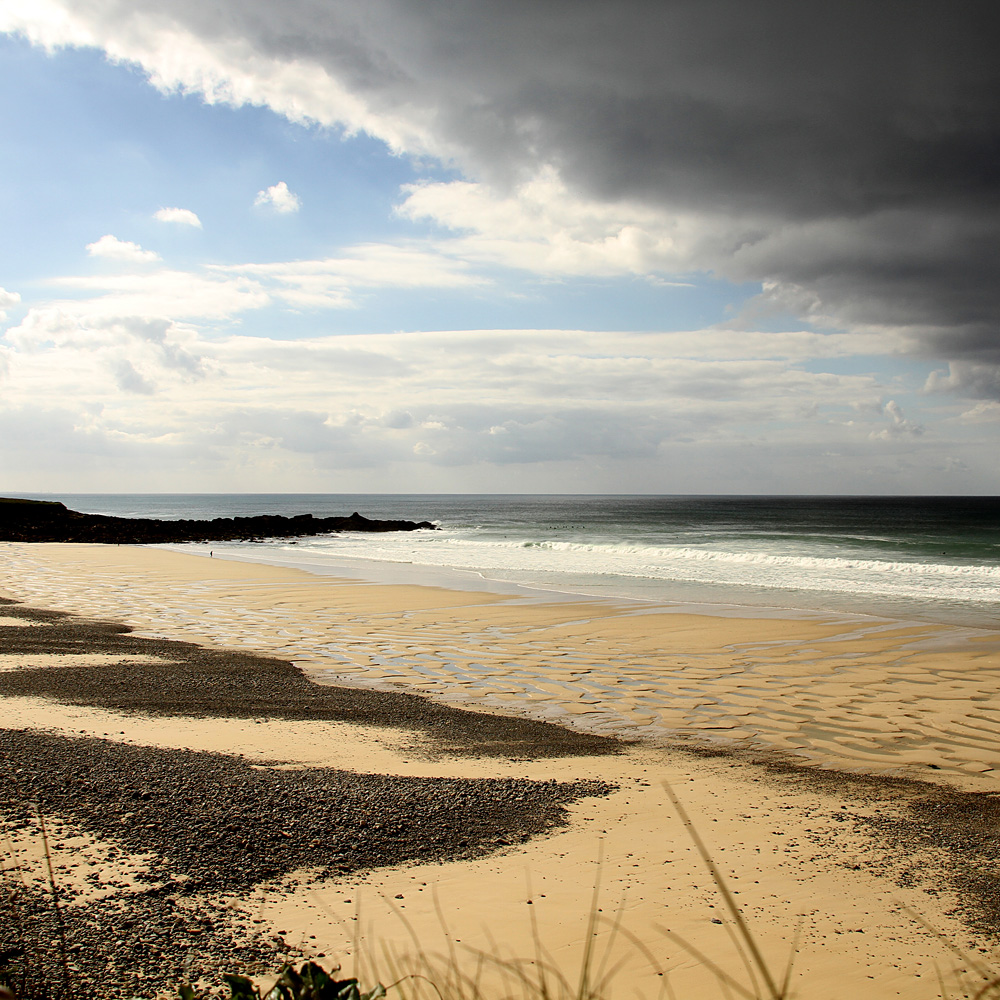
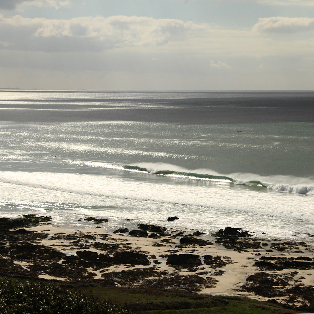
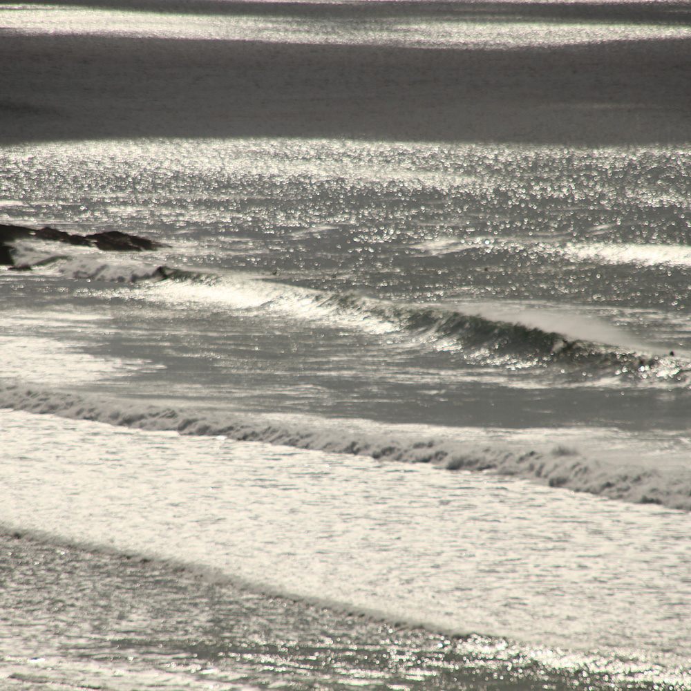
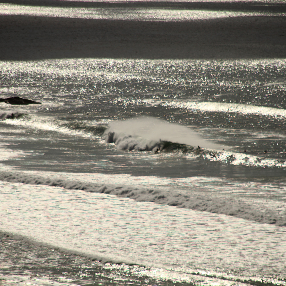
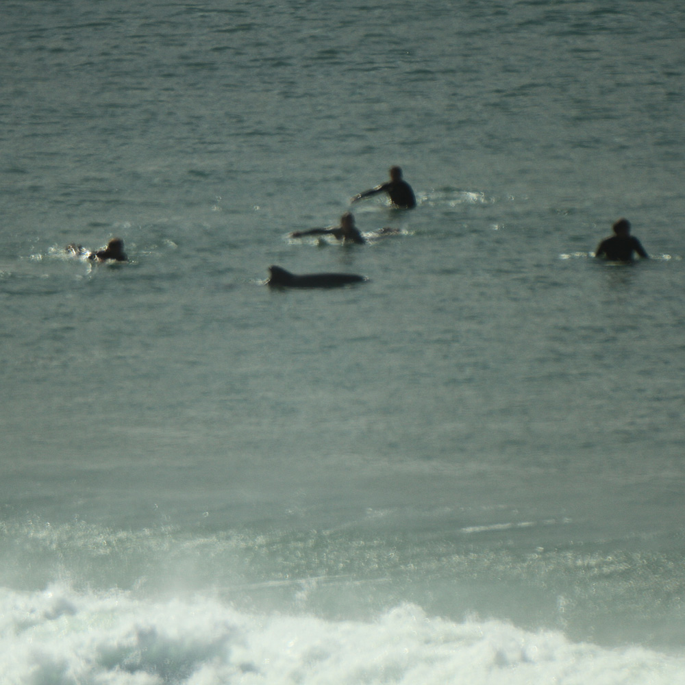
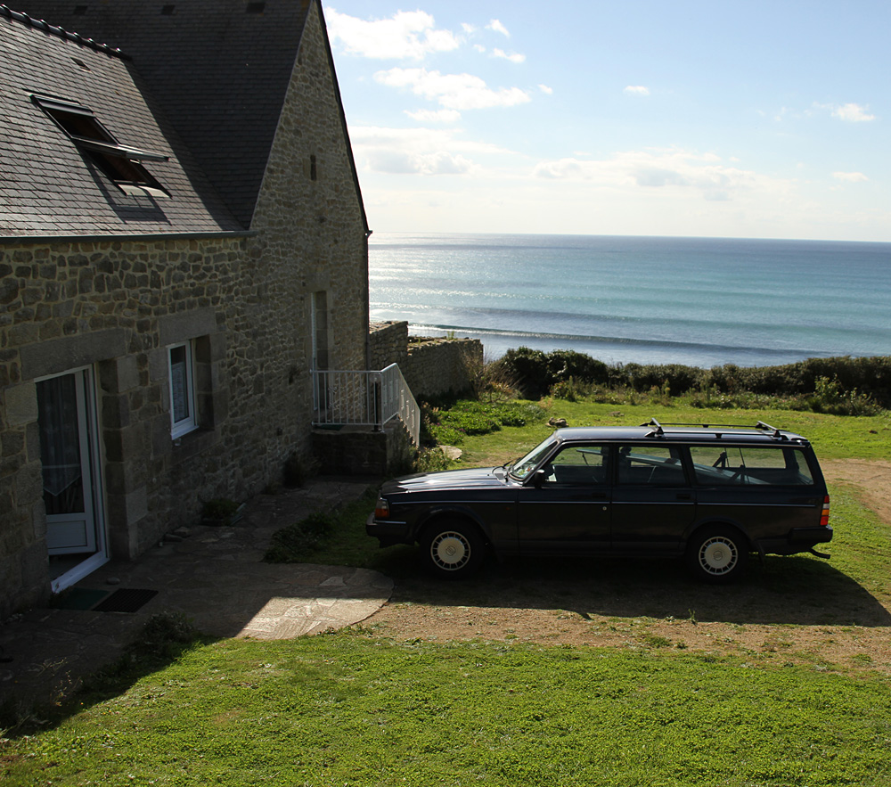
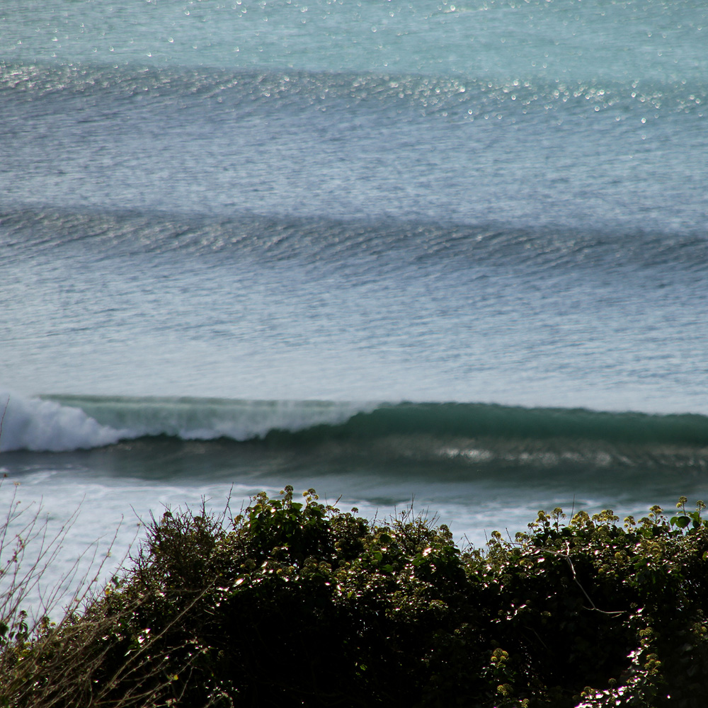
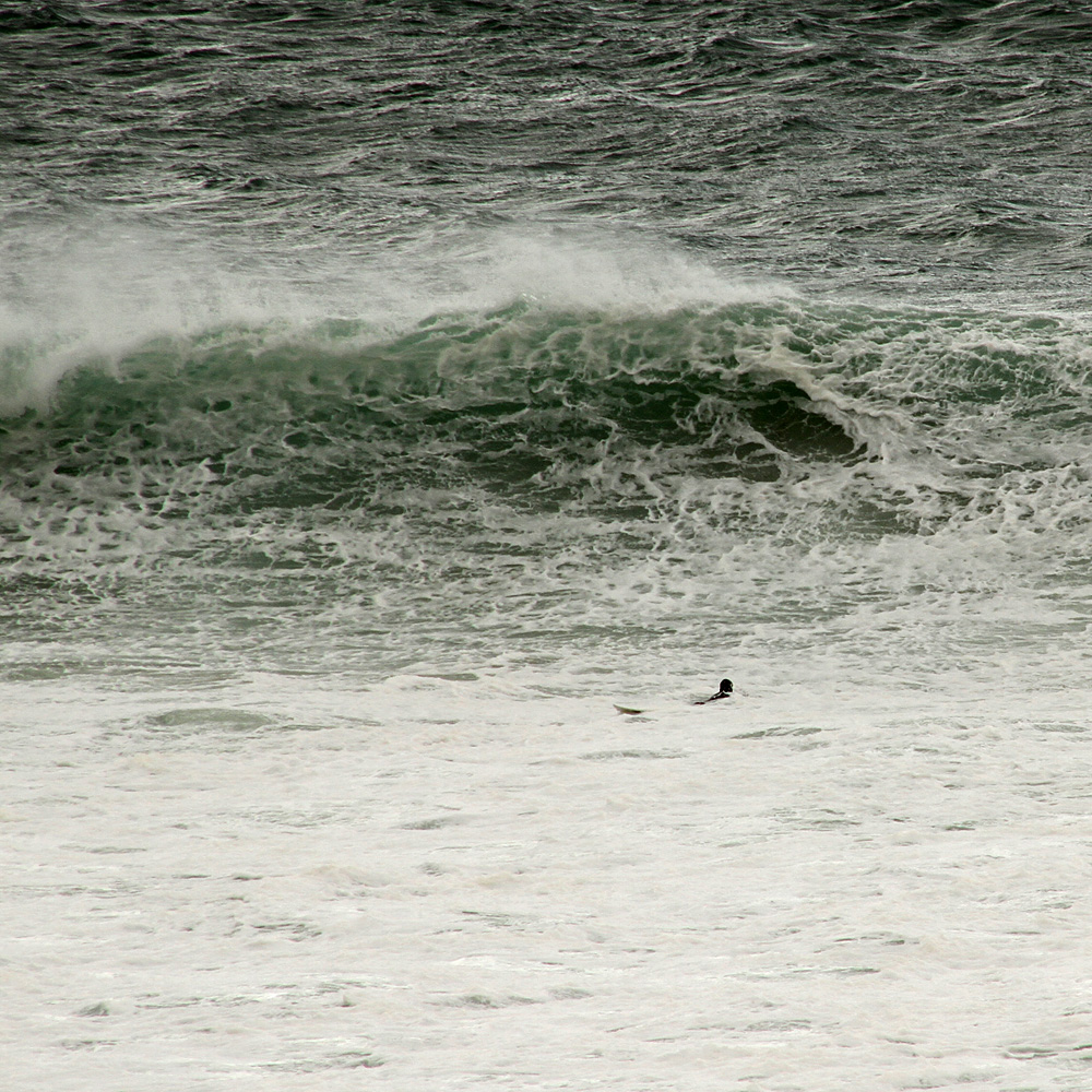
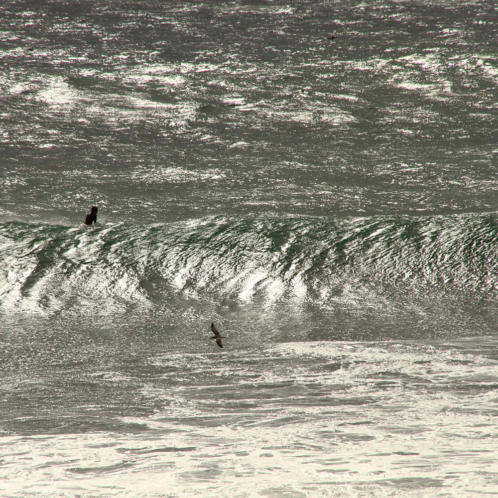
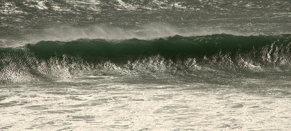
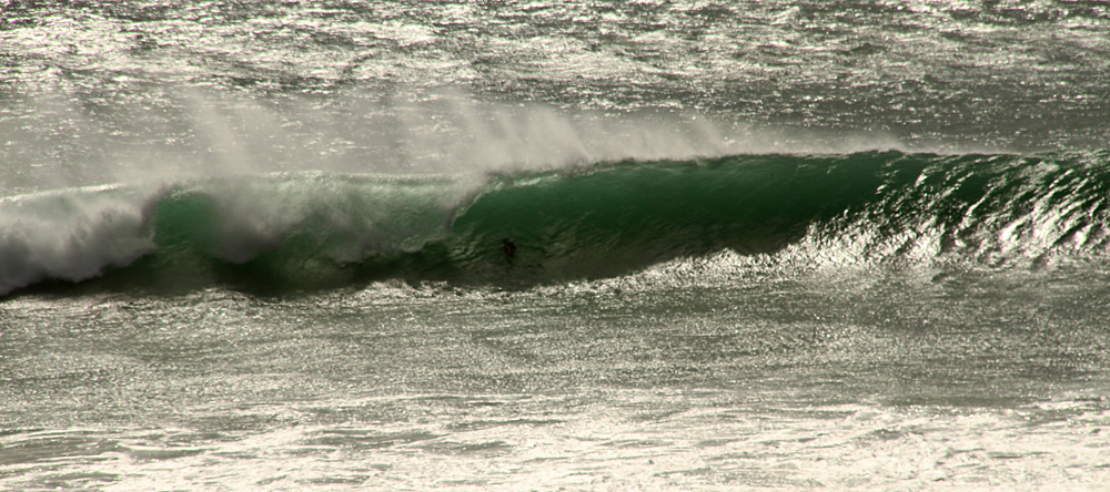
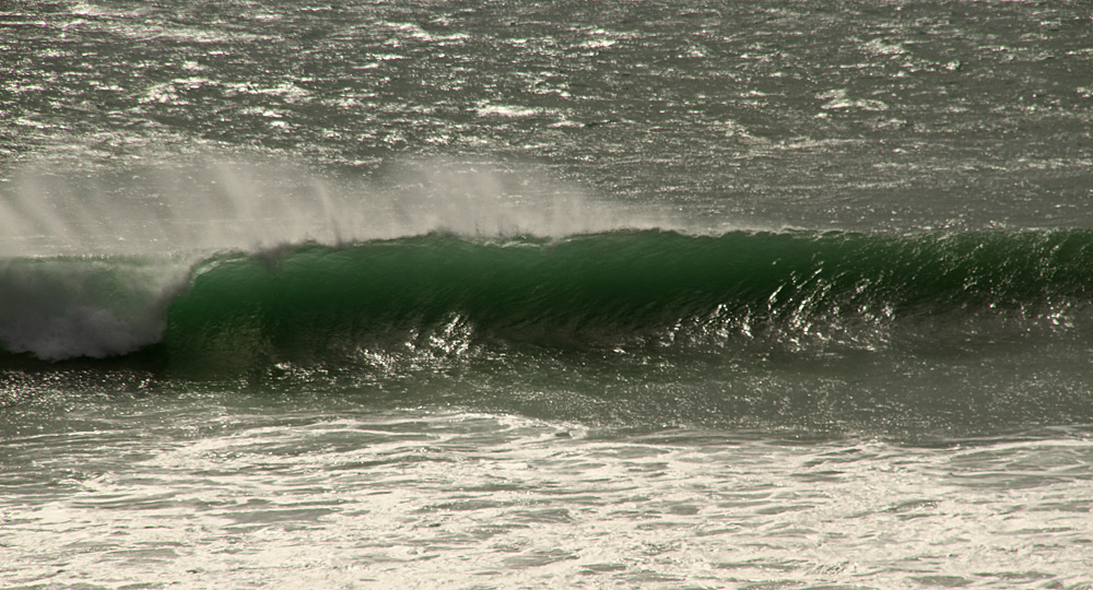
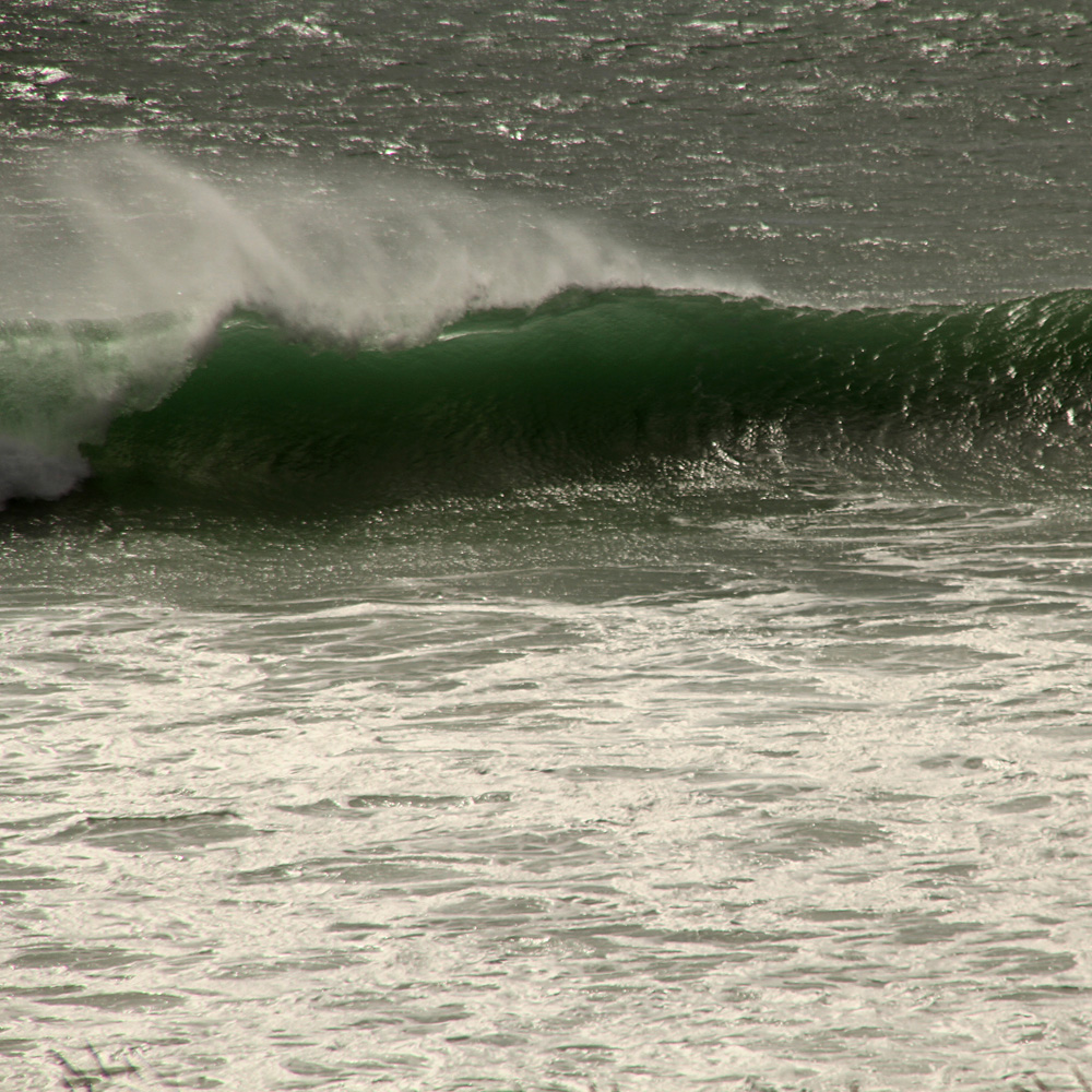
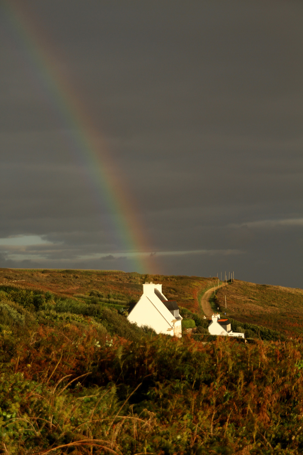
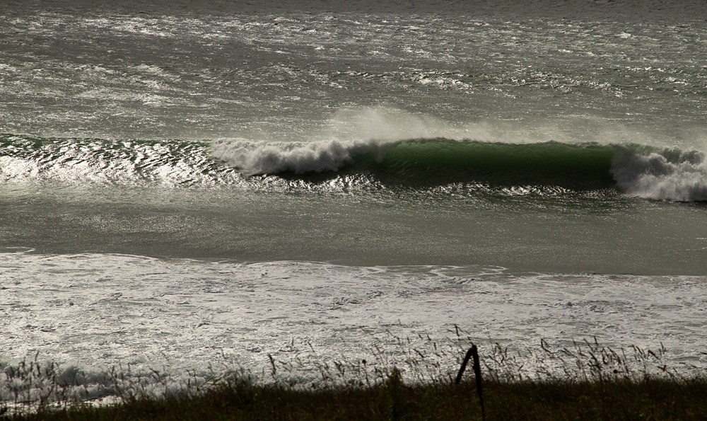
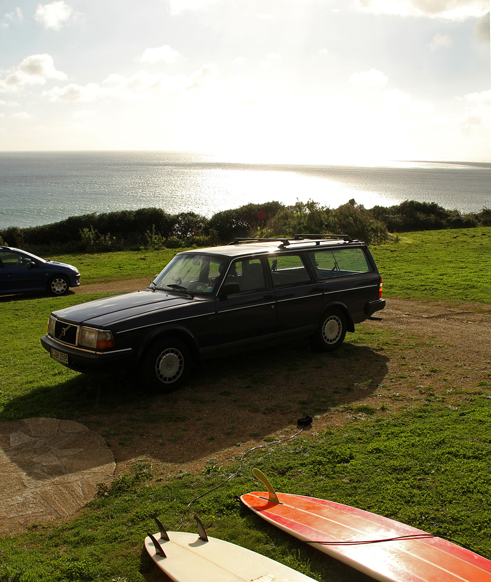
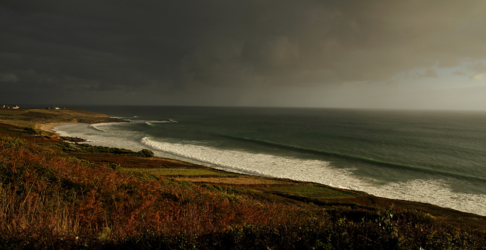
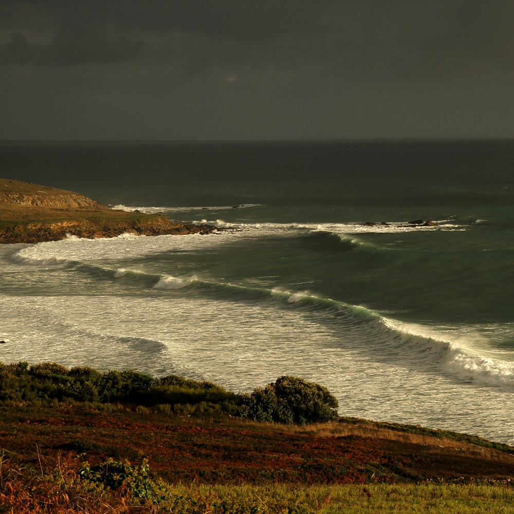
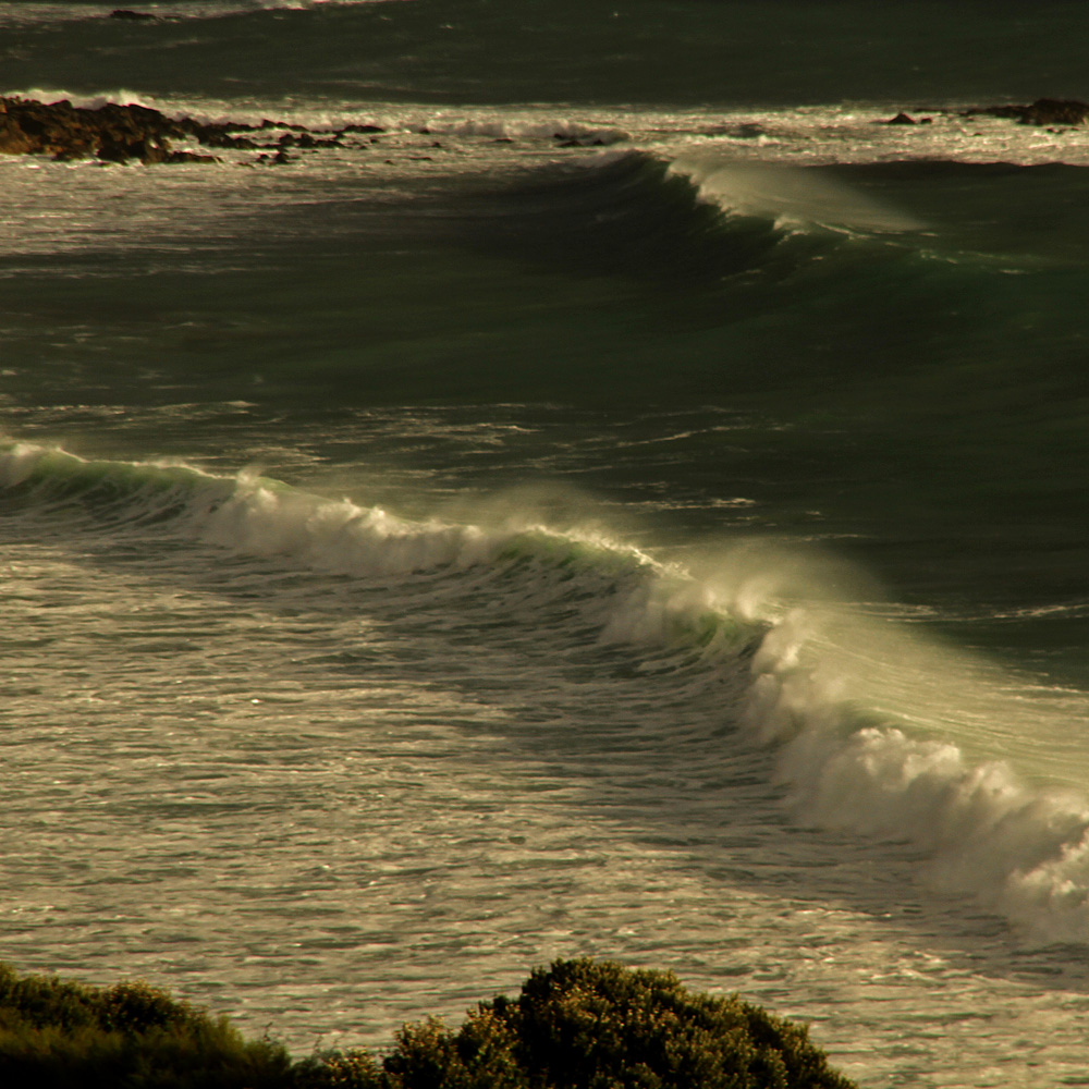
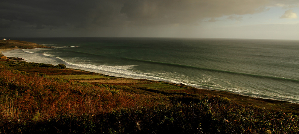
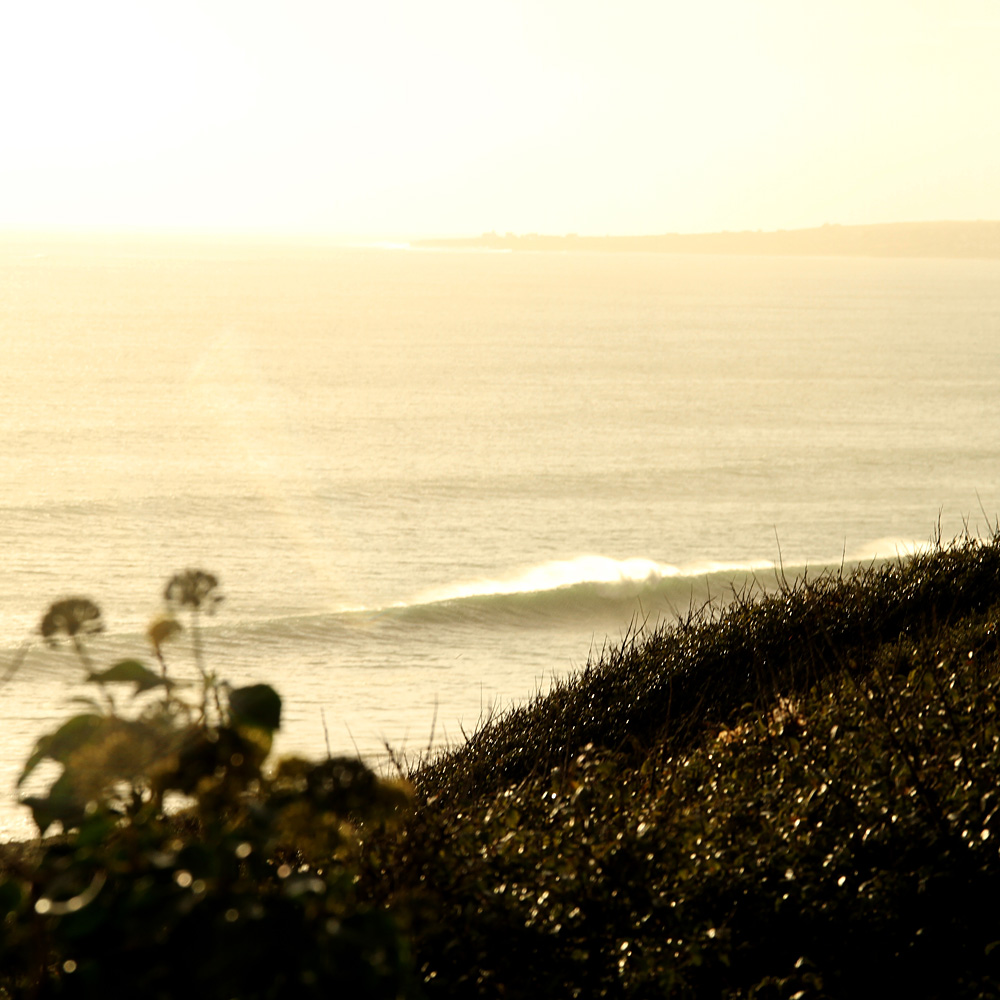
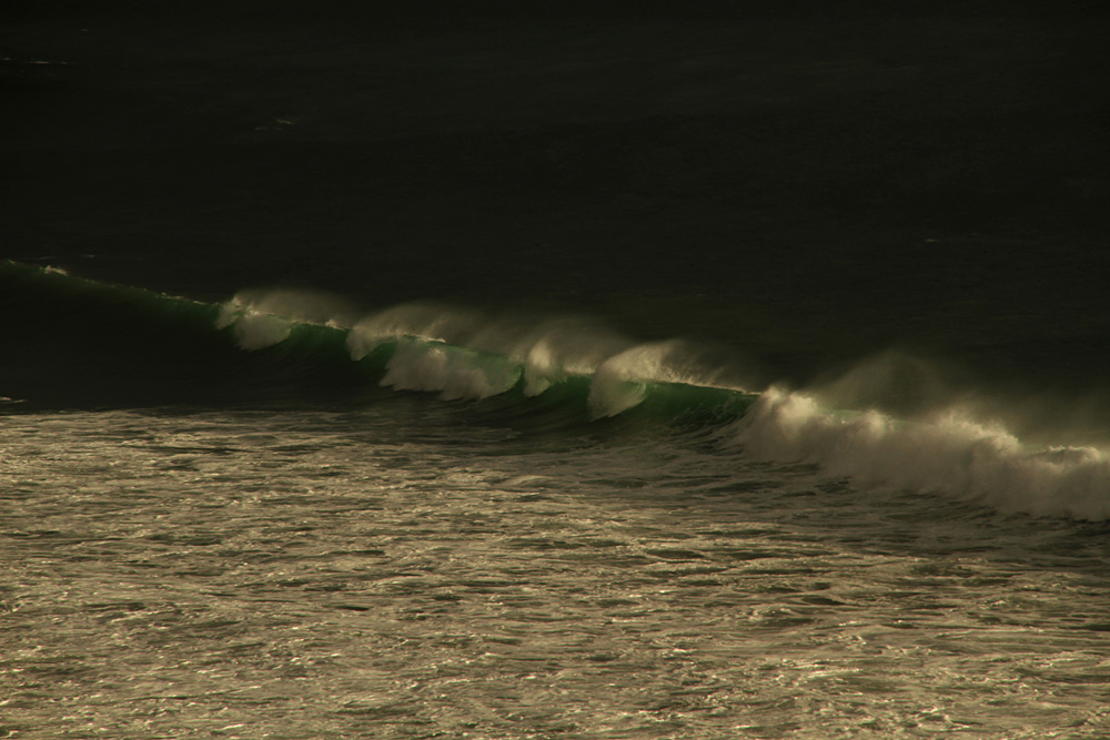
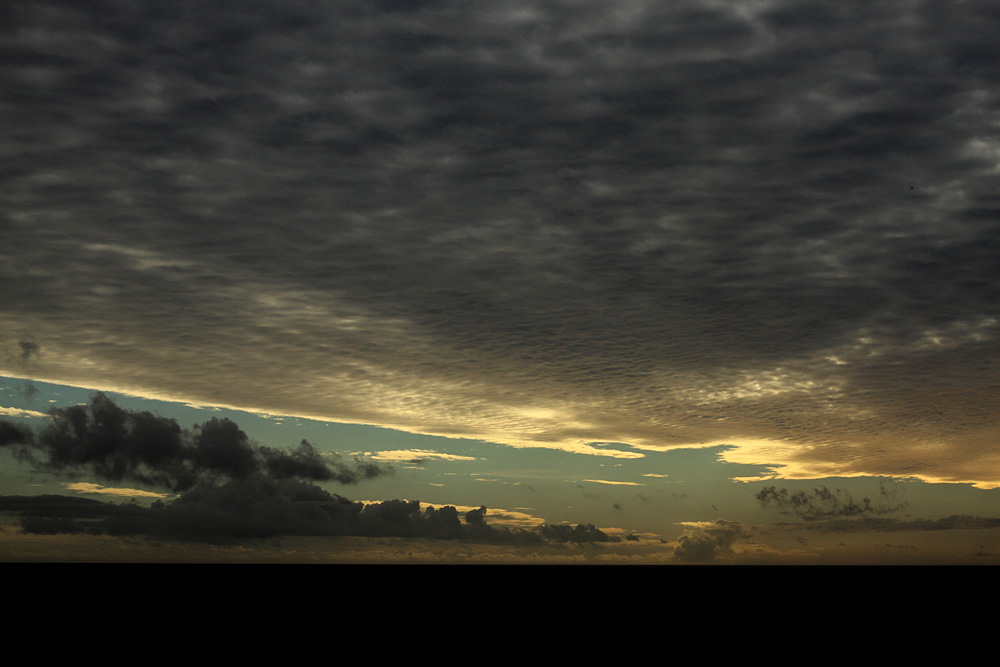
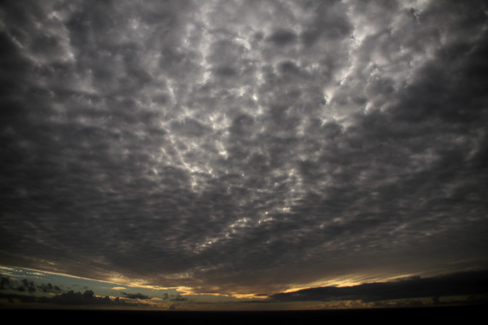
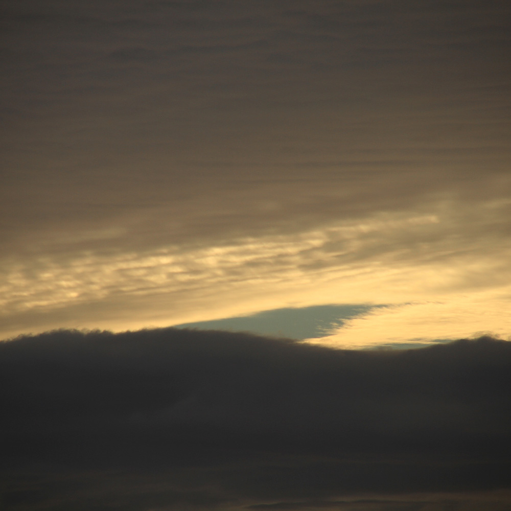
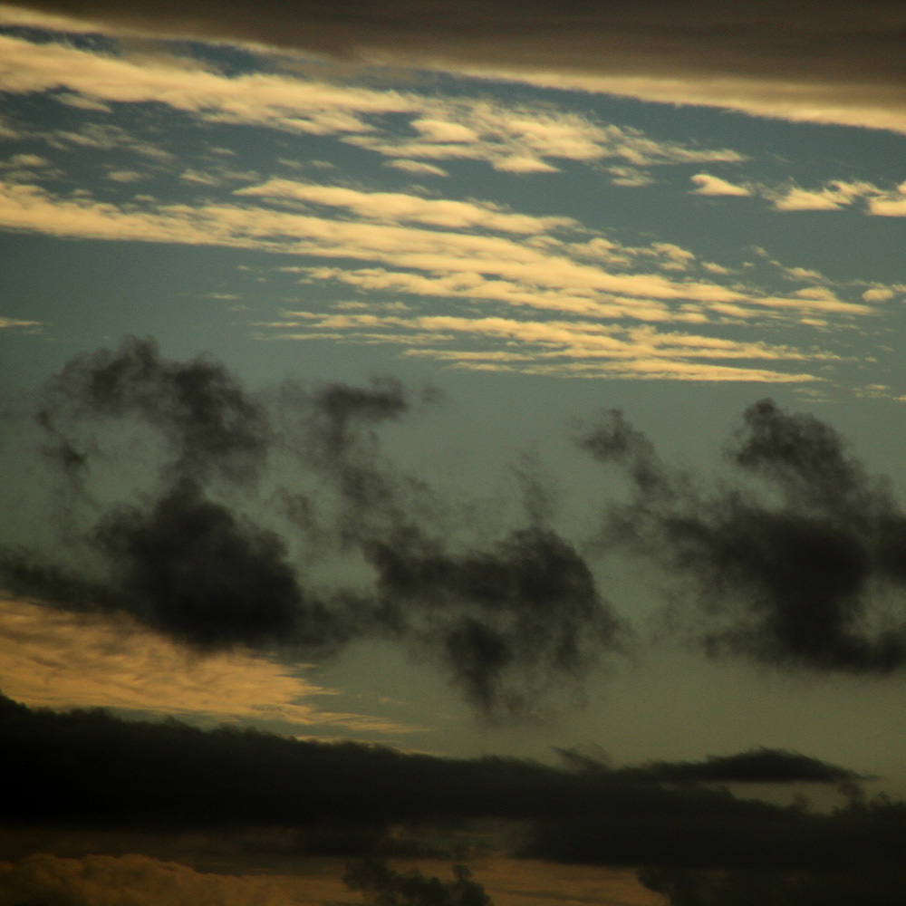

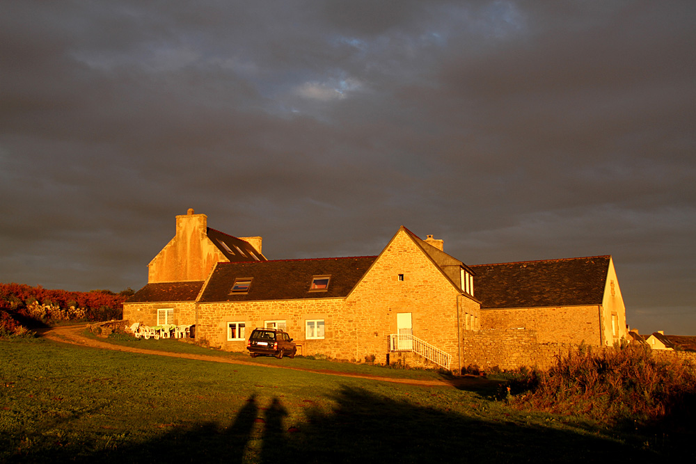
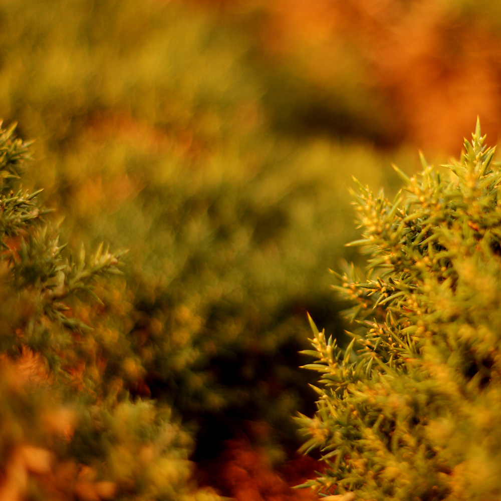
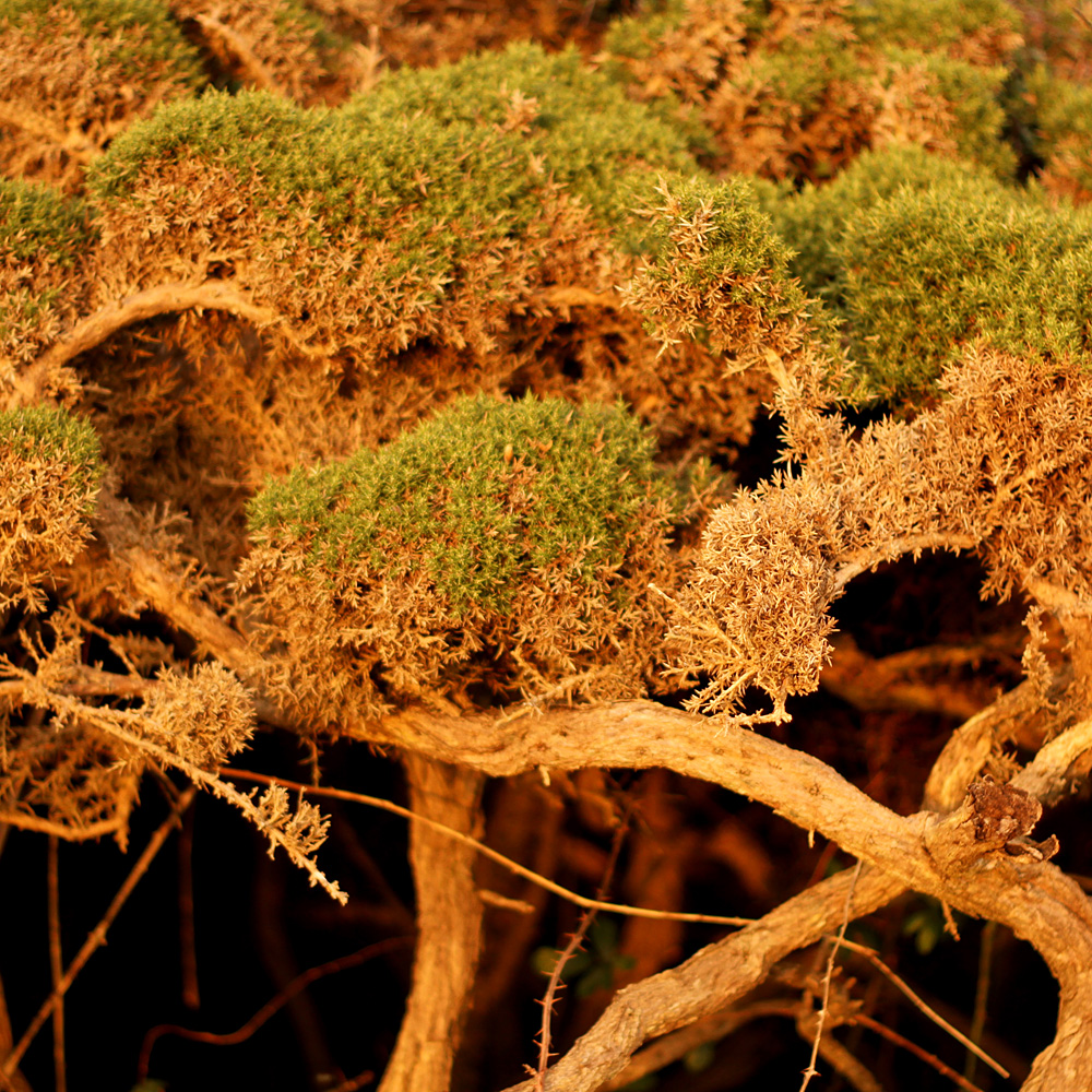
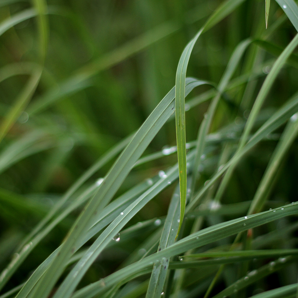

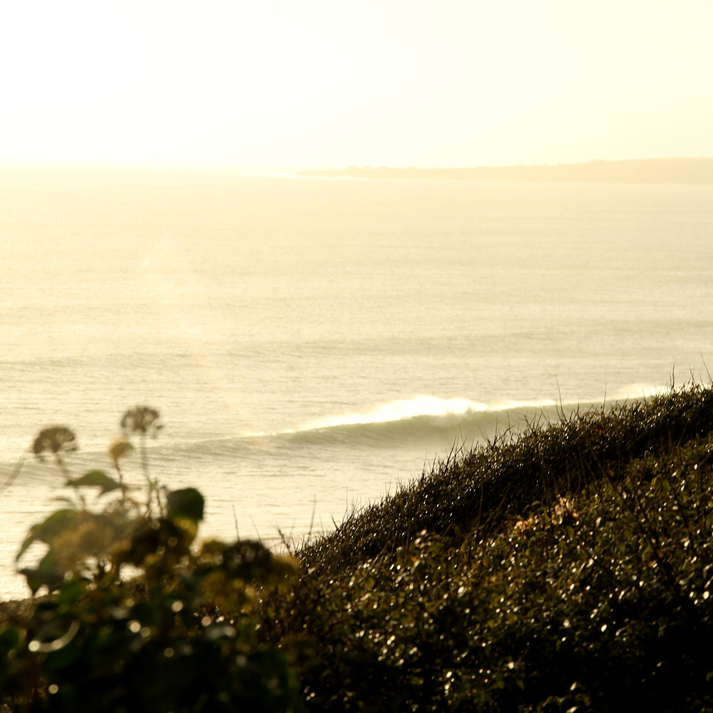
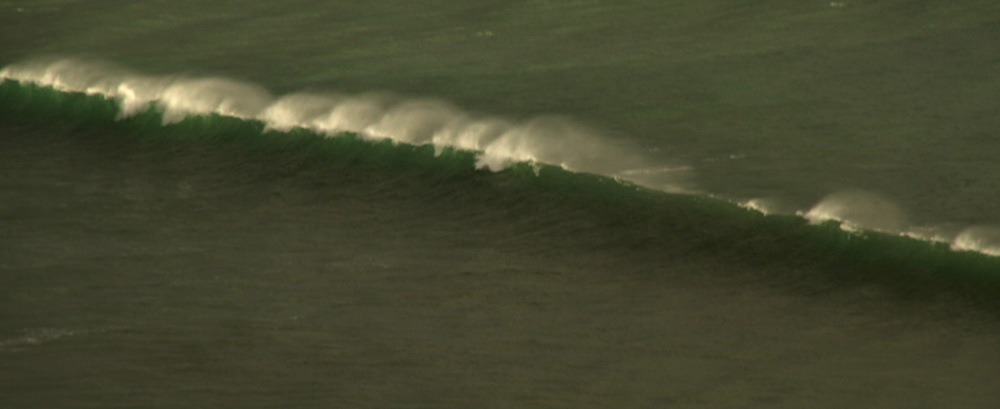
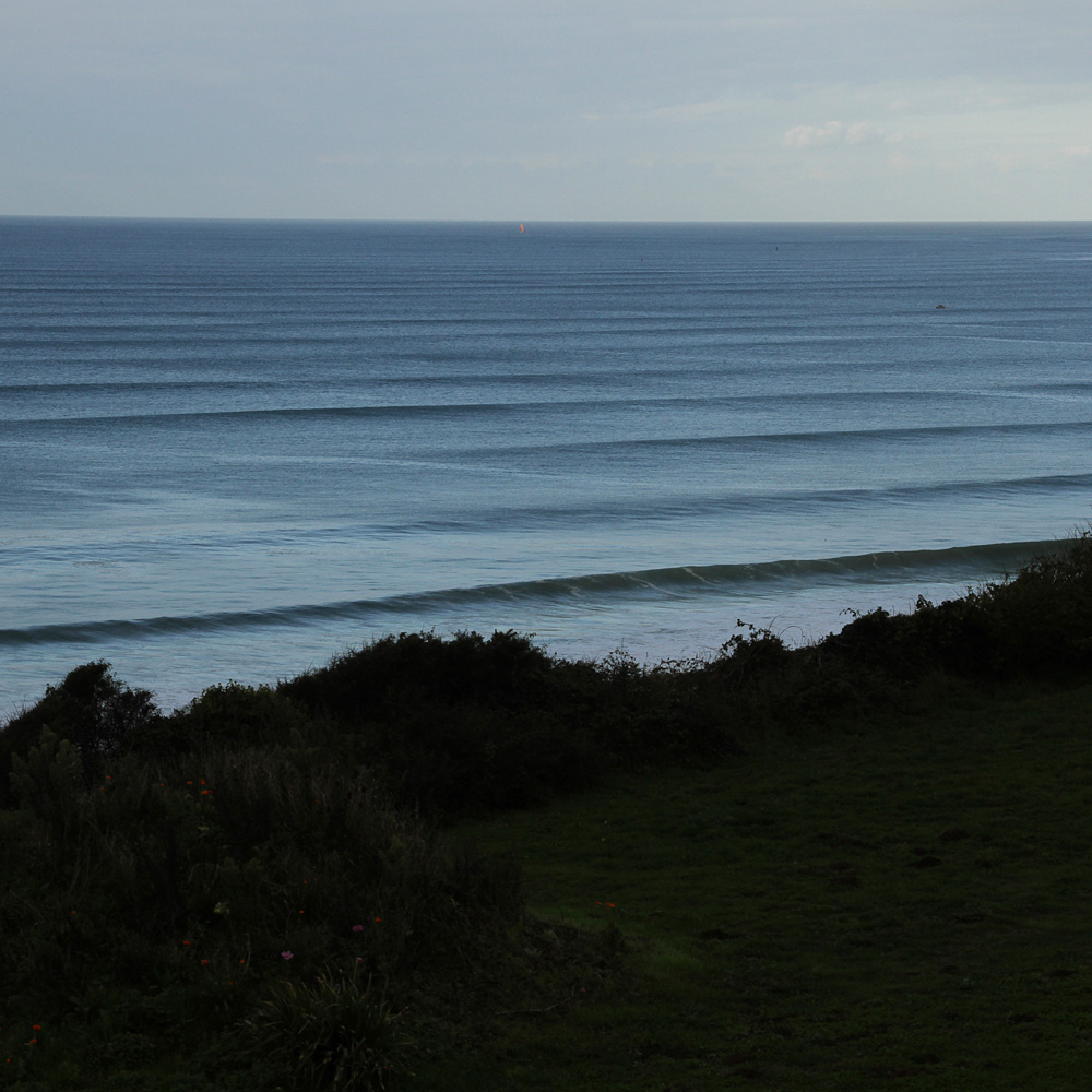
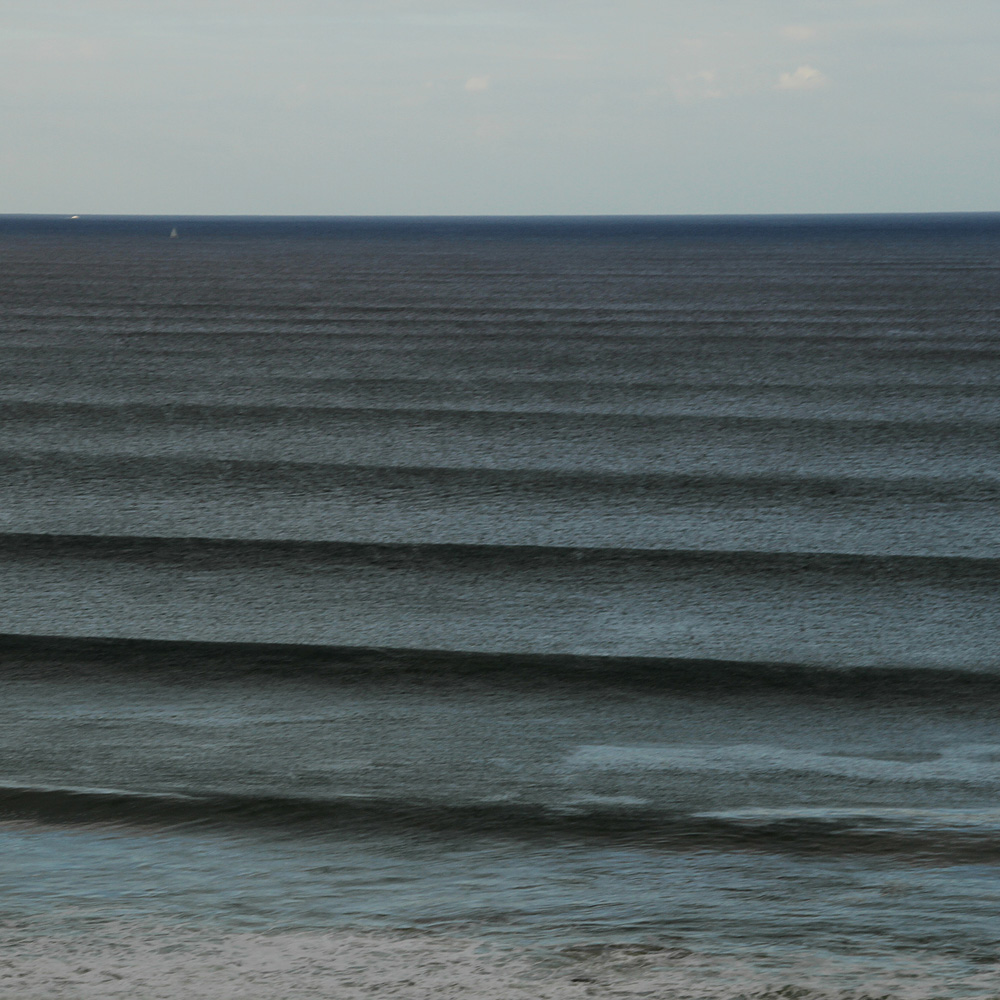
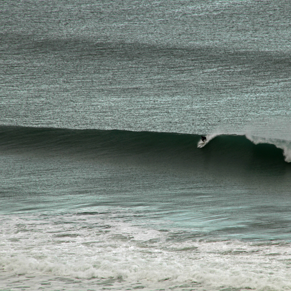
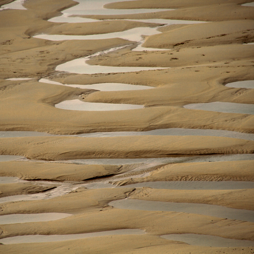
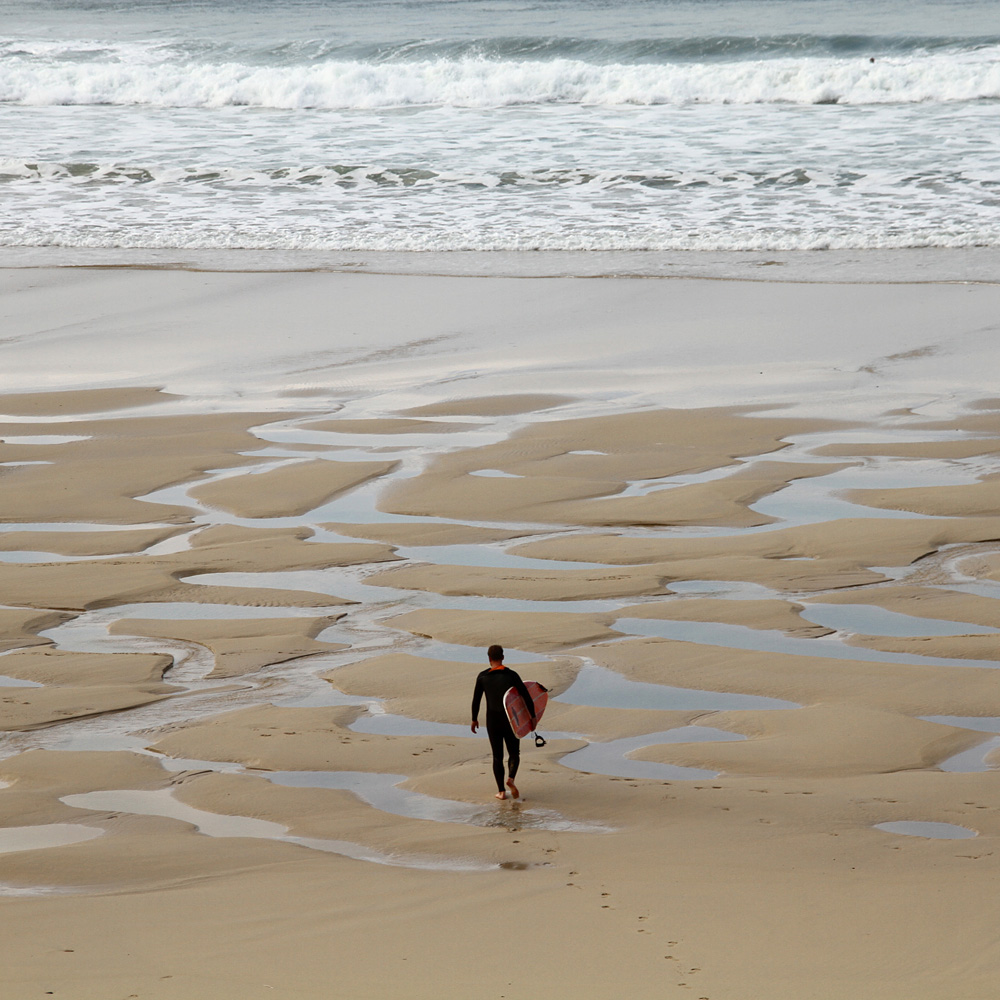
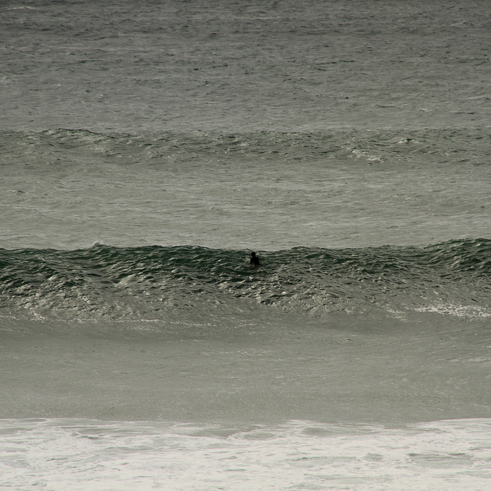
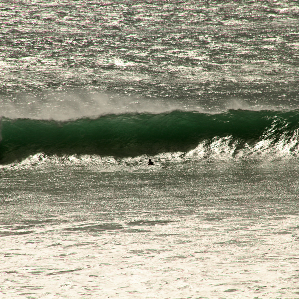
Septembre en Bretagne
Three fantastic weeks in Gwendrez.