Geographic Farming

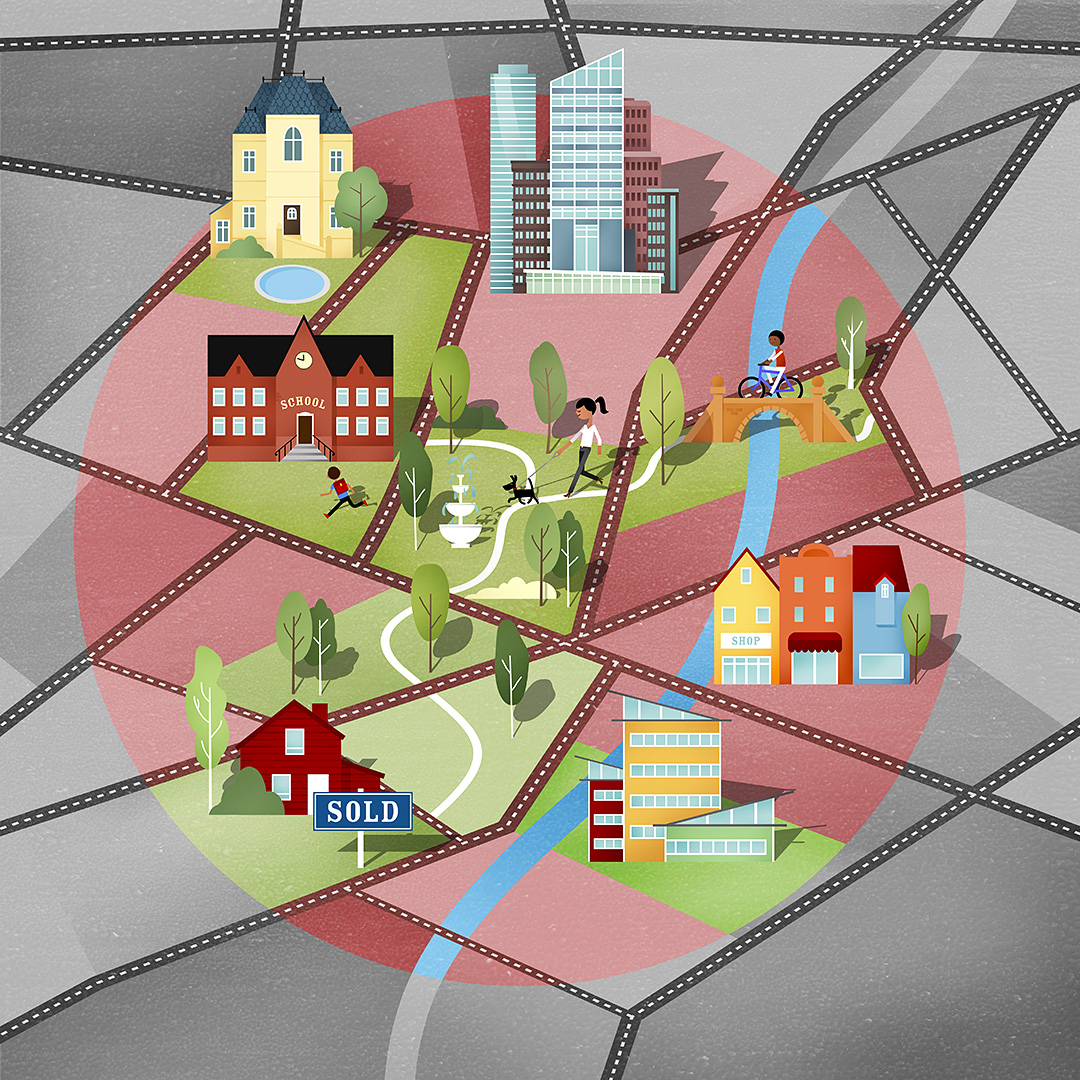
Do you know the qualities of your city?

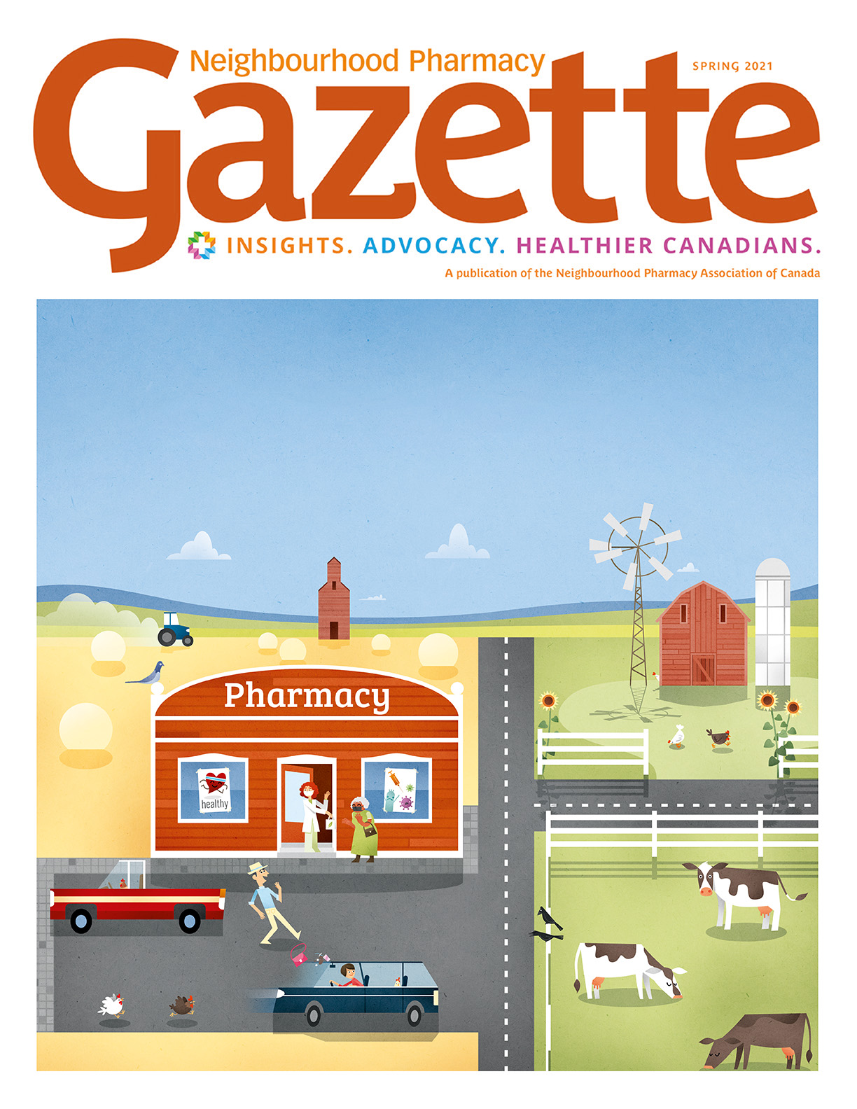
Hungry Eye Media from Denver Colorada asked me to provide an illustration for their client RE/MAX, to be published on their newssite. The article deals about geo-farming and how to optimize your real estate business.
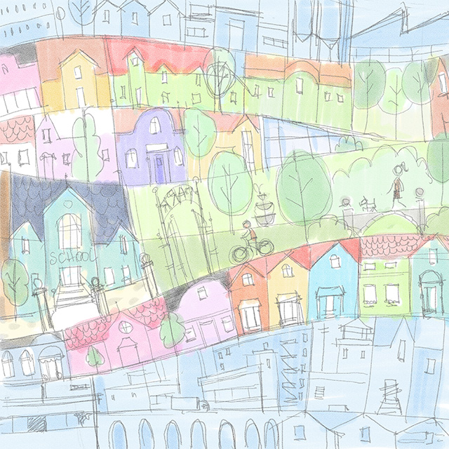
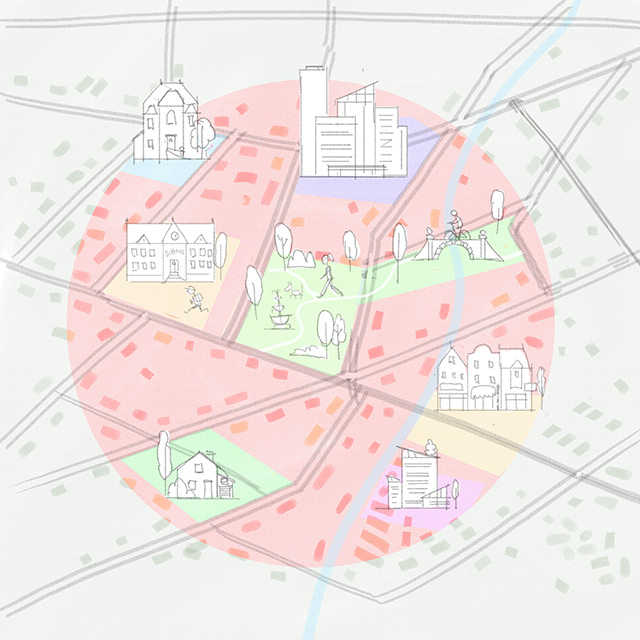
So I did some scribbling and came up with three drafts.


Client: RE/MAX
Agency: Hungry Eye Media, Denver Colorado

SOLO SHOW FRANKFURT

I was invited to do a sollo show in my Reps house, known as an exhibition-venue under the name “der kleine Mann mit der Kamera”.

For just a couple of days it had been quite an effort to put together but totally worth it. The vernissage was well visited and received, I was happy to meet interesting new and long not seen old friends. I was able to sell a couple of woodprints. Even to Tatort actress Barbara Philipp!

I enjoyed a couple of wonderful summer days “camping” next to the skatepark so I could enjoy a couple of rides after my daily duties.


Neighbourhood Pharmacy Gazette

For Canadas Neighbourhood Pharmacy Gazette I was assigned to do 4 Cover illustration.
Each cover represented a season and a typical canadian region with its typical architecture and features.


Client: Neighbourhood Pharmacy Gazette
Agency: Twocreative  / Shawn Samson
Anna Goodson Illustration Agency


FLUFFY ICECREAM

Together with my riend Lars we started to found a new brand: Fluffy!
We aim to produce high class icecream aand sell it via vending machines at selected spots.
Here are some first illustration and concept sketches.


FREE

LA SANTA, LANZAROTE

I’ve spent some time with Prof. Superheiss on the lovely Island of Lanzarote and we went surfing a lot. On this trip La Santa was working most of the days and on one occasion I brought my GoPro to film myself.

That day the offshore wind was very strong making it hard to breathe while paddling and taking off.

Here’s a fun edit.

Let’s Collab!

This clip was Originally thought to be used at the Frankfurter Buchmesse but actually became a short and nice standalone clip showcasing the diverse spectrum of kombinatrotweiss’ illutrators and linking to our group-project called “Let’s Collab!”. Of course it’s just a glimpse into the amazing work my fellow illustrators have to show.

I had just about two days to do it, so from the beginning it was clear that I will have to reduce and focus on few elements in this animation. As I was trying out a new character rigging and a totally new mouth-rig, I was eager to try it out in this project.

Svetlana Jakel @kombinatrotweiss did the voice recording herself and Christoph von Chamier did the music and sound design. The rigging worked very well and it was nice to see, that in a relatively short amount of time it was possible for me to provide lip-synced animation. I was also very glad, that Svetlana liked my character design of herself, as I often find this to be the hardest part.


client: kombinatrotweiss illustration
voice over: Svetlana Jakel
music and sound design: Christoph von Chamier

Woodprint for Rocktrust

Rock Trust is an Edinburgh based organiziation fighting youth homelessness in a very active and creative way.

Bi-annually they organize an art exhibition showcasing donated artwork on postcards they send out to selected artists.

For over ten years now I was happy to regularly participate and provide additional artwork for some of their events. This years topic was “untold”, and I decided I wanted to make a three colour woodcut.
I had been sketching a lot with color pencils in the past couple of weeks mostly using three colors: blue, red and turquoise. I liked the roughness of the drawings and wanted to transport it to the woodprint, so my thought was that using three plates would add some imprecision. I could also use the overlap of colors, something that normally isn’t possible in the “lost cut” technique I normally use.

Even though it was more actual cutting than normally I am very happy with the outcome. I used lino printing colors instead te oil based colors which I normally use and for this motif I love the “dusty” look the paint has on the paper.


I documented the whole creative process and cut it down to a qick minute tutorial:


Schoolbooks!

Vistas 6 & Senderos & Get Ready!

Nearly four years ago I got a request from Vista Higher Learning, Boston, for illustrations for a new edition of one of their schoolbooks. I wasn’t the only artist requested, so we did a pitch, starting with two spreads. Soon I realized how difficult it is to place so many elements and keep an eye on headlines, textboxes and gutter…

The publisher chose me, but before we started with the main project I was assigned with one spread for a new issue of “Senderos”.
For “Vistas 6” I provided in total 16 spreads and 33 smaller (but sometimes pretty extensive) Illustrations. One nice detail in the briefing was the task to put in some more or less obvious joke in each spread. For the following 8 months I was pretty busy doing sketches, revisions, vector versions, and finals.

Half a year after finishing the last of the Vistas illustration Slavi contacted me again. This time it was about “Get Ready!”, a schoolbook for middle and high school Newcomer English Language Learners. This time I provided ten spreads, one for each chapter of the book. Jokes had to be included again, so this time somehow the ducks took over….

The production of “Get Ready!” nearly overtook the production of “Vistas”, so I received both copies together.

The thought that thousands of people are now learning english or spanish looking at my illustrations is a very nice one:)


Vistas 6 & Senderos & Get Ready!

Vor fast vier Jahren wurde ich vom Vista Higher Learning Verlag aus Boston für Illustrationen für eine Neuauflage eines Schulbuches angefragt. Da neben mir noch andere Illustratoren angefragt waren, kam es zu einem Pitch, bei dem zwei Doppelseiten umgesetzt werden sollten. Schnell wurde klar, dass es gar nicht so einfach ist, so viele Begriffe und Elemente unter zu bringen, wenn man noch Textkästen, Überschriften und Seitenumbrüche beachten muss…

Der Verlag entschied sich für mich, bevor es aber mit dem eigentlichen Buchprojekt losgehen sollte wurde ich noch für eine einzelne Doppelseite für die Neuausgabe von “Senderos” eingesetzt. Für das eigentliche Schulbuch “Vistas 6” sollte ich insgesamt 16 Doppelseiten und 33 kleinere Illustrationen anfertigen. Ein schönes Detail im Briefing war, dass ich in jeder Doppelseite einen Witz verstecken sollte.  Über die nächsten 8 Monate war ich konstant mit Entwürfen und Umsetzungen, diversen Änderungen und Korrekturen beschäftigt.

Schon ein halbes Jahr nach Abgabe der letzten “Vistas” Illu meldete sich Slavi erneut mit bei mir. Geplant war “Get Ready!”, ein Schulbuch für den Englisch-als-Fremdsprache Unterricht für die Middle und High School. Diesmal wurden nur 10 Dopelseiten benötigt, die waren aber dafür oft um so aufwändiger. Die Produktion von “Get Ready!” war sehr schnell und überholte fast die Produktion von “Vistas 6” so dass mir nun beide Belegexemplare zusammen geschickt wurden.

Der Gedanke, dass nun weltweit tausende von Menschen mit meinen Illustrationen Spanisch und Englisch lernen, ist ein sehr schöner:)


Client: Vista Higher Learning, Boston, USA
Art Direction: Radoslav Mateev

Get Ready! 

Vistas 6th Edition

Café Gloria, Cologne

For 6 weeks I am showing a selection of woodprints in colognes neat and lovely Café Gloria!

The Café is part of the well known “Gloria Theater” a cultural hotspot in colognes vibrant art-scene.

Though it was pretty difficult to display the prints (no nails, no screws, just nylon cord) I’m pretty happy  how the prints look in this funny architecture.

Notice those light wells in the walls? There might be a small woodprint hidden inside the wall for eternity now… For future archeologists to baffle or just some contractor to throw away…;(

Big thanks go to Isabell for helping all around this small exhibition, and for Jan to make it a special day.


Gloria Theater
Apostelnstr. 11
D-50667 Köln

http://gloria-theater.com/cafe/

Amira, Super-PTA

Longtime friend Maria thought of me, when she was pitching for a new project.

And everybody was happy with the style and look of my illustrations so we went on to design a new face for the whole operation, a character: Amira, Super PTA. A superhero watching over all those hard-working, lab-coat wearing humans. To this point it is not sure if the whole operation will be as altruistic as presented, but Amiras intent in any case is to do good. Hope she stays strong and will not be fooled by sinister allure.

As we already hit the spot during the pitching phase we could quickly move on and adapt her in some different poses. It looks as Amira will become a big project with the need for lots of artwork and animated clips. So watch out for this new superhero!


Client: Amira
Agency: Beziehungsweise
Website: www.amira-welt.de


Animated Clip for UKB

Beginning of October I was contacted via my representatives by a swiss agency from St. Gallen, Yjoo.
They had a visually appealing and technically (at least for me) quite challenging project and wanted me to do the illustration and animation. The client, the Urner Kantonalbank was going for a strategy change and wanted to communicate this through an animated film.

The project kickoff was in november, and with an aim to have a first final version ready for december it was clear that the timing was tight. As the storyline had been provided by the agency and worked quite well i directly started with some character sketches and the storyboard. After a few drafts we agreed on the characters, style and storytelling and I went on with illustrating all characters, poses elements and background.

The challenge was to have a camera flight starting in a birdseye view of a map (of the Kanton Uri) and flying in and out of three different locations and scenes. Because this is no real 3D, rather 2.5 D I had to find a way to synchronically rotate all elements on the map according to the camera movement. This brought a hell of a lot of trouble with it: disappearing mountains, houses that jump over trees and all kinds of layer trouble. I never had a project with so many unexpected errors or bugs, and so many renders in between.

In the end, it all worked out of course. The client received a good version in time, and with a bit of extra time (two weeks) another version, (nearly) bug free, and with all the shadings and sructures I had in mind.

Oh, did I mention that it also quite complex to choreograph around 12 people in one scene…?

watch it here or click below.


Agency: Yjoo / Suisse 
Creative Director: Jan Walser

Sound: BLOOP . SOUND AND MUSIC
Roland Roller Frei
www.bloop.ch

Client: Urner Kantonalbank